- Best for
- Move-ready bathroom counter styling
- Cost
- $300 total
- Time
- About 2 hours
- Renter-safe
- Yes—no-drill swaps and soft goods
Why warm tan-and-teal details are the bathroom vanity counter of 2026
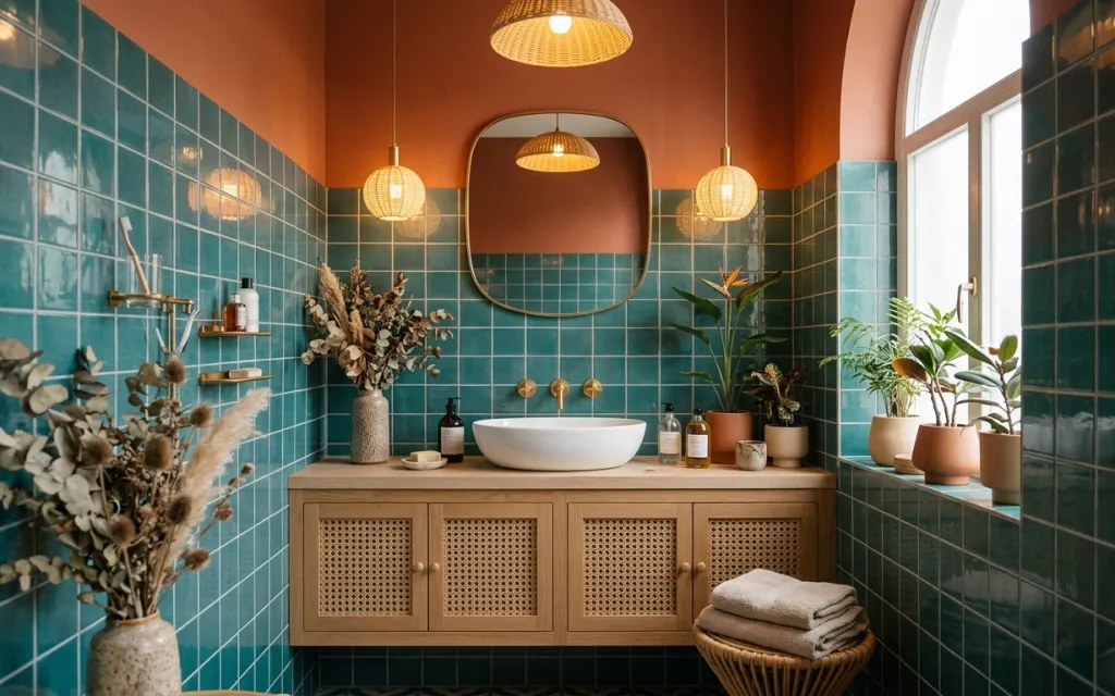
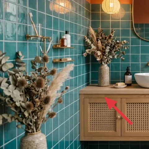
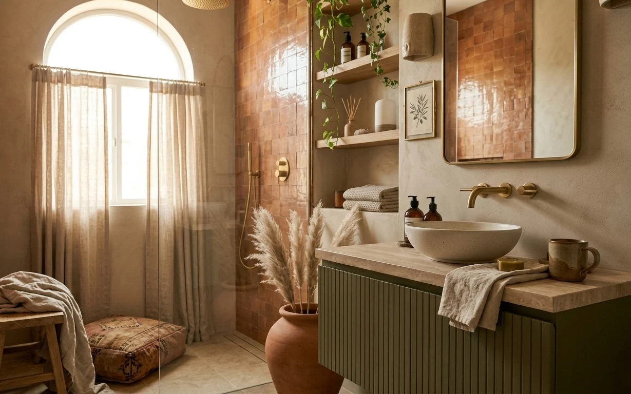
Teal square tile is the loud backdrop, so the counter needs quieter “repeatable” textures. In the photo, the look is built from folded bath towels, warm tan planter pots, and matte ceramics set across the wooden vanity top. A large round mirror softens the geometry, while dried stems in a vase add height without making the space busy. For shared housing, this kind of layering is achievable because every piece is removable and packs flat or nests together—no hardware changes required.
I used to over-buy bathroom decor because I thought the counter had to “look expensive” every day. The problem was that too many mismatched items made my routine feel cluttered. What clicked for me was copying the spacing in this setup: one vertical element (the dried arrangement), one plant cluster, then small ceramics that land in a tight rhythm. That mix reads polished even when you’re only there for the basics.
Layer 1 — folded bath towels stack ($35) The absorbent texture you can see from the doorway
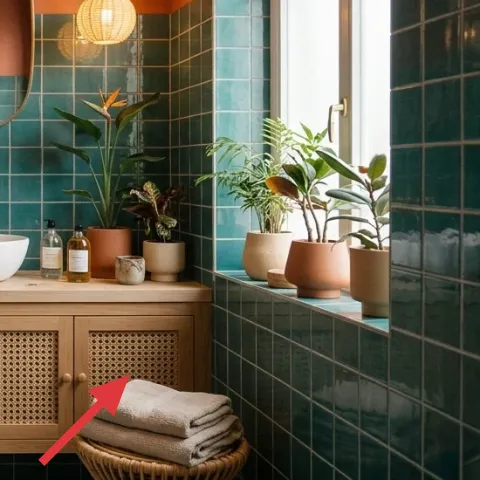
Folded bath towels near the front edge of the vanity top give you an immediate, “kept up” signal without introducing new colors. In this photo they’re a soft neutral stack, which matters next to busy teal tile: they calm the eye and echo the warm tones in the wood. The trade-off is practical—towels take up a little visual weight—so keep them to one stack, not multiple rolls. The other win: towels pack easily in a moving box and don’t depend on wall condition.
Fold with intention, not perfection
Use a consistent fold size so the stack looks intentional even when it’s slightly imperfect after a move.
Layer 2 — tan planter pots (multiple) ($40) A warm base for greenery without matching hardware
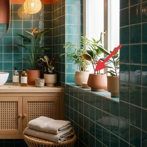
Multiple tan planter pots create a tonal “group” that looks curated from across the bathroom, even when the individual pots aren’t the same exact shape. Because terracotta tones sit between teal and wood, they act like a bridge color. The choice here is about flexibility: you can swap plants later, and the pots themselves are move-ready and reusable. The main trade-off is that unsealed clay can look dry faster, so the pot set works best if the plants stay alive (or if you keep the grouping tight and simple).
Why grouping beats one big statement
Three smaller pots read layered and balanced, while one pot can feel lonely against the teal grid.
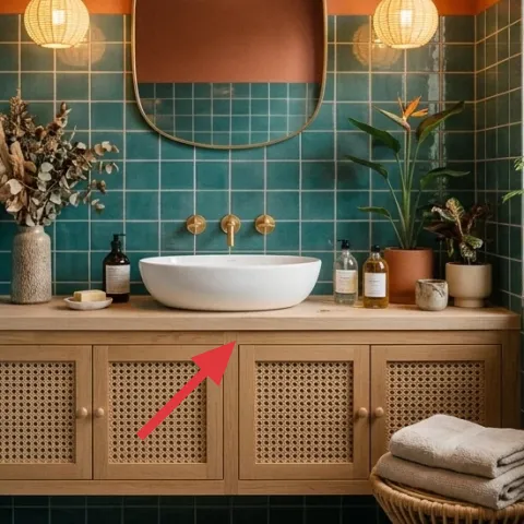
Layer 3 — large round mirror ($90) The curve that makes square tile feel less sharp
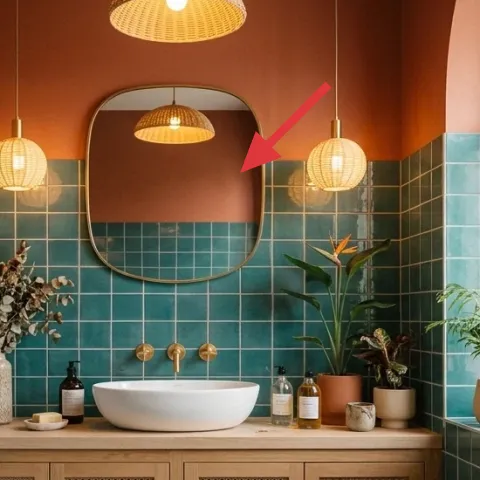
The large round mirror is doing more than reflecting light—it interrupts the strict grid of the teal tiles with a softer curve. That matters in a bathroom because straight lines can make the room feel busy fast. A mirror like this also gives you styling flexibility: you can keep the counter minimal, and the mirror’s shape still makes the space feel designed. The trade-off is size: you’ll want to commit to a single focal point rather than layering small frames. In shared housing, if the mirror can’t be removed safely, it’s better to style around what’s already there and keep this purchase optional.
Don’t overhang your styling behind the mirror
Keep tall decor centered so reflections don’t turn into a visual tangle in the glass.
Layer 4 — dried floral arrangement in vase ($35) Height that doesn’t demand daily care
Dried stems in a vase add vertical interest, which is the easiest way to make a flat counter look intentional. Here, the arrangement sits to one side, so it balances the round mirror and gives the counter a “composition” rather than scattered items. Compared with live flowers, dried material is move-friendly for shared housing: it stays looking good for weeks and packs more easily because you’re not fighting changing water levels. The trade-off is that dried arrangements can shed, so keep it controlled—bag or box it gently when you move.
Choose neutral stems for the tile
Greens and creams keep the teal from becoming overpowering.
Layer 5 — small stoneware cups/ceramics ($25) The micro-texture layer that reads “spa”
Small ceramics—like cups, dishes, or tiny catch-alls—add micro-texture and help your counter look styled instead of staged. In this photo, the small objects sit among the bottles and plants, creating a visual rhythm that feels collected rather than accidental. Ceramic also plays well with tile because it has that slightly matte, artisanal surface that doesn’t fight glossy grout lines. The trade-off is to resist the urge to fill every inch; keep ceramics to a small group so the counter still feels breathable.
Think “set,” not “single item”
Two or three matching pieces make the look feel designed even if the rest of the counter is simple.
Layer 6 — potted plant on right ($35) Fresh green to keep teal from feeling too cool
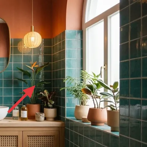
A potted plant on the right side adds life and a calmer green note against the teal tile. This kind of plant styling is a practical move for shared housing because you can pick something forgiving and still get the same visual effect—dense leaves read “fresh” even when the bathroom lighting isn’t perfect. The trade-off is maintenance, but it’s manageable: choose a plant that tolerates bathroom humidity without being fussy. Place it where it won’t be bumped by towels, and let the pot shape repeat the warm tan tones already happening.
Match leaf shape to the room lines
Longer leaves feel natural beside teal tiles because they echo the vertical grout.
Layer 7 — countertop bottle set ($40) Bottles that look finished even when the labels aren’t
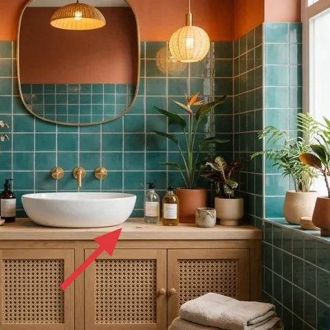
Countertop bottles make a bathroom feel put-together because they’re “functional decor.” In this setup, the bottles sit along the back line of the vanity top, which visually clears the front where you’d want towels and quick grabs. The key is keeping the bottles in a tight cluster so they don’t become random. This layer is cheaper than swapping big fixed items and easier than adding wall decor, which is often a hassle in shared housing. The trade-off is that you’ll need to keep them from getting messy—wipe drips and store backups in a drawer.
Don’t let liquids run wild on tile
Use a tray or keep bottles spaced so any tiny spills don’t travel onto the wood.
The cost, layer by layer
| Layer | Item | Cost |
|---|---|---|
| 1 | Folded bath towels stack | $35 |
| 2 | Tan planter pots (multiple) | $40 |
| 3 | Large round mirror | $90 |
| 4 | Dried floral arrangement in vase | $35 |
| 5 | Small stoneware cups/ceramics | $25 |
| 6 | Potted plant on right | $35 |
| 7 | Countertop bottle set | $40 |
| Total | $300 | |
If this budget needs to flex, the easiest swap is to downsize the mirror option and put that money into more towels and a tighter bottle cluster. You’ll still get the teal-tile balance because towels, ceramics, and a plant group are the core reads.
What worked, what didn't (across the whole room)
This bathroom vanity counter styling works because it balances a busy teal grid with warm, matte countertop textures and a few repeated shapes. The counter stays functional while still looking curated, and the round mirror softens everything immediately.
What worked
- Folded towels add visible texture without competing with the teal tile pattern.
- Tan planter pots repeat a warm color that bridges tile and wood vanity tones.
- A large round mirror interrupts the grid so the room feels calmer.
- Dried stems bring vertical height without daily maintenance or water mess.
- Small stoneware pieces add micro-matte texture that reads intentionally styled.
- Grouped bottles create functional decor that looks finished from a distance.
What didn't
- Overfilling the counter makes the teal tile feel even busier, even with “nice” items.
- Mixing too many pot shapes looks random next to the tight tile grid.
- Letting liquids collect around bottles turns the countertop into clutter fast.
- Skipping a height element (dried stems or plant) makes the styling read flat.
What we'd skip if we did it again
Skip replacing the fixed bathroom pieces. In shared housing, swapping a vanity or faucet rarely survives the next move, and it pushes your budget away from the parts that actually read as “styled.” This look gets its power from removable counter details and textiles, not from changing the base hardware.
Skip buying lots of small, unrelated decor objects. On a teal tiled wall, variety multiplies the visual noise. A tighter system—one plant cluster, one dried height piece, and two or three ceramics—creates cohesion without needing matching sets.
Skip fragile wall decor or anything that requires lingering adhesives. The easiest wins here come from items that pack into a moving box without drama: towels, pots, ceramics, a vase, and a bottle cluster that can be wrapped together.
Frequently asked
How long does this bathroom vanity counter refresh take?
Plan for about 2 hours, plus a little cleanup time. The big work is arranging: towels in one stack, a plant group on the right, and bottles lined up so the front edge stays clear. The mirror shape helps even if you don’t add much else, so you can keep the counter simple and still land the look.
What if I’m not allowed to keep a mirror or decor on display?
If the mirror or any wall-adjacent item is fixed and you can’t move it, focus on removable counter styling only: towels, ceramics, and a plant. These items don’t require wall permission. For the visual “curve” effect, use a round tray or round ceramic dish on the vanity top to echo the mirror’s softness.
Can I do this in a smaller bathroom with a narrower counter?
Yes—reduce the number of bottles and ceramics and keep one height element. On a smaller counter, one plant pot cluster (two pots max) usually reads better than three. Keep towels to a single folded stack rather than multiple folds, and leave a small gap between the cluster and the edge so the styling still feels intentional.
Where should I shop if I want this style on a budget?
Start with home basics and ceramics at discount home stores, then add one “hero” item like the round mirror or the dried arrangement from a craft or floral supply section. Pots and plants are often cheaper at garden centers. For the bottle look, buy refillable dispensers and swap labels later.
What’s the biggest mistake people make with bathroom counter styling?
Filling every empty spot. On a patterned tile wall, more objects can make the counter feel chaotic even if everything matches. The fix is to pick one vertical element, group similar items together, and keep the front edge mostly clear so towels and daily use stay comfortable.
More in Bathroom

7 renter-safe upgrades for a bathroom vanity counter refresh, $300
A bathroom vanity counter refresh that leans into teal tile, warm wood, and soft styling—built for shared housing and moves. This $300 plan…
A warm modern bathroom for $700
A $700 weekend refresh for the bathroom vanity area: swap in a crisp mirror, soften the lighting with round wall lights, and refinish the d…
7 move-friendly swaps for a $400 bathroom corner refresh
A terracotta-and-brass bathroom corner refresh on a $400 shared-housing budget—built from move-friendly textiles, wall art, and decor. This…