
- Best for
- Small upgrades that look staged
- Cost
- About $400 total
- Difficulty
- Easy to medium (labels + styling)
- Time
- About 2–3 hours
Why warm amber-and-cream is the retro bathroom of 2026
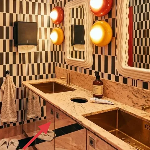
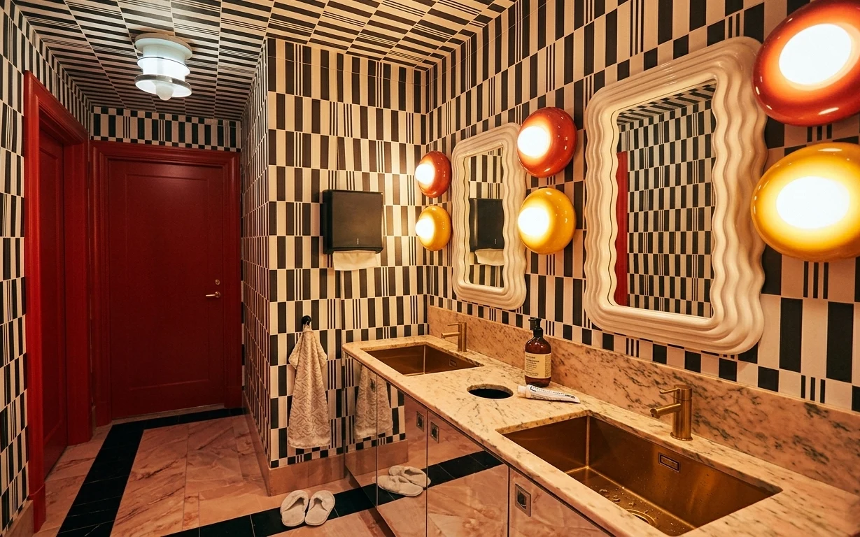
The fastest way to make a rented bathroom feel “finished” is to work with textures you can swap, not fixtures you can’t. In this photo, the checkerboard tile and wavy mirrors set a retro tone, while the warm amber glow gives everything a soft edge. I’d mirror that approach with a black bath mat on the floor, then bring in beige towels and simple flip-flops so the whole scene reads cohesive. Finally, a glass bottle styled on the counter becomes a tiny focal point when it’s labeled the same way.
I used to think the “pretty” part of a bathroom was the hardware—until I moved into a place with gorgeous mirrors and nothing else done. What I changed first wasn’t glamorous: it was the textiles and the little counter details. Once the mat and towels matched in tone, the mirrors finally looked intentional instead of accidental. This is that same idea, just dialed in to a retro palette.
Layer 1 — black bath mat ($35) Textured anchor under your feet
A black bath mat is the grounding piece here because it visually lowers the floor line in a bathroom that already has a high-contrast tile pattern. In the photo, the mat sits on the tiled floor near the flip-flops, so it reads like part of the “set,” not an afterthought. Choosing a mat with a tighter weave (or low-pile) helps it look tidy against small square tiles. The trade-off: black shows less dirt than lighter options, but you still want to shake it out regularly so the fibers stay crisp.
Low-pile works best on checkerboard tile
With busy patterns on the floor, a flatter mat keeps the look sharp instead of fuzzy.
Layer 2 — beige hand towels (set) ($30) Softens the tile contrast
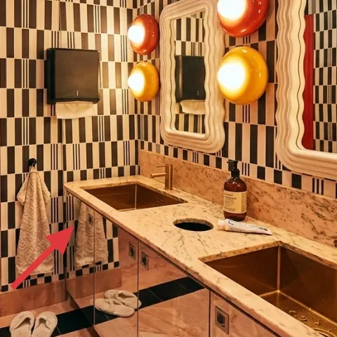
The beige towels are doing double duty: they echo the cream tile and they add a cozy, absorbent texture that tile can’t provide. In the hero image, the towels hang where you’ll actually see them—right by the mirror area—so they immediately make the bathroom feel staged. When you pick beige, go for a slightly warm undertone so it harmonizes with the amber light, not cools it down. The trade-off is practical: lighter towels can be easier to spot, so keep at least one darker option for guests and daily use.
Match undertones, not just colors
Because the lighting is warm, “cream” that leans yellow will feel more cohesive than a blue-tinged white.
Layer 3 — beige flip-flops ($20) Keeps the floor styling intentional
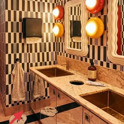
Those beige flip-flops are a small styling moment that makes the whole floor look lived-in on purpose. They sit near the bath mat, and that placement is key: they read as “bath time essentials,” not random clutter. If the alternative is leaving them in a pile by the sink, the photo would feel messier even with the same mirrors and tile. The trade-off is that flip-flops look best when they’re dry and neatly aligned—wipe them off before you put them back out, especially if the bathroom runs humid.
Align them like bookends
Two shoes/flip-flops placed parallel look cleaner than one-off angles.
Layer 4 — wavy-frame mirror set (3 mirrors) ($85) Adds retro sculptural shape
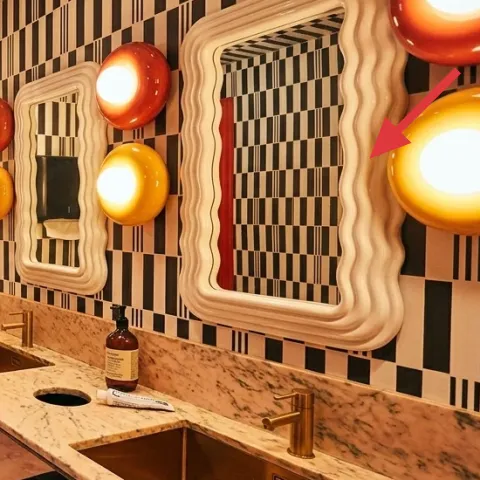
Mirrors are the “big drawing” in this bathroom: the wavy frames repeat the retro geometry and bounce the warm light across the walls. Even though you can’t change the tile, you can make the mirror zone look more styled by treating it like the main vignette—cleaner lines, coordinated textiles, and fewer visually competing objects on the counter. That’s why this layer is about the mirrors’ look as the focal backdrop. The trade-off: mirror styling is less forgiving than adding a rug—you really notice smudges, so wipe them down often.
Don’t over-stack countertop items
Too many objects in front of a mirror turns the whole area into visual clutter.
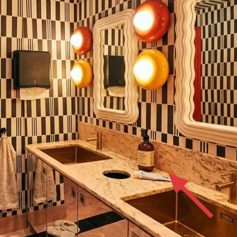
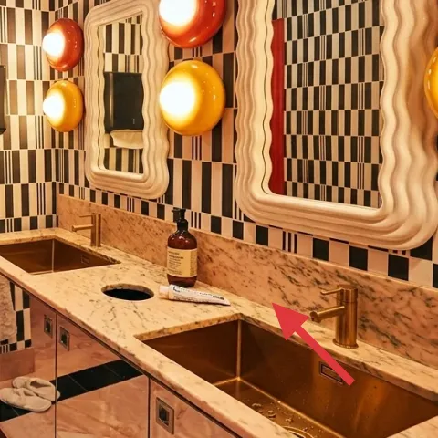
Layer 5 — glass bottle on counter (styling) ($18) One object that reads “intentional”
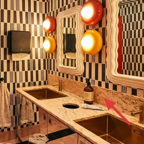
That glass bottle on the counter is already the hero object—its dark liquid and clean shape work with the warm amber lighting. Styling with one bottle (instead of a scatter of small containers) keeps the retro vibe from tipping into random. You can use it as a stand-in for shampoo or a simple decorative scent bottle, as long as the silhouette stays consistent. The trade-off: if the bottle label is blank or mismatched, it can look unfinished—this is exactly what the next layer fixes.
One “anchor” object beats three small ones
In pattern-heavy bathrooms, fewer items read cleaner in photos and in real life.
Layer 6 — apothecary-style jar labels on your bottle ($45) Make the small detail match the big look
Make it instead of buying it
This is a DIY label for the glass bottle on the counter so the retro palette feels planned, not random.
Materials
- Printable label sheets (adhesive paper) — 1 pack — Staples — $8
- Acrylic paint markers or ink pens — 1 set — Michael’s — $7
- Cardstock backing (optional) — 1 sheet — craft store — $6
- Clear tape or label laminate sheets — 1 roll/pack — office supply — $12
- Small scissors — 1 pair (if needed) — Walmart — $4
Steps
- Clean and dry the bottle so the label surface sticks evenly.
- Measure the bottle’s flat label area using a strip of paper.
- Design the apothecary-style text (planty name + “cleaning/wash” style wording).
- Print onto adhesive label sheets or onto cardstock if you want thicker edges.
- Trim the label with scissors and test-fit it around the bottle.
- Seal the printed design with clear tape or laminate so it handles bathroom humidity.
- Remove the backing slowly and apply, starting at one edge.
- Press down firmly and smooth out any bubbles with your fingertip.
Total DIY cost: $37 — saves about $8 over buying.
Layer 7 — counter tray for bottle styling ($150) Gives the retro counter a “display” feeling
A counter tray pulls the bottle and any matching small extras into a single composition, which matters in a bathroom with a busy checkerboard wall and warm mirrors. In the photo, the bottle sits alone on the counter; adding a tray creates a boundary so it looks like part of the design instead of a random item you left out. Choose a tray with warm undertones (wood or wood-look) to play nicely with the amber lighting. The trade-off: trays take a little more space on the counter, so keep it to one tray and one main object.
Pick a tray size that fits your daily routine
Keep the bottle near the center so you don’t knock it when you reach for the sink.
The cost, layer by layer
| Layer | Item | Cost |
|---|---|---|
| 1 | Black bath mat | $35 |
| 2 | Beige hand towels (set) | $30 |
| 3 | Beige flip-flops | $20 |
| 4 | Wavy-frame mirror set (3 mirrors) | $85 |
| 5 | Glass bottle (for counter styling) | $18 |
| 6 | Apothecary-style bottle labels (DIY at retail-equivalent) | $45 |
| 7 | Counter tray for bottle styling | $150 |
| Total | $383 | |
Cheaper variant: skip the mirror-set upgrade and keep the mirrors as-is, then focus your budget on textiles (bath mat + towels) and a budget tray. A simpler label design plus thrifted towels can keep the look consistent for under $250.
What worked, what didn't (across the whole room)
The warm mirror-and-tile backdrop already does the heavy lifting, and these swaps make the bathroom feel intentionally styled instead of just decorated. The biggest wins come from textiles and one controlled counter vignette.
What worked
- The black bath mat grounds the floor so the checkerboard pattern feels balanced.
- Beige towels repeat the cream tone, which makes the mirrors look more cohesive.
- Neat flip-flops on the mat read as purposeful rather than cluttered.
- Labeling the bottle adds “designed” detail without changing any fixtures.
- A tray organizes the counter so it stays tidy in a mirror reflection.
- Warm undertones in accessories match the amber lighting instead of fighting it.
What didn't
- Adding too many small items to the counter makes the mirror zone look crowded.
- Cool-toned towels can feel mismatched under amber lighting.
- High-pile mats look fuzzy against the crisp tile lines.
- Blank or mismatched bottle labels make the counter vignette feel unfinished.
- Oversized trays can crowd the sink area and create visual clutter.
What we'd skip if we did it again
Skip replacing mirrors or any big built-in bathroom fixtures mid-lease. Even if the look is tempting, it’s rarely worth the hassle and it can complicate your move-out. Instead, keep existing mirrors as the backdrop and spend on renter-safe styling you can pack away.
Skip buying a bunch of small countertop containers in matching colors. In a tile-heavy bathroom, the reflections multiply the visual noise. One bottle, one tray, and one label style keeps the retro vibe clean and readable.
Skip high-pile bath accessories and overly busy textures. Checkerboard tile plus warm amber light already creates motion; a flatter mat and smooth towel textures make the whole scene feel sharper instead of chaotic.
Frequently asked
Can renters do this without permission?
Yes—this approach relies on swap-ready textiles and small accessories. A bath mat, towels, flip-flops, a counter tray, and bottle labels all come with you when the lease ends. The one thing to be careful with is anything that suggests changing fixed bathroom fixtures; keep the upgrades in the “bring it with you” category.
How long does the label DIY take?
Plan for about 30–60 minutes for the apothecary-style labels, mostly because you’ll want clean, measured placement on the bottle and a quick seal step. Add another 10–20 minutes for styling the counter with a tray and resetting towels to the mirror zone.
What if my bathroom is smaller or less colorful?
Go lighter on the number of accessories. Keep one anchor (the bath mat) and one counter vignette (bottle + tray), then use towels in one warm neutral so everything still feels cohesive. In smaller bathrooms, that “fewer items, clearer placement” rule prevents the space from looking cluttered.
Where should I shop for the renter-safe pieces?
For fast matches, look for bath mats and towels at big-box retailers with lots of beige options, then choose a tray and bottle labels online. Thrift stores can be great for towels if the color undertone works with warm lighting. The goal is texture consistency, not brand matching.
What’s the biggest mistake people make in bathrooms like this?
Over-styling the counter and mirror zone. With retro checkerboard tile, reflections, and warm amber glow, each extra object gets multiplied. A simple layout—mat, towels, one bottle, one tray—reads designed even if the rest of the bathroom is unchanged.
More in Bathroom
7 renter swaps for a retro bathroom refresh, $400
A retro bathroom refresh for renters on a $400 budget: swap in a soft black bath mat, style beige towels and flip-flops, and add no-drill b…
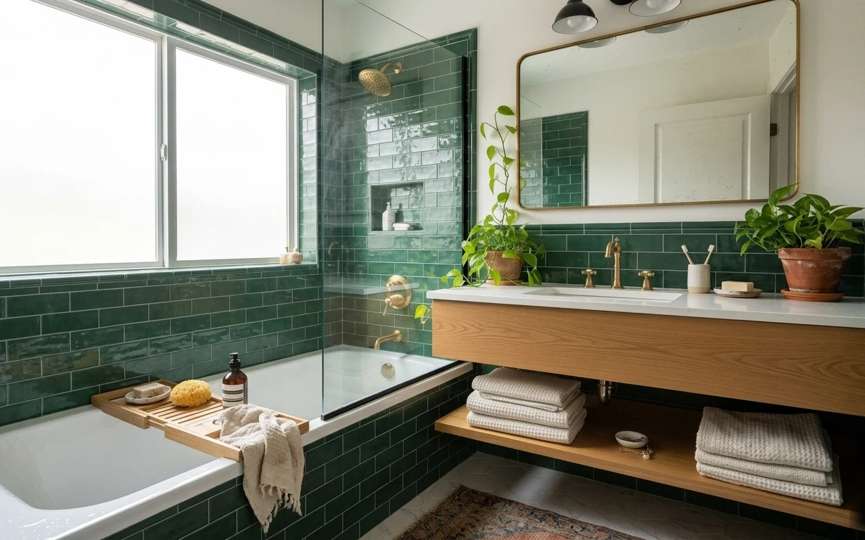
What $300 buys: a renter-friendly tub-and-vanity corner refresh
A renter-friendly bathroom tub-and-vanity corner refresh built around deep-green tile and warm wood—no drilling, no permanent changes. For …
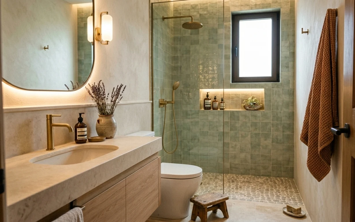
How to refresh a walk-in shower bathroom for under $400
A walk-in shower bathroom refresh that stays move-ready and no-drill-friendly on a $400 budget. Swap in warm textiles, a few countertop/sho…