- Best for
- Shared dining corners that need to pack up
- Time
- About 2–4 hours for the swaps + DIY
- Total cost
- $600 for seven move-ready pieces
- Renter-safe
- No drilling; everything is removable
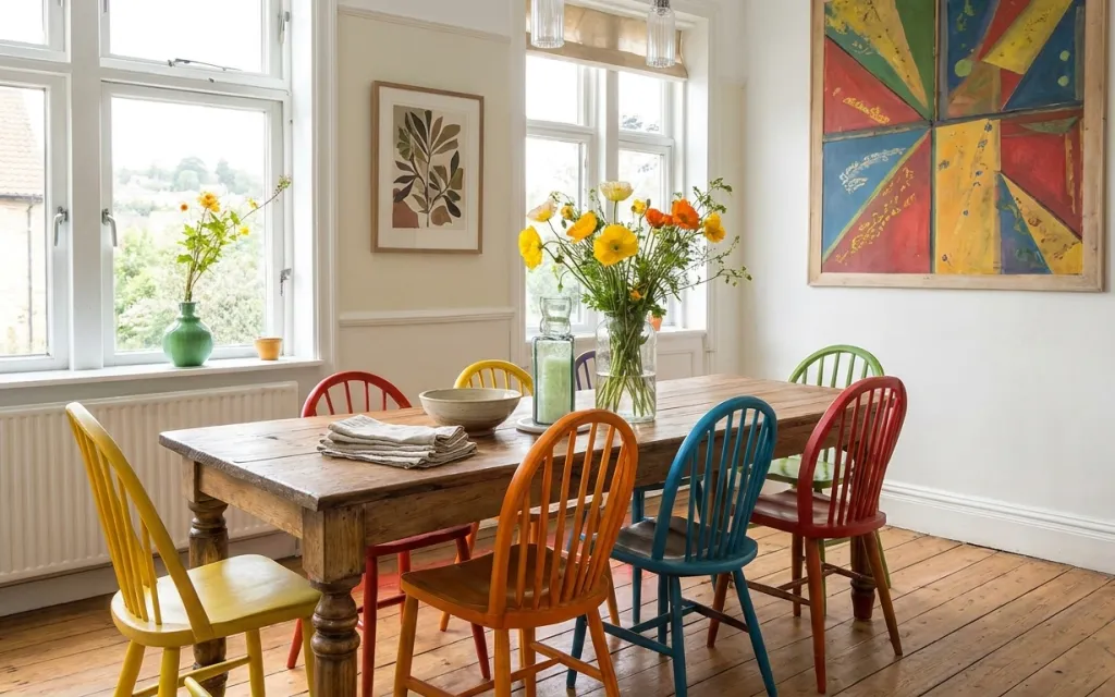
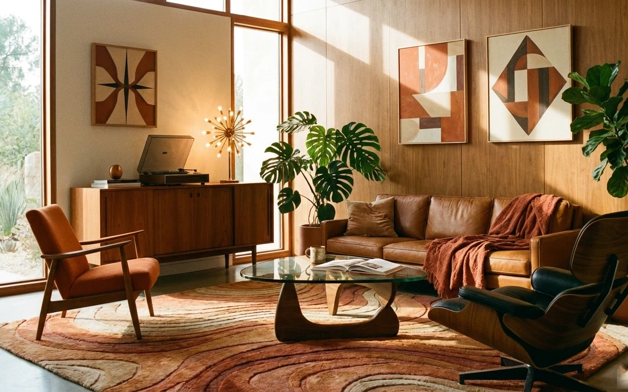
Why this wood-and-multicolor chair scene is the dining nook of 2026
Look closely at what’s doing the work: a wood dining table with strong grain, a cluster of chairs in bright tones, and two framed artworks that pull the color story upward. The vase of yellow flowers adds movement without needing big furnishings, and the folded cloth napkins make the tabletop feel intentional. This layout fits a shared place because it relies on removable pieces—art and decor—rather than changing anything fixed. It also matches a magazine-ready rule I learned the hard way: repeat one or two colors, and keep the rest calmer.
I used to think bright chairs meant the whole room had to be loud, but in my last shared house the wall got crowded and the look fell flat. What changed my mind was living with one “loud” chair and one “loud” artwork, then letting everything else be wood, white, and texture. Here, the chair backs and the multicolor framed piece talk to each other, while the botanical print brings the palette back toward nature. That push-pull is the secret to a dining nook that feels curated, not chaotic.
Layer 1 — table bowl ($30) for a quick styling anchor
A simple table bowl is the small, grounding object on the tabletop that keeps the look from feeling like “just chairs and a bunch of frames.” In the photo, it sits near the folded cloth napkins, so it visually ties together the place setting and the center arrangement. A ceramic bowl also reads as intentional even when it’s empty, which matters when your dining nook doubles as study space during the week. The obvious alternative is stacking more decorative items, but that’s harder to pack and harder to reset before guests come over.
Use it as a staging surface
Keep keys, a small spoon, or extra napkins in the bowl so it always looks styled at meal time.
Layer 2 — framed botanical print ($50) for a calm counterpoint
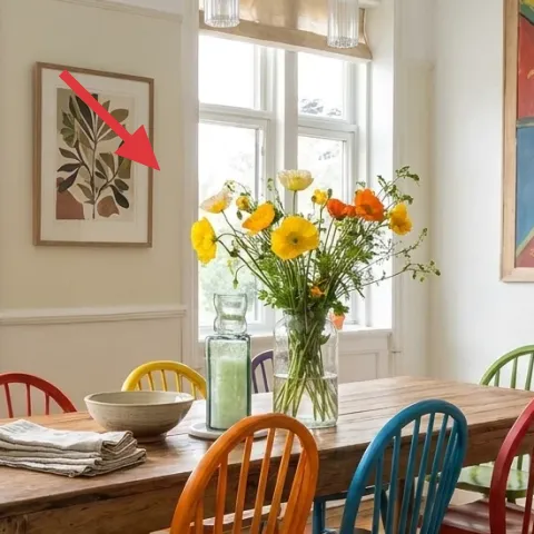
The framed botanical print gives the room a quiet “breather” color story: green and warm neutrals against the white wall paneling. Because it’s a flat, framed piece, it’s also one of the easiest upgrades for shared housing—no drilling, no permanent installs, and no moving parts. This matters in dining nooks where chairs and table already add visual weight; the botanical print softens that weight. The trade-off is scale: it works best when it’s centered and not competing with the louder artwork on the other side of the wall.
Match frame style, not exact subject
If you can’t find the same botanical art, choose another botanical or leaves print with a similar frame color.
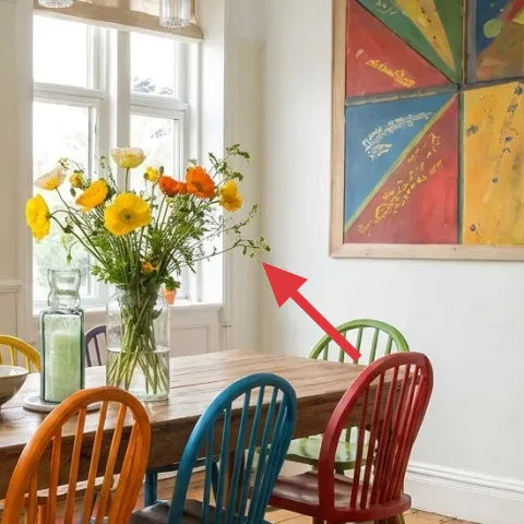
Layer 3 — framed abstract multicolor artwork ($50) for the big color hit (DIY)
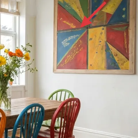
This is the piece that makes the whole corner feel playful: bold blocks of blue, yellow, red, and teal with a hand-painted rhythm. To keep it move-friendly, a DIY replaces the framed artwork without changing anything fixed about the room. A hand-painted abstract on cardstock is light, cheap, and easy to swap out when you move—so the color story stays yours. The trade-off is you won’t get the exact same print texture, but you’ll get the same visual purpose: a bright focal point that echoes the chair colors.
Make it instead of buying it
DIY a hand-painted abstract on cardstock and slide it into a lightweight frame so you can take it to the next lease.
Materials
- Cardstock (assorted colors or white) — 1 sheet — craft store — $6
- Acrylic paint set — 1 small set — craft store — $10
- Small craft brush — 1 — craft store — $8
- Painter’s tape — 1 roll — hardware/craft store — $4
- Clear archival tape or corner guards — 1 pack — craft store — $2
Steps
- Sketch simple shapes (triangles, wedges, and circles) lightly with pencil.
- Mask a few clean edges with painter’s tape, leaving generous white space.
- Paint the first color blocks and let them dry for a few minutes.
- Layer contrasting colors on top, then pull the tape while paint is still slightly tacky.
- Add small details (tiny dots or thin lines) with the tip of the brush.
- Allow the cardstock to fully dry, then protect corners with tape or guards.
Total DIY cost: $30 — saves about $20 over buying.
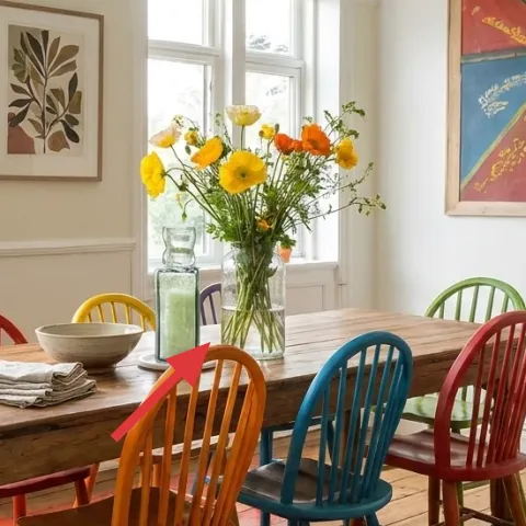
Layer 4 — vase of yellow flowers ($40) to bring life to the center
A vase of yellow flowers adds height and movement, and in this nook it works like the “centerpiece” without demanding a fancy table. The yellow blooms echo the warm chair tones and make the dining area feel bright even in softer daylight. Choosing a simple vase also keeps the styling doable: swap flowers based on what’s available, keep the container, and you don’t waste money re-buying everything. The trade-off is upkeep—cut flowers have a shorter life than faux stems—so it helps to refresh small bunches midweek if the room looks used.
Repeat yellow once more
Let one other small detail—napkin color, bowl, or a chair—bring the yellow back so it doesn’t look random.
Layer 5 — yellow wooden dining chair ($90) for instant warmth
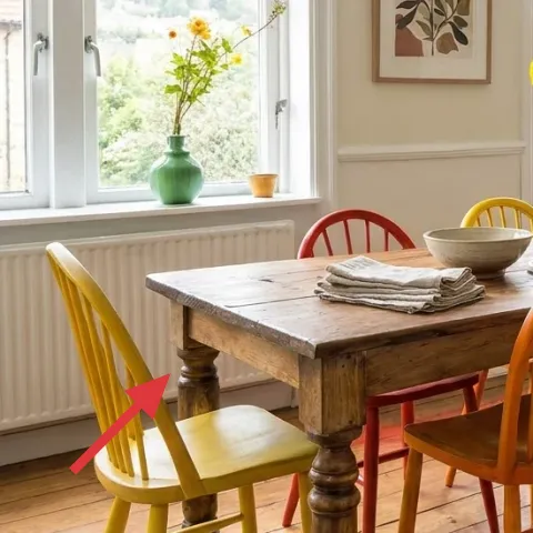
The yellow wooden chair does a lot of work because it adds warmth and a clear visual “corner” shape at the left side of the table. In a shared space, it’s also a smart investment: one standout chair can carry the whole palette, even if you don’t match every chair perfectly. The trade-off is practicality—bright color will show scuffs—but that’s manageable with a fabric seat cover or a quick wipe routine. Compared with buying a fully matching set, this approach feels more personal and looks better even when you’re still gathering pieces over time.
Pick scuff-tolerant material
If the seat is smooth wood, plan on quick cleaning and avoid dragging bags across it.
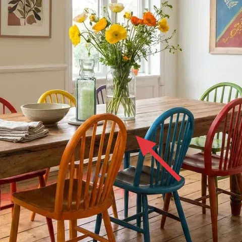
Layer 6 — blue wooden dining chair ($90) to balance the yellow
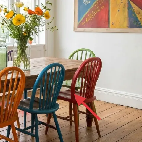
The blue chair brings the counterbalance the palette needs. In the photo, the teal-blue tone sits near the center seats, so it visually links the table to the brighter wall art above. This is the “choose one bold color” principle in action: you’re not trying to wallpaper the room with color, you’re placing it where your eyes already land—around the dining circle. If the obvious alternative is more neutral chairs, the nook will feel calmer but less like a designed spot for coffee, work, and dinner. Color here is doing the layout work.
Mind the spacing, not the match
A slightly mixed chair look looks intentional when the tones are repeated around the table.
Layer 7 — wood dining table ($250) for the real room structure
The wood dining table is the foundation because it anchors every other element: the chairs, the bowl styling, and the framed artwork lines. This version reads mid-century inspired because of the sturdy grain and the classic proportions that don’t fight with bright accents. It’s also the hardest piece to hunt for, but once it’s in place, the refresh is mostly removable details—so you’re not constantly re-buying. The trade-off is move logistics: a full-size table is bulky, but if you buy it used (or choose a smaller footprint), it’s still manageable across a shared-house move.
Buy used, then make it yours
Look for solid wood with sturdy joints, then style the tabletop so the table feels fresh every season.
The cost, layer by layer
| Layer | Item | Cost |
|---|---|---|
| 1 | Decorative ceramic bowl | $30 |
| 2 | Framed botanical print 16×20 | $50 |
| 3 | Framed abstract multicolor artwork (DIY ~$30 materials) | $50 |
| 4 | Planter / pot (medium) used for a simple flower vase | $40 |
| 5 | Dining chair (yellow) for the table | $90 |
| 6 | Dining chair (blue) for the table | $90 |
| 7 | Dining table | $250 |
| Total | $600 | |
A cheaper variant keeps the color impact but reduces the furniture cost: choose one statement chair (yellow or blue), use thrifted framed art prints with simple frames, and go smaller with the table footprint.
What worked, what didn't (across the whole room)
The look works because the room repeats a color story (yellow and blue) across chairs and wall art, then softens it with white wall paneling and botanical imagery. The floral centerpiece adds life without taking over the table surface. The one thing to watch is how quickly the palette can feel busy if too many small objects pile onto the tabletop.
What worked
- Two framed artworks create a top anchor so the dining nook reads styled from across the room.
- Color-mixed chairs look intentional when yellow and blue repeat near the center seats.
- The vase of yellow flowers brings height, making the tabletop feel “set” without extra furniture.
- The tabletop bowl helps the folded cloth napkins look purposeful, not random.
- Wood tones tie together bold chairs and bright wall art so the palette stays cohesive.
- Removable decor does the heavy lifting, which is ideal for shared housing moves.
What didn't
- More chair colors than the photo can tip the nook into clutter fast, especially near the framed art.
- If the table is too bare, the dining area can look like a hallway stop instead of a real spot.
- Oversized wall art placements can crowd the window sightlines and make chairs feel cramped.
- Bright chair finishes show scuffs sooner, so wiping and protection matter.
What we'd skip if we did it again
Skip buying a fully matching six-chair set. In this kind of colorful nook, mismatched chairs with shared tones (yellow and blue) look more designed, and you can source pieces over time.
Skip changing anything fixed or hardwired. Framed prints, a lighter vase centerpiece, and tabletop styling are the move-friendly route because they pack flat or in boxes.
Skip putting too many small tabletop items in the same spot. One bowl anchor plus a simple flower arrangement lets the chair color and wall art stay the headline.
Frequently asked
How long does this kind of dining nook refresh take?
If the table and chairs are already in place, the rest is quick: frames up first, then tabletop styling, then the flower centerpiece. A hand-painted cardstock piece is the only part that adds drying time, but you can still finish it in an afternoon. In shared housing, the real time savings comes from choosing removable items—no cure time, no hardware, and no long resets.
What’s the most move-friendly way to handle framed art between leases?
Keep frames and art in a single “moving day” box each, with paper or bubble wrap so corners don’t bump. For the DIY abstract, store the cardstock flat if possible, then place it in the frame after you arrive. The goal is to avoid repacking that turns into re-styling from scratch.
My dining area is smaller—can I still do this look?
Yes. Go smaller on the table footprint, keep the chair mix to two or three colors, and prioritize one botanical print plus one bold abstract. The color impact doesn’t require a large wall; it requires repetition. If wall space is tight, center the botanical print and let the abstract artwork take the right side only.
What if the room is bigger—how do I avoid it looking empty?
Use the wall art as your scale tool: larger frames or additional prints can fill the vertical space, while keeping chair colors limited prevents the dining nook from becoming visually noisy. Add a second floral container only if there’s enough table surface—otherwise, stick with one vase and keep the tabletop uncluttered.
Where should I shop if I want this mid-century inspired, colorful vibe on a budget?
For chairs and tables, try resale marketplaces first so you can choose solid wood without paying new prices. For prints, look for 16×20 framed art sizes, and if you can’t find the exact look, DIY the bold abstract on cardstock. The botanical print is usually the easiest to source because it comes in lots of themes and color palettes.
Biggest mistake people make with colorful dining nooks?
Overbuilding the palette. The photo works because two loud elements (chair color and the multicolor abstract) repeat, while the rest stays grounded in wood and white. If you add too many other bright objects—extra table decor, more chair colors, or layered wall items—you lose the crisp, designed feel.
More in Living Room

A bright, colorful dining corner for $600
A shared-housing dining nook refresh with seven move-friendly swaps, built around framed art, bold chair color, and a simple flower vase. G…
5 move-ready swaps for a $600 living room refresh
A warm wood, rust, and cream living room can look intentional even in shared housing. With a $600 refresh and move-friendly pieces (rug, so…
What $700 buys: a move-ready living room seating refresh
A move-friendly living room seating area refresh for shared housing, built from 7 no-drill swaps, warm curtains, and plant-friendly color. …