- Best for
- Move-ready listening corners and framed-art walls
- Cost
- About $600 for 7 renter-safe layers
- Difficulty
- DIY-friendly with one easy paint project
- Time
- About 2–3 hours total (plus dry time for DIY art)
Why warm terracotta lighting is the listening corner of 2026
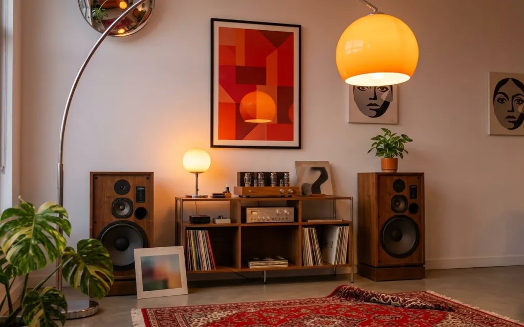
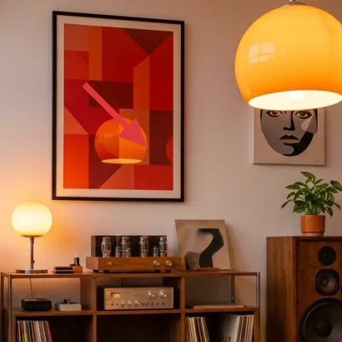
Start with what’s already working: the light wood floor, the gallery-style wall, and that warm orange glow. In this setup, three textures do the heavy lifting—your red patterned rug underfoot, the cream-shaded lamp light pooling around the console, and the leafy plant softening the corners. I’m especially into how the framed red print and face art bring color without feeling too “matchy.” The best part for renters is that the look relies on movable pieces, not anything that needs landlord approval.
I caught myself once buying “just one” wall piece when I was staging a rental—and the whole room looked unfinished because the eye had nowhere to land. Here, the trick is to repeat a small set of colors (red, cream, warm wood) across light, rug, and art. That’s what makes it feel composed instead of random.
Layer 1 — red patterned area rug ($200) Anchors the whole listening layout
A red patterned area rug is doing the anchoring job here: it establishes a clear “zone” on the light wood floor and gives the room a rhythmic, almost vintage pulse. Look at how the rug sits under the console and the folded throw—those elements read as a set because they share the same base texture and color temperature. The trade-off with going bold on pattern is that you’ll want your other surfaces to stay simpler; that’s why the lamps and wall prints are the calmer counterpoints. This is the part you’ll actually feel every time you walk in.
Let the rug lead, then color-match in small doses
Pull red from the rug into one wall print and one lighting piece so the zone feels intentional.
Layer 2 — orange globe pendant-style lamp ($120) Adds a warm, rounded focal point
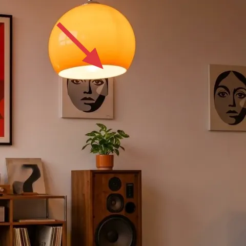
The orange globe pendant-style lamp is what makes the room glow after dark. Its rounded shade shape softens the angular feel of the console shelves and wall frames, and the warm color echoes the rug’s reds without matching every thread. If the obvious alternative is a neutral white shade, the whole space would skew flatter; here, warmth gives the “listening corner” mood. Position matters too—having the globe above and slightly toward the right side creates a natural highlight over the rug and console. For renters, a plug-in style lets you keep the impact without permanent changes.
Warm light reads cozier against gray walls
The light gray wall keeps orange from looking loud; it turns the lamp into the color accent.
Layer 3 — table lamp with cream shade ($60) Creates a second pool of light
A cream-shaded table lamp adds a gentler layer of light that supports the globe’s drama. In the photo, the smaller lamp sits near the center-left console area, which helps the eye move across the room instead of getting stuck on one bright point. The cream shade also adds texture—its fabric surface breaks up the glossy look of the globe and the reflective glass jars on the console. I’d skip a stark white shade here, because it can make the rug’s red look harsher. This one is a simple swap that makes the whole corner feel more lived-in.
Place the second lamp lower than you think
A slightly lower light source keeps shadows soft and makes wall art look brighter, not dull.
Layer 4 — hand-painted abstract on cardstock ($80) DIY framed color that’s easy to pack
Make it instead of buying it
DIY a small abstract in the same red-and-cream direction as the framed print, then slip it into a renter-friendly frame so it packs up with the rest of the corner.
Materials
- Thick cardstock (8x10 sheets) — 2 sheets — craft store — $10
- Acrylic paint set (red + neutrals) — 1 set — craft store — $18
- Assorted paintbrushes (2–3 sizes) — 1 pack — craft store — $6
- Painter’s tape — 1 roll — craft store — $15
- Small frame (matches the size) — 1 — home goods store — $12
Steps
- Lightly size the cardstock to the frame opening; trim if needed.
- Use painter’s tape to block 3–5 geometric areas in red and warm neutrals.
- Paint each taped shape with acrylic, leaving small gaps for contrast.
- Let it dry completely, then remove tape to reveal crisp edges.
- Add a couple of hand-painted “soft blocks” with a smaller brush for depth.
- Once dry, place the art into the frame and align it before finalizing.
Total DIY cost: $61 — saves about $19 over buying.
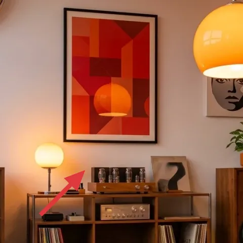
The framed abstract red print brings the whole color story together, and the DIY route keeps it move-friendly. The key is not perfect art—it’s repeating the room’s visual language: warm reds, blocky shapes, and a neutral base that won’t fight the rug pattern. In the photo, that center frame sits above the console, so it becomes the “anchor” for all the smaller details below (the tray, jars, and plant). The trade-off with a DIY print is time and trial—tape edges can look imperfect—but acrylic is forgiving and the frame makes it look intentional. When the lease ends, swap in your next version.
Don’t over-detail
Too many tiny shapes will compete with the rug pattern; stick to big blocks and 2–3 colors.
Layer 5 — framed face print on the wall (right side) ($80) Adds a human focal point without clutter
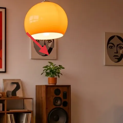
This face print works because it’s graphic and contained—black lines on a light background give contrast against the warm wall tones. It’s also placed to balance the composition: the right-side face art offsets the center abstract so the console area feels centered, not “left-heavy.” If the obvious alternative is adding another landscape or neutral print, the room would lose its personality; here, the faces introduce a playful, gallery-like vibe. The trade-off is that you’ll want consistent frame finishes across your picks. This layer is also renter-friendly because a framed print is easy to remove and reuse.
Match frame finishes, not the print style
Keeping frame color consistent makes mixed art look curated instead of accidental.
Layer 6 — small potted plant in a terracotta pot on the console ($25) Softens the console and repeats warmth
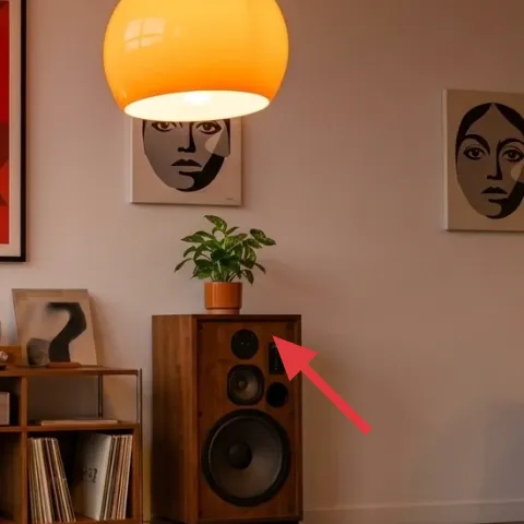
A small potted plant in a terracotta pot adds instant softness where the console would otherwise feel too geometric. In the photo, it sits on the right side of the console, and the warm terracotta tone echoes the lamp globe and the rug’s reds. Plants also help “read” the room as a lived space rather than a staged photo, especially next to the glass jars and record stacks. The trade-off is sunlight: if light is limited, the plant may need rotation or swapping. Still, it’s one of the easiest layers to move between apartments—no hard installs, just a pot and a new corner.
Keep the plant tight to the console edge
That placement creates a visual border for the shelf styling instead of floating in the middle.
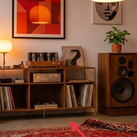
Layer 7 — decorative tray on the console ($35) Makes jars and objects look intentional
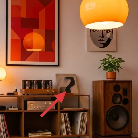
A decorative tray on the console turns a collection of small items into a single, styled “still life.” Here, it sits near the clear glass jars, which would otherwise look random in open shelving. The tray’s warm wood tone also connects the console feel to the light wood floor and speaker cabinets, so everything reads as part of one material family. If the alternative is arranging items directly on the shelves, the eye has nothing to “group,” and the setup can look cluttered fast. The trade-off is space—you’ll likely edit down to fewer objects so the tray looks purposeful. That editing is usually the difference between busy and curated.
Use the tray as your editing tool
When you add a tray, remove one extra object until the tray looks balanced.
The cost, layer by layer
| Layer | Item | Cost |
|---|---|---|
| 1 | Red patterned area rug | $200 |
| 2 | Orange globe pendant-style lamp | $120 |
| 3 | Table lamp with cream shade | $60 |
| 4 | Hand-painted abstract on cardstock (DIY) | $80 |
| 5 | Framed face print on the wall (right side) | $80 |
| 6 | Small potted plant in terracotta pot | $25 |
| 7 | Decorative tray on the console | $35 |
| Total | $600 | |
If you want a cheaper version, downsize the rug to a smaller size and pick a simpler runner-style pattern. Keep the globe lamp and one framed print for impact, then swap the plant for a low-cost cutting in a terracotta-style pot.
What worked, what didn't (across the whole room)
This corner reads intentional because warm light and a bold rug do the anchoring, while the framed art gives the wall a clear focal story. The biggest improvement came from editing the console with a tray instead of letting small items sprawl across open shelves.
What worked
- The red patterned area rug creates a defined zone on the light wood floor.
- The orange globe lamp adds warm, rounded emphasis without changing any permanent fixtures.
- The cream table lamp adds a second light pool that softens shadows near the console.
- The center framed abstract print repeats the rug’s red family for visual unity.
- The right-side face print brings contrast and keeps the wall from feeling too orderly.
- The terracotta plant introduces organic shape next to glass and records.
- The decorative tray groups small items so open shelving looks styled, not accidental.
What didn't
- Swapping the lamp shades for something all-neutral made the room feel flatter and less layered.
- Adding too many small console objects at once turned the tray area cluttered fast.
- Choosing a second “busy” patterned wall piece would’ve competed with the rug.
- If the plant is placed too far forward, it blocks the sightline to the wall art.
- Using a rug with a weak red tone made the lamps look warmer than intended.
What we'd skip if we did it again
Skip changing the wall itself or replacing anything landlord-installed. This look depends on movable layers—rug, plug-in lamps, and framed prints—so it keeps your deposit safer and your timeline simple.
Skip adding more frames just to fill space. One strong center print plus one contrasting graphic print is enough; extra prints usually compete with the rug pattern and the console shelving.
Skip a second “busy” pattern on top of the rug. If the rug is doing the work, keep the rest in solids, simple shapes, and warm neutrals—especially lampshades and plant pots.
Frequently asked
How long does this corner refresh take if I’m DIY-ing the abstract print?
If you’re only DIY-ing the abstract art, plan about 1–2 hours of active work: taping, painting, and framing. Dry time depends on the paint thickness, but acrylic usually finishes within a couple of rounds of drying. Everything else—swapping a lamp, setting the rug, and placing wall art—can be done in under an hour. Overall, most renters can finish the full refresh in one afternoon.
Is this renter-safe if my lease doesn’t allow wall changes?
Yes, because the layers in this setup are removable and don’t require painting, drilling, or permanent fixture swaps. The biggest “wall” elements are framed prints, which can come down with no damage when you leave. For light, the approach uses plug-in lighting rather than hardwired updates. Even the DIY artwork is built to fit a frame you can keep using later.
What if my living room is smaller than the photo?
If the room is tighter, keep the globe lamp and one framed print, then scale down only one big item: either choose a smaller rug size or use a less wide tray styling on the console. The key is the same: one bold anchor (rug) plus warm light plus one graphic wall element. In small spaces, fewer pieces placed closer together usually read more intentional than adding more decor.
What if my space is bigger—can I keep the same style?
Yes—repeat the rhythm. Add a second framed print on the opposite side of the center abstract (so the wall has balance), and consider a larger rug size to keep the console and rug zone aligned. For lighting, a second lamp can help, but keep the same warm palette so the room doesn’t look like multiple color stories. Terracotta and cream tones are the “glue” here.
Where to shop differently if I want to keep costs down?
For the rug, compare large-box brands with local discount stores—patterned rugs are often discounted for quick-turn inventory. For the lamp, look for plug-in globe pendant-style options at home goods retailers and secondhand marketplaces. For framed prints, thrift stores and discount art racks are great for frames specifically; you can always swap the artwork later with the same frame.
Biggest mistake renters make in a listening-corner setup?
The most common mistake is under-editing the console and over-adding wall elements. Open shelving looks messy quickly when there’s no grouping, so use one tray to consolidate small items. On the wall, two pieces are usually enough when the rug already has a strong pattern. If the wall becomes too busy, the corner loses that “focused mood” feeling.
More in Living Room

A renter-friendly listening corner for $600
A renter-friendly listening corner for $600—built with a red patterned rug, warm globe lighting, and no-drill framed art updates. The resul…
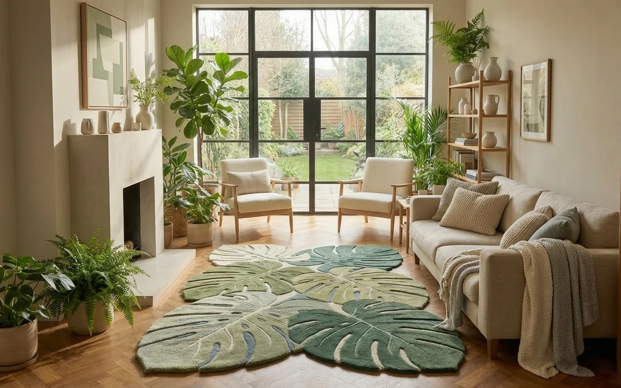
Cream-and-sage biophilic living room refresh, $600
A renter-friendly plant-filled living room refresh built around two sage leaf rugs, a beige throw blanket, and no-drill styling. This $600 …
Make the sofa lounge feel pulled-together for $700
A renter-friendly living room lounge refresh under $700, built from 7 visible swaps. The look centers on a patterned rug, a round wicker co…