
- Best for
- Warm, layered living-room styling
- Cost
- About $659 total
- Difficulty
- Easy (styling + no-drill decor)
- Time
- 2–4 hours for layout + styling
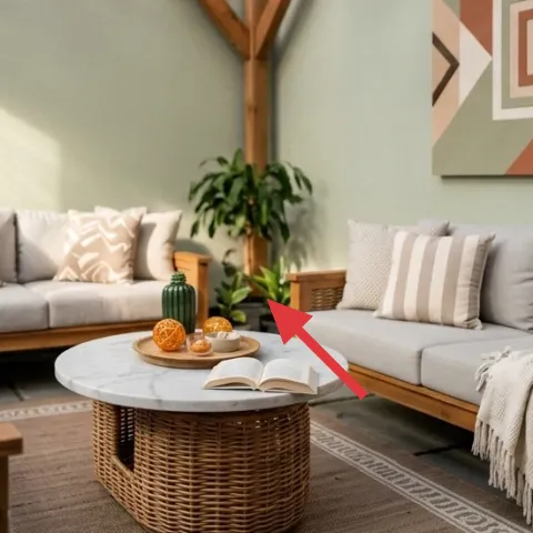
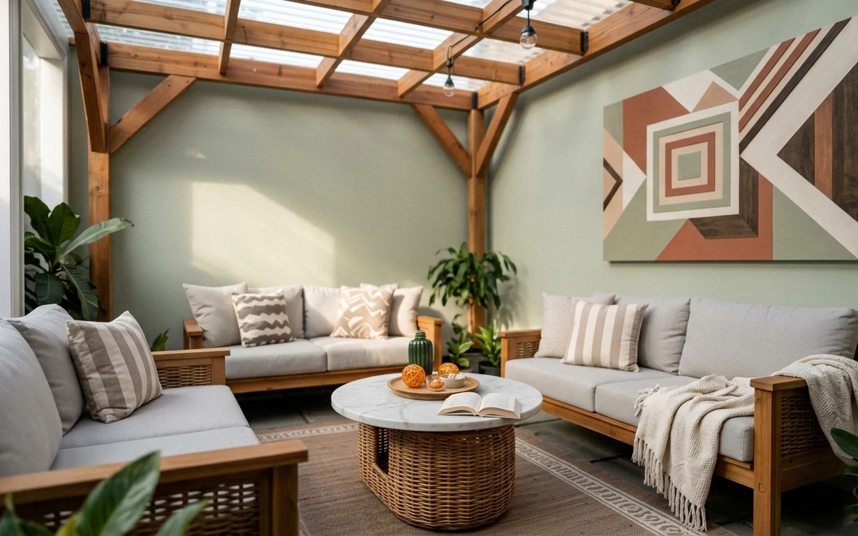
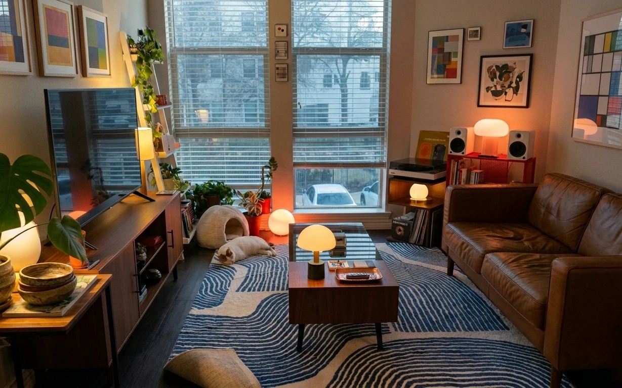
Why warm neutral textures are the sofa lounge under wood-beam ceiling of 2026
Start with the big visual anchor: a patterned rug that frames the seating like a “room within a room.” Then bring in the same warm materials across multiple spots—woven from a round wicker coffee table, knit from the cream throw, and soft textile variation from striped pillows. The framed abstract art on the right wall adds color geometry, which keeps the neutral palette from reading flat. Even with hanging exposed bulbs overhead, the layering makes everything feel styled, not just furnished.
I used to think rugs and wall art were enough, then I kept wondering why my rooms still looked a little unfinished. What finally clicked was repeating texture in small doses—like adding a knit throw over a sofa edge and letting a striped pillow echo the rug’s pattern. Here, the woven table, the knit blanket, and the patterned rug all pull the same weight so the look works in a renter setting.
Layer 1 — Patterned area rug 5×7 ($200) Frames the seating so it feels intentional
This patterned area rug sits under the entire coffee-table zone, with a geometric border that visually connects both sofas. The key is that it’s not one flat field of color; the border gives your eye a stopping point so the space reads “designed” even when you don’t change the wall or ceiling. A plain neutral rug would make the seating feel separated from the rest of the room, especially with all that wood overhead. This one also hides everyday scuffs better because the pattern breaks up visual wear. The trade-off: you have to keep the pillow colors within a similar warm-neutral family.
Let the rug do the math
If the rug has a border, repeat that rhythm with one additional pattern (like a striped pillow) so the room doesn’t look randomly patterned.
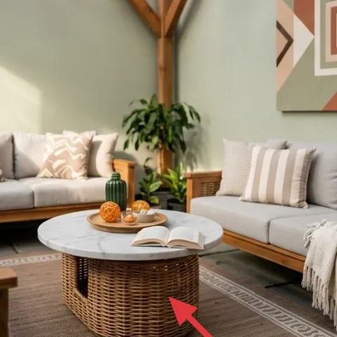
Layer 2 — Round wicker coffee table ($180) Adds warmth and texture at eye level
The round wicker coffee table adds that woven texture you can feel across the whole lounge. Its shape matters: rounded edges soften the straight lines of the sofas and the angular ceiling beams, so the room doesn’t feel boxy. A standard rectangular table would fight the geometry of the rug border and make the center feel too rigid. This table also gives you a built-in “styling bowl” for small objects—like the open book and tray—without needing extra shelves. The trade-off is maintenance: wicker catches dust, so a quick vacuum brush pass is the routine.
Style it in a triangle
Keep one tall item, one medium piece, and one small detail on the tray so the center looks composed from both sides.
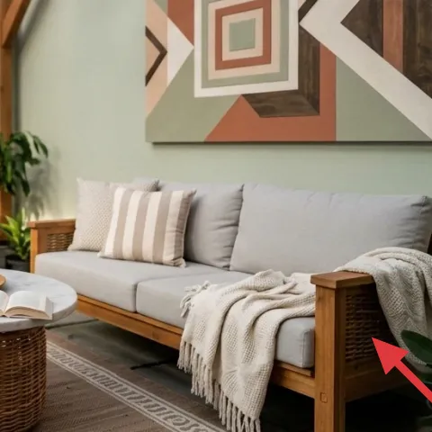
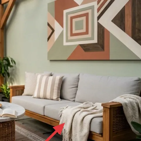
Layer 3 — Cream knit throw blanket ($40) Makes the gray sofas feel lived-in
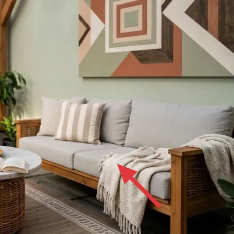
Drape the cream knit throw over the right sofa arm so it looks casual but still purposeful. Knit is doing a lot here: it adds softness against the smooth upholstery and makes the warm wood feel even richer. If the throw were a smooth woven or a thin blanket, it wouldn’t read clearly in this bright lounge light. This one also adds a “third texture” next to the rug’s pattern and the coffee table’s wicker weave, which is why the room feels layered. The trade-off is keeping it tidy—fold it back neatly after lounging so it stays styled, not rumpled.
Match knit to the coffee-table weave
When the room has wicker, knit makes the softness believable instead of decorative.
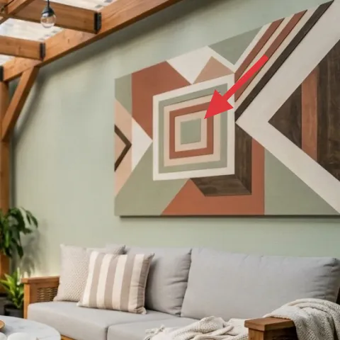
Layer 4 — Framed abstract wall art ($120) Brings color geometry to the otherwise neutral walls

The large framed abstract art on the right wall acts like a focal point that balances the seating and visually anchors the lounge. The palette pulls warm tones (burnt orange and wood browns) into the gray-and-cream base, so everything looks coordinated instead of separate. Going smaller or choosing a simple landscape would make it harder for the art to compete with the scale of the seating area. This works especially well under a wood-beam ceiling because the ceiling already has structure—your wall art adds a calmer kind of structure through shapes and lines. Trade-off: you need to keep other decor more neutral so the art stays the loudest thing in the room.
Don’t hide the frame
If a frame looks too dark or too thin compared with the room’s warm wood, it can visually “sink” behind the beams.
Layer 5 — Floor potted leafy plant (right) ($35) Adds fresh volume without adding clutter
The right-side potted plant fills vertical space and softens the straight lines of the sofas and the rug border. It also repeats the room’s warm-neutral theme because the foliage reads deep green against gray upholstery and light walls. A smaller plant would look like decoration instead of part of the layout, especially when the ceiling has so much visual weight. The best renter-friendly approach is to choose a pot that’s stable enough to live where you place it—no leveling drama near the coffee table. Trade-off: plants ask for light and watering rhythm, so a weekly check matters.
Choose foliage, not flowers
Green leaves keep the color story consistent when seasons change.
Layer 6 — Striped pillow cover on sofa ($24) Connects pattern between rug and seating
That striped pillow cover on the sofa is doing the quiet job of bridging the rug’s geometric border and the room’s neutral palette. Stripes read clearly from a distance, so they don’t get lost the way small prints can. A solid pillow alone would make the gray seating feel flat, especially with all the warm woods above. This stripe also echoes the visual “lines” in the framed abstract art, so the room feels synced rather than a collection of odds and ends. Trade-off: stick to two or three colors max, or the pattern will start competing with the wall art.
Use one stripe, then echo it once
Repeat the stripe idea in only one other place—like the rug border—so it stays cohesive.
Layer 7 — Hand-painted abstract on cardstock (framed) ($60) A renter-friendly alternative to buying the same wall art
A bold framed abstract doesn’t have to come from a high-end gallery wall. This DIY route keeps the same role as the store-bought art: large-scale color shapes that balance the sofas and give the wall a focal point. The secret is scaling—use a frame that’s big enough to read at a glance, then paint a simple palette inspired by the colors already in the room (warm orange and warm neutrals). You can also match the “direction” of the abstract shapes so it feels related to the rug’s border rhythm. Trade-off: the first draft may not look perfect, but abstract leaves room for that.
Make it instead of buying it
DIY a hand-painted abstract on cardstock in warm orange and neutral tones, then frame it to replace the framed art.
Materials
- Cardstock (thick) — 1 sheet — craft store — $6
- Acrylic paint (warm orange + neutrals) — small set — craft store — $18
- Fine-tipped paintbrushes (2 pack) — 1 set — craft store — $16
- Painter’s tape — 1 roll — craft store — $10
- Matting/foam board insert (if needed) — 1 — craft store — $8
Steps
- Trim the cardstock to match the frame opening.
- Lightly tape off 2–3 shapes on the cardstock using painter’s tape.
- Paint the largest shape fields first with acrylics, starting with the warmest tone.
- Let the paint set briefly, then build smaller geometric lines on top.
- Remove tape while the paint is still slightly tacky for cleaner edges.
- Add a few thin, contrasting strokes to mimic the framed abstract’s linework.
- Set the piece flat to fully dry.
- Slide it into the frame (and mat/foam board if your frame needs it).
- Check alignment with the sofas and adjust the tilt only before fully closing the backing.
Total DIY cost: $58 — saves about $2 over buying.
The cost, layer by layer
| Layer | Item | Cost |
|---|---|---|
| 1 | Patterned area rug 5×7 | $200 |
| 2 | Round wicker coffee table | $180 |
| 3 | Cream knit throw blanket | $40 |
| 4 | Framed abstract wall art | $120 |
| 5 | Floor potted leafy plant (right) | $35 |
| 6 | Striped pillow cover on sofa | $24 |
| 7 | Hand-painted abstract art on cardstock (framed) | $60 |
| Total | $659 | |
A cheaper variant is swapping the patterned rug for a solid jute or natural sisal runner and using fewer pillow patterns. The color comes through wall art plus plant foliage, so the lounge still looks cohesive even if the rug’s border is simplified.
What worked, what didn't (across the whole room)
This lounge reads warm and styled because the textures repeat: woven (coffee table), knit (throw), and patterned (rug + pillows) all play nicely against gray upholstery. The big framed abstract art also gives the wall a clear focal point, so the room doesn’t depend on the ceiling light for personality.
What worked
- The patterned rug defines the seating zone and keeps the lounge from floating in space.
- The round wicker coffee table softens the room’s geometry and supports easy center styling.
- Cream knit on the sofa arm makes gray upholstery feel softer and more comfortable.
- Large framed abstract art provides warm color balance against light walls.
- Leaning on leafy volume on the right adds height without visual clutter.
- Striped pillow texture repeats the rug’s line rhythm without needing extra wall decor.
What didn't
- Too many small decor items on the coffee table would compete with the framed art’s scale.
- A solid rug would make the seating look disconnected from the center table zone.
- Skipping the throw blanket makes the gray upholstery feel flat in bright daylight.
- A smaller piece of wall art would get swallowed by the sofa mass and ceiling structure.
- Using multiple competing pillow patterns would fight the rug border instead of echoing it.
What we'd skip if we did it again
Skip adding a second small wall piece near the framed abstract. With a statement print already doing the focal work, extra wall items can make the right side feel crowded and pull attention away from the seating layout.
Skip a low, rectangular coffee table. In this lounge, the round shape coordinates with the rug’s framed border and keeps the center soft; a rectangle tends to look like an afterthought between two sofas.
Skip buying plant accessories that don’t match the room’s warmth. If the pot is too cool-toned or flashy, the green foliage reads less grounded and the whole palette starts to feel mismatched under the wood-beam ceiling.
Frequently asked
How long does this kind of renter-friendly refresh take?
Most of the time is styling: arranging the coffee-table tray, folding the throw so it looks intentional, and spacing the pillows so they look “caught mid-relax.” If you’re DIY-ing the framed abstract, budget an extra afternoon for dry time. For everything else—rug placement and plant positioning—expect about 1–2 hours once the pieces are in the room.
What if I rent and can’t hang the framed art?
Choose a renter-safe hanging method that matches the frame weight—often Command strips rated for frames or picture-rail hooks if your building already has a rail. If the wall can’t handle any mounting at all, keep the art free-standing on a plant stand or lean it on the wall for a temporary staged look.
My room is smaller. Should I downsize the rug and coffee table?
Yes—start by keeping the rug large enough that the front legs of both sofas sit on it. For smaller rooms, you can tighten the seating distance so the round table still feels centered in the lounge zone. The goal is the same: the coffee-table area should feel like the room’s “center,” not a patch of floor in between furniture.
My ceiling is lower than this. Will the hanging bulbs look too intense?
Hanging exposed bulbs can work, but the trick is spacing and bulb size. Use smaller bulbs or keep cords tucked neatly so they don’t visually drop into the seating line. If the cords visually clutter the beams, replace them with a cleaner ceiling attachment point that your lease allows—without drilling.
Where’s the best place to shop for these materials and textures?
For the rug and throw, look for mid-priced neutrals that already match the warm-gray palette. Wicker coffee tables and plants are easiest to source from furniture secondhand apps, home stores with free returns, or thrift if you can inspect stability. For framed abstract art, local art fairs and online sellers with large print sizing work well.
What’s the biggest mistake in a lounge like this?
Overloading the coffee table and wall at the same time. When you have one large framed focal point and a rug with a defined border, the center should stay cohesive and not too busy. A styled tray with a book and one small object reads richer than scattering several small items.
More in Living Room
Make the sofa lounge feel pulled-together for $700
A renter-friendly living room lounge refresh under $700, built from 7 visible swaps. The look centers on a patterned rug, a round wicker co…
7 no-drill swaps for a $600 orange-sofa living room
An orange-sofa living room refresh with renter-safe, move-friendly swaps: a warm rug base, a comfy seating anchor, and layered textiles. Th…
How to make a living room seating area feel styled for under $400
A renter-friendly living room seating area refresh that leans into warm lamp light, layered texture, and blue-and-cream patterning—all move…