- Best for
- blue-and-neutral living room refresh
- Cost
- $400-ish
- Difficulty
- easy, mostly textiles + accessories
- Time
- about a weekend
Why blue-and-terracotta accents are the living room seating area of 2026
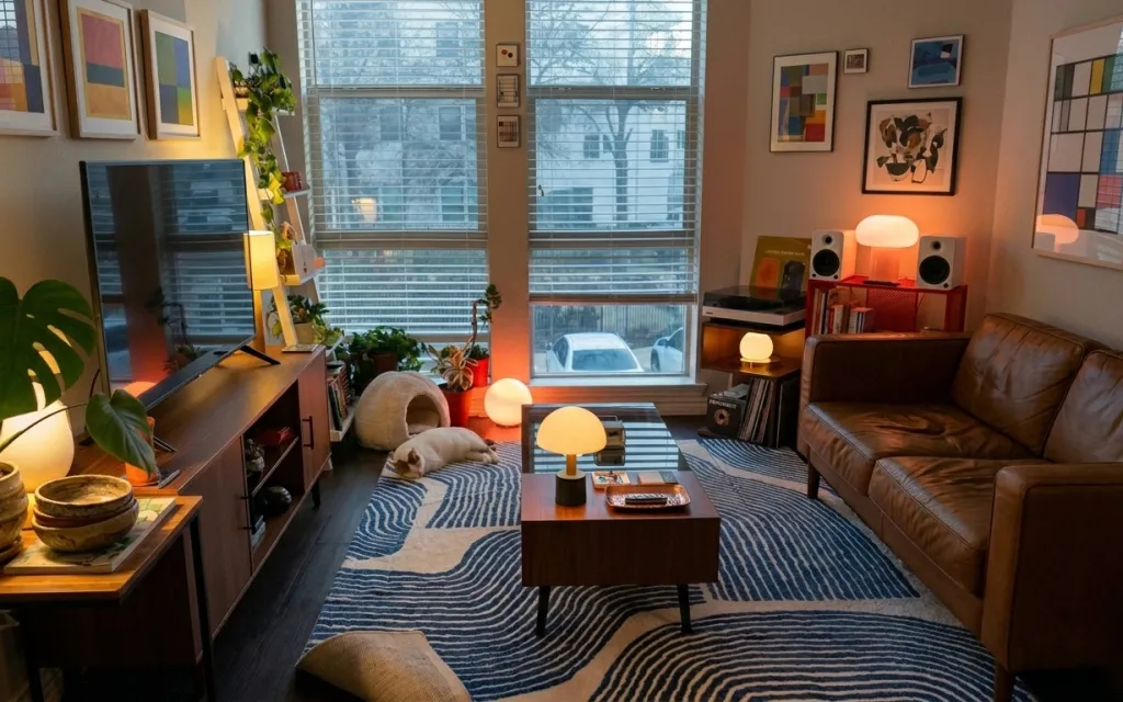
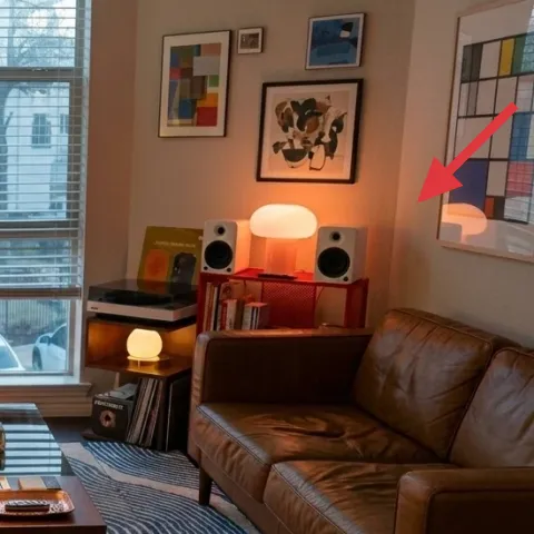
The look starts with one confident anchor: a bold striped area rug that pulls your seating into the same color family. In the photo, the rug’s blue-and-cream pattern sits under a dark wood coffee table, plus a warm white-shade lamp that softens everything in the evening. The console styling mixes wood, woven texture, and greenery—like the monstera’s big leaves against the terracotta pot. This is achievable for renters because the biggest visual moves are plug-in lighting, replaceable decor, and textiles that don’t need landlord permission.
I used to overthink wall decor first, then wonder why the room still felt flat. In this setup, the warmth comes from light height (lamp glow) and the tactile stuff you can touch—woven baskets, a tray for everyday clutter, and a dense rug underfoot. Once the pattern has a home and the light has a location, the framed art can be louder without competing.
Layer 1 — striped area rug (8×10 look) ($200) Pattern for grounding
A striped area rug is doing most of the work here: it repeats the blue from the room and creates a clear “zone” under the coffee table and sofa. Go for a medium-scale stripe (not pinstripe thin) so it reads from across the room, and choose cream + blue so the palette stays warm, not icy. This rug size choice matters—too small and the pattern looks like a throw blanket, not a base. The trade-off is you’ll be committing to vacuuming regularly, but that’s also how you keep the look sharp with foot traffic.
Choose a rug with bolder stripes than you think you need
If the stripes are subtle, the coffee table reads heavier and the whole setup feels “stuck,” not anchored.
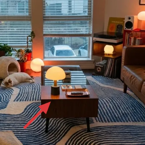
Layer 2 — dark wood coffee table ($70) A low contrast base
The dark wood coffee table gives you a practical surface while balancing the brightness of the rug. Its rectangular footprint keeps the seating area tidy, and the slightly warm tone connects to the console and the lamp base instead of fighting them. If you go the obvious route—matching everything to the sofa—you lose contrast and the room stops looking intentional. Picking a simpler, darker tabletop is an easier win for renters because it’s freestanding and easy to swap later. The only downside: a darker finish shows dust faster, so wipe it as part of your weekly rhythm.
Keep the tabletop clutter contained
One tray (added in the next layer) helps the table read styled instead of crowded.
Layer 3 — plug-in table lamp with white shade ($35) Warm light at the right height
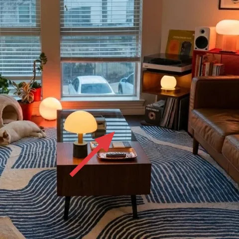
This plug-in lamp is the reason the room feels soft, not flat. A white shade spreads light without casting a harsh edge, and the warm bulb tone makes the blue stripes look richer. The placement matters: centered near the coffee table means your eyes get a warm “pause” in the middle of the seating area, especially after dark. The alternative would be relying on overhead lighting, but that tends to bleach out the rug pattern and make everything feel colder. Trade-off: lamp styling depends on keeping the shade dust-free—quick wipe, big difference.
Pick a warm bulb over a bright white one
Warm light is what keeps blue from turning gray in photos and in real life.
Layer 4 — monstera plant in terracotta pot ($25) Green volume without renovation

The monstera adds scale and a natural color counterweight to all the geometry—rug stripes, framed rectangles, and the coffee table’s clean lines. A terracotta pot also brings that clay warmth that shows up in the woven baskets and wood surfaces. If you go with a tiny plant, you’ll get cuteness but not presence; the room needs leaves that can be seen from the sofa. Choosing a floor-friendly potted plant is renter-safe because it’s portable and doesn’t require changing anything on the walls. The only care commitment is rotating the pot occasionally so the leaves grow evenly toward the window.
Skip decorative rocks that trap moisture
For terracotta pots, let excess water drain—otherwise you’ll end up with sad leaves instead of a lush silhouette.
Layer 5 — botanical-style framed print (DIY hand-painted abstract on cardstock) ($35) Color on the wall, lease-safe
That framed botanical-style print anchors the right side and gives your eye something “designed” to land on, without needing to refinish anything. The renter-friendly move is to replace the look with a DIY frame using cardstock and paint: it hits the same color-pop function, but you aren’t stuck with a high-priced print. Avoid copying a perfect botanical illustration if that’s not your thing—abstract shapes with green and warm earth tones read botanical from a distance. Trade-off: cardstock is lighter than a heavy print, so use a sturdy frame and don’t over-stress the corners when hanging.
Make it instead of buying it
This DIY hand-painted abstract on cardstock recreates the framed botanical color story for less than the price of a store print.
Materials
- Cardstock (thick) — 1 sheet — craft store — $6
- Acrylic paint set (assorted greens + warm tones) — 1 small set — craft store — $12
- Small picture frame (fits your print) — 1 — thrift or craft store — $10
Steps
- Sketch a loose layout on cardstock with pencil: 2–3 big “leaf” shapes and one warm block.
- Lightly wash the background with a thin green mix, keeping it airy.
- Paint layered leaf shapes with thicker acrylic so they look dimensional.
- Add warm accents (terra or soft rust) in small rectangles or curves for that photo-like contrast.
- Let the paint dry fully until no cool sheen remains.
- Erase visible pencil lines once dry (gentle rub).
- Trim the cardstock to fit inside your chosen frame opening.
- Insert into the frame and close it carefully.
- Use removable hanging hardware (like Command-style picture mounting) so it comes down cleanly.
Total DIY cost: $28 — saves about $7 over buying.
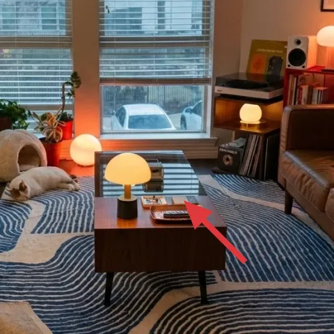
Layer 6 — decorative tray on coffee table ($20) Make the surface look intentional
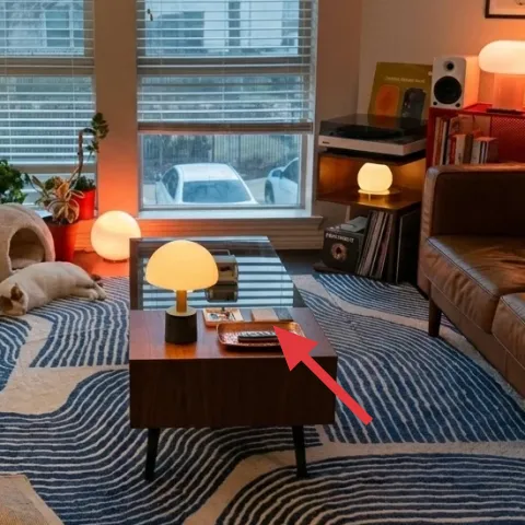
A tray is the easiest way to make a coffee table look styled even when daily life happens. In the photo, the tray keeps small items corralled, so the table reads as one composition instead of scattered objects. Choose a tray with a warm material (wood, lacquered wood, or a dark neutral) so it plays well with the rug’s cream and the lamp’s white shade. The obvious alternative is letting everything live loose on the tabletop, but that quickly turns the look into “in progress.” The trade-off is you’ll have to decide what always belongs in the tray and what gets stored away.
Use the tray to edit, not just organize
One stack of small books and a single small object keeps the composition calm.
Layer 7 — woven baskets on console ($20) Texture that reads from across the room
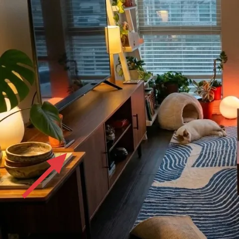
Woven baskets add texture that connects the wood console, the terracotta plant pot, and the softness of the rug. They’re also functional: a place for extra blankets, remotes, or random everyday items so the console stays visually calm. The reason to pick baskets over extra decor is that the texture does the styling job while also solving clutter. If you choose a single basket, the look can feel too light; using a couple of sizes reads more collected and intentional. Trade-off: baskets need occasional fluffing and a quick shake to keep them looking crisp.
Mix one flat basket with one round or dome-shaped one
That shape contrast mirrors the rug stripes and keeps the console from looking uniform.
The cost, layer by layer
| Layer | Item | Cost |
|---|---|---|
| 1 | Striped area rug (5×7–8×10 look) | $200 |
| 2 | Dark wood coffee table | $70 |
| 3 | Plug-in table lamp with white shade | $35 |
| 4 | Monstera plant in terracotta pot (4–6 ft look) | $25 |
| 5 | Botanical framed print made DIY with hand-painted cardstock (retail-equivalent) | $35 |
| 6 | Decorative tray for coffee table styling | $20 |
| 7 | Woven baskets for console storage | $20 |
| Total | $405 | |
If the budget has to shrink, prioritize the rug and lamp first, then go smaller on the plant and tray. A thrifted tray and one basket can carry the texture theme while you save for a larger piece later.
What worked, what didn't (across the whole room)
The strongest choices are the ones that change how the space functions: the rug defines the seating area, the lamp shifts the mood at night, and the tray keeps the coffee table from drifting into clutter. The wall art works best when it’s in the same color family as the greenery and the warm wood tones, so the whole right side feels cohesive.
What worked
- The striped rug visually groups the sofa and coffee table into one seating zone.
- The warm white-shade lamp makes blue feel deeper instead of gray.
- Terracotta and woven textures keep the palette earthy even with lots of window light.
- A dark coffee table adds contrast without needing heavy decor.
- The framed art gives the room a designed focal point on the right wall.
What didn't
- Skipping a tray on the coffee table makes everyday items look too scattered.
- Small plants can disappear next to framed prints and a patterned rug.
- Choosing a cool-white bulb can flatten the rug’s contrast.
- Using only one basket can leave the console feeling unfinished.
What we'd skip if we did it again
Skip buying extra decor before the rug is in place. Without that patterned anchor, it’s hard to judge whether framed art and lamp color will feel coordinated or random.
Skip matching every wood tone to the sofa. Instead, mix one darker piece (like the coffee table) with lighter accents so the room has depth and doesn’t look monochrome.
Skip cold lighting experiments. If warm bulbs aren’t available, wait—because the blue palette only looks as rich as the photo when the lamp light is warm.
Frequently asked
How long does this renter-friendly refresh take?
Most of the time goes to rug placement and styling. If the framed art DIY is on your list, plan about 2–3 hours for the painting and a little extra for drying and framing. Shopping is the swing factor—if you already have a tray and basic supplies, the rest is mostly plug-in lighting and swap-in decor.
Can this look work in a smaller living room?
Yes—go smaller on the rug size first, but keep the pattern bold enough to read as a base layer. A compact coffee table or even a narrower side table can replace the center table while still letting the lamp provide warm light. Framed art should be scaled so it doesn’t overpower the window wall.
What if my lease doesn’t allow any wall mounting?
You can still keep everything renter-safe. Use removable mounting options that leave minimal residue, or lean into the framed-art look by displaying a framed print on a console or shelf. The lamp, rug, plant, and tray are the core visual anchors and can carry the styling even without wall changes.
Where should I shop to keep the budget around $400?
For this palette, start with a rug from a place with good return policies (so you can get the size right), then thrift the coffee table or lamp if you can. The easiest budget levers are plants and baskets—look for mid-season sales and clearance terracotta pots.
What’s the biggest mistake people make with a patterned rug?
They buy a rug that’s either too small or too subtle. Too small breaks the seating zone, and too subtle turns the stripes into background noise. The goal is for the rug to feel like the floor’s “design,” then everything else—table, light, and wall art—echoes it.
Can I swap the plant for something else?
Definitely. If a monstera doesn’t fit your care tolerance, pick a plant with big, readable leaves so it still adds scale. A fiddle-leaf-style plant or a small tree-form can work, as long as it comes in a warm pot (terracotta or a similar clay tone) to match the woven textures.
More in Living Room

How to make a living room seating area feel styled for under $400
A renter-friendly living room seating area refresh that leans into warm lamp light, layered texture, and blue-and-cream patterning—all move…
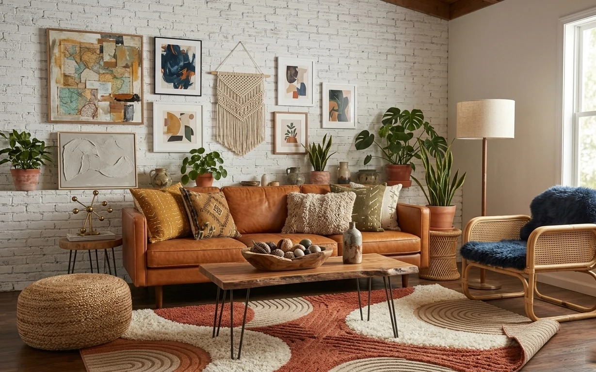
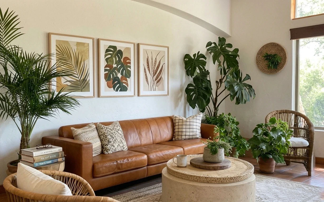
What $700 buys: a terracotta boho living room renter refresh
A terracotta-and-cream boho living room refresh with no-drill upgrades: rug, lamp, plants, and renter-friendly wall art. Includes a macramé…
7 no-drill swaps for a leather-sofa lounge, up to $600
A leather-sofa lounge can look finished fast with small, move-friendly swaps. This $600 refresh focuses on rug texture, botanical wall art,…