
- Best for
- Earthy-neutrals living room updates with no-ceiling-change lighting
- Cost
- About $625 for the layered look (under $700 cap)
- Difficulty
- Easy (rug + lighting decisions, DIY art is the only handwork)
- Time
- A weekend for buying and styling; DIY art adds 1–2 extra hours
Why olive-and-rust palette is the living room of 2026
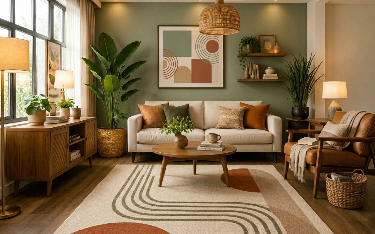
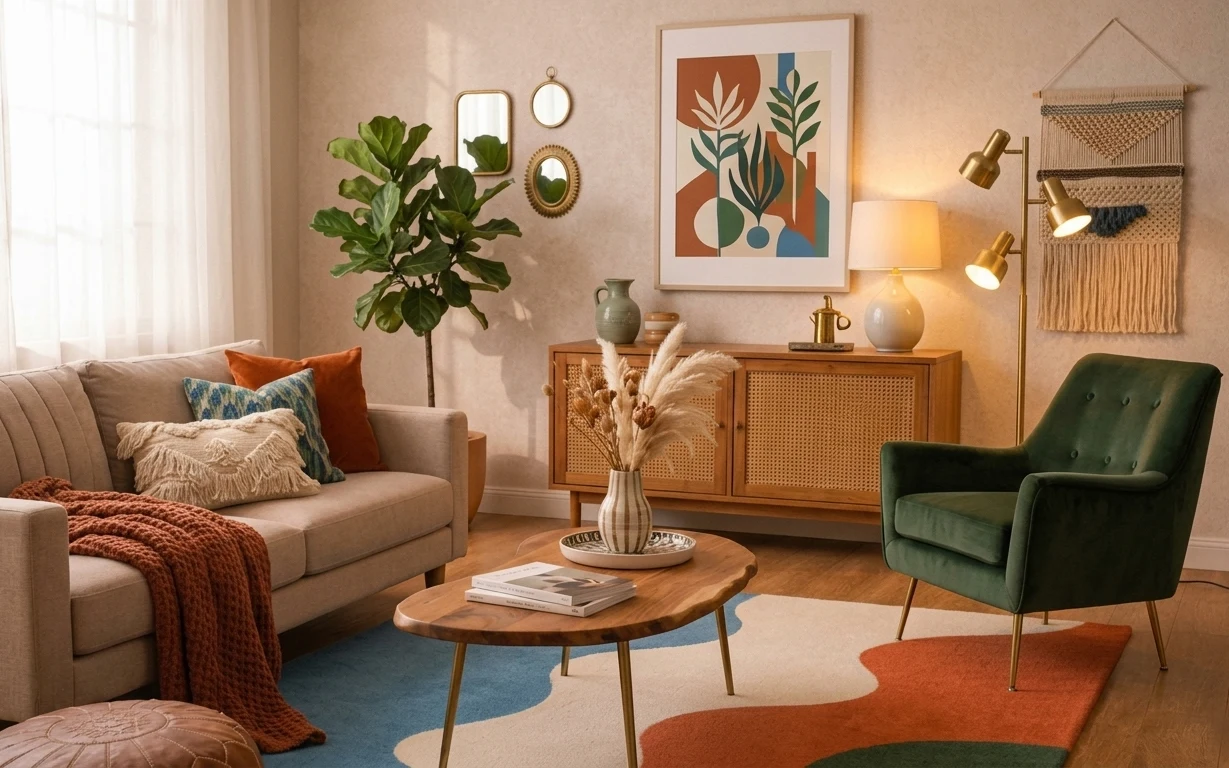
There’s a reason this layout feels pulled-together even with real texture everywhere: the colors repeat in three places—on the rug, in the sofa pillows, and in the framed art. The cream upholstery and the warm wood coffee table give everything a calm base, while the green painted wall makes the greens on the rug look intentional instead of random. I’m also noticing the material mix: woven lamp shade, smooth ceramic vases, and that soft, matte rug pile. It’s achievable on a renter budget because the “big visual moves” are all items you can take with you.
I’ve made the mistake of adding one “statement” item and stopping there—usually a rug first, then nothing else repeats the palette. In this setup, the repeat matters: the lamps echo the warm undertone, and the framed print sits at eye level so the wall doesn’t feel unfinished. The other thing I caught myself doing was going too matchy with pillows; here, the tones share the same family but still vary in texture, which keeps the room from looking flat. That’s the whole trick.
Layer 1 — area rug (beige base with green and terracotta stripes) ($200) Defines the whole palette by grounding the floor
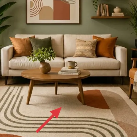
The rug is the anchor here: a light beige field with curved green stripes and a few terracotta hits. That pattern is what lets the rest of the room stay neutral without looking bare—your eyes have a path to follow from the coffee table to the sofa. For renters, choosing a rug with enough contrast to read from across the room is better than going “almost the same as the floor.” The trade-off is size: you’ll want to size it so it sits under at least the front legs of the sofa, not just in the center. This one does the heavy lifting for color and shape.
Match undertones, not exact colors
Try to keep the rug’s green-leaning tone and the pillows’ green within the same warmth level, so they feel related.
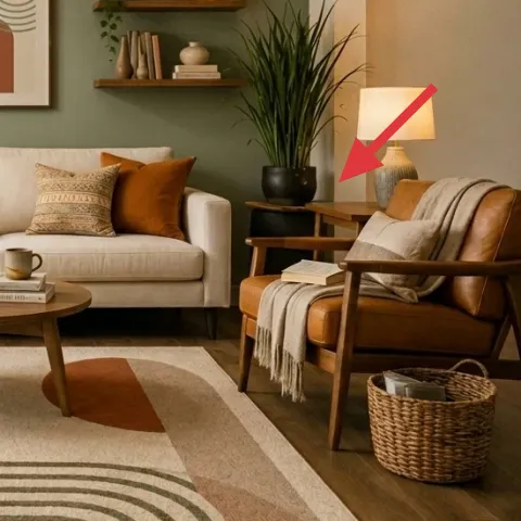
Layer 2 — floor lamp with white drum shade (left) ($60) Adds warm, no-ceiling-change light
That left floor lamp gives the room a soft, warm wash without needing any hardwired changes. The white drum shade keeps the light from turning harsh against the green wall, and the height brings brightness upward—exactly where a dark wall can swallow contrast. A plug-in floor lamp is also renter-proof: pack it up at move-out and you’re not asking permission. The trade-off is bulb choice: an LED that’s too cool will make the rug stripes look gray instead of earthy. Aim for warm white to keep the whole palette leaning golden.
Why a drum shade matters
Drum shades spread light in a wider circle, so the sofa area looks even instead of spotlighted.
Layer 3 — table lamp with white drum shade (right) ($60) Completes the warm “two-source” lighting setup
The right table lamp balances the floor lamp so the seating area feels lit from both sides. That matters with a busy rug pattern: when the lighting is lopsided, the stripes can look busier than they are. The white shade again is doing quiet work—softening shadows and keeping the green wall from feeling too saturated at night. As a swap, a plug-in table lamp is simpler than replacing fixtures, and it’s easy to reposition as your furniture shifts. The trade-off is counter placement: choose a stable surface so the shade sits at a comfortable, readable height near the armchair.
Let lamp light repeat the rug’s warmth
If the room feels too cool, change only the bulb temperature before you buy more decor.
Layer 4 — framed abstract wall art print (above sofa) ($80) Pulls the eye to a calm focal point
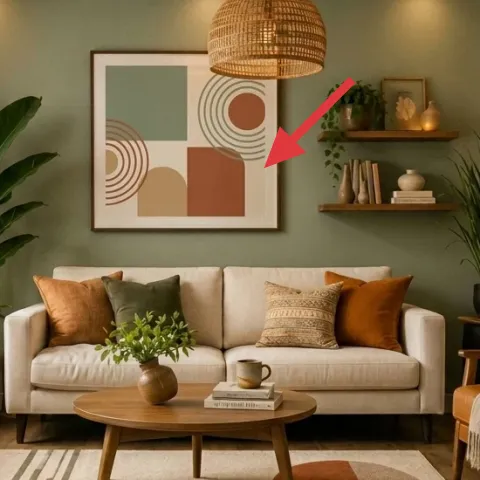
Make it instead of buying it
DIY a hand-painted abstract on cardstock so the wall art matches the rug’s green and terracotta tones without committing to a pricey framed print.
Materials
- Cardstock, 8.5×11 in (or thicker) — 1 sheet — art store — $12
- Acrylic craft paints (green + terracotta + warm beige/cream) — small set — craft store — $10
- Frame (to fit the finished card) — 1 — discount home store — $18
Steps
- Lightly sketch 2–3 curved shapes and blocks with pencil so the composition has a center.
- Paint the background warm beige, then let it dry fully.
- Add layered curves in green, using a small brush for crisp lines.
- Paint one terracotta element smaller than you think it should be (it reads better from across the room).
- Touch up edges and wait until everything dries completely.
- Seal with a clear acrylic medium if you want extra durability (optional, quick-dry).
- Insert the finished cardstock into the frame and close the back.
- Hang using picture-rail hooks or a renter-safe hanging method, then step back to confirm alignment above the sofa.
Total DIY cost: $40 — saves about $40 over buying.
In this room, the framed abstract print is the calm middle: it echoes the rug’s curves and repeats the same green/terracotta story, but it does it in fewer shapes so the wall stays restful. The frame also gives a “designed” finish even when the rest of the styling is casual—pillows, plants, and warm wood furniture. The alternative is to skip wall art or go with something random-sized, which often makes the wall feel unfinished or too busy. DIY lets you match the palette without hunting for the exact print, and you can store it between leases.
Don’t match every color 1:1
Pick one dominant green and one smaller terracotta accent; too many close matches make the wall look noisy.
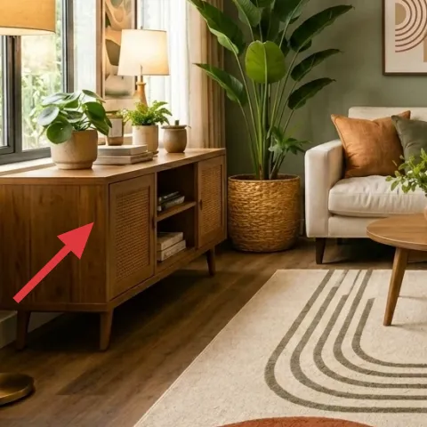
Layer 5 — wood sideboard/cabinet (left) ($150) Creates a styling platform for plants and warm objects
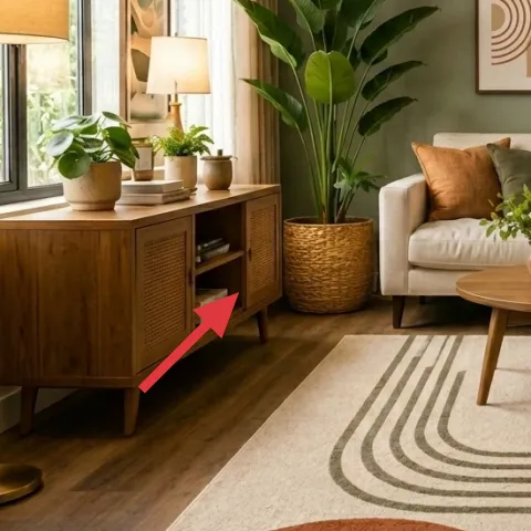
The left sideboard/cabinet is what turns “plants by a window” into a scene. It gives the room a horizontal anchor at mid-height, which balances the tall sofa and the wide green wall. The wood tone also plays nicely with the coffee table and lamp bases—so the warm undertone feels consistent rather than accidental. If you skip a storage surface, you’ll end up with plants and decor scattered on the floor, and that’s where small rental rooms can look cluttered fast. The trade-off is practical storage: keep it mostly visible with a few baskets or books so it stays airy. You’re buying function plus visual rhythm.
Style in threes
A plant, a small object, and a taller book stack keeps the cabinet from looking like a random drop zone.
Layer 6 — wood shelf styling cluster (right shelf) ($25) Adds texture without committing to a bigger piece
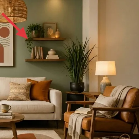
The right shelf works because it’s not packed: it holds small ceramics, a couple of stacked books, and a touch of greenery, all spaced so the wall can breathe. That’s why a shelf styling layer is cheaper than swapping big furniture—you get the “collected” look with small items and a clear edit. A common mistake is adding too many objects at once; then the shelf becomes a second rug pattern, which competes with the seating area. The trade-off here is intentionally leaving negative space so the green wall doesn’t turn busy. If you’re renting, treat the shelf styling as removable: baskets, books, and small vases come with you.
Keep one matte, one ceramic, one organic
Matte books, ceramic vases, and leafy stems create variation even when colors repeat.
Layer 7 — large potted leafy plant (tall, black pot by sofa right) ($50) Brings vertical life and softens hard lines
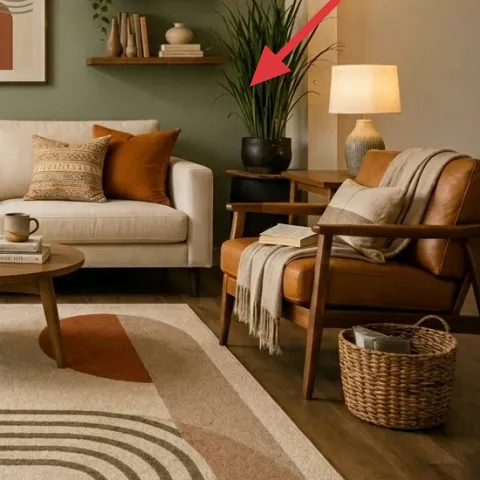
The tall plant by the sofa right adds vertical contrast to the smooth surfaces—cream upholstery, the light wood table, and the clean lines of the armchair. It also helps the rug pattern feel grounded: the stripes are horizontal, while the plant’s leaves read as upward movement. That makes the room feel fuller without needing another large piece of furniture. The trade-off is placement: too close to the seating edge, and the leaves become a clutter blocker; too far away, and the plant looks disconnected. This one sits near the armchair zone, so it visually “joins” the seating and frames the coffee table area.
Watch light and leaf hydration
If the plant is too far from the window, it will look tired fast—rot it weekly so it stays even.
The cost, layer by layer
| Layer | Item | Cost |
|---|---|---|
| 1 | Area rug (8×10) with curved stripe pattern | $200 |
| 2 | Plug-in floor lamp with white drum shade | $60 |
| 3 | Plug-in table lamp with white drum shade | $60 |
| 4 | Framed abstract wall art print (DIY ~$40 materials) | $80 |
| 5 | Wood sideboard/cabinet for plant-and-decor styling | $150 |
| 6 | Shelf styling set (small ceramics, books, greenery cluster) | $25 |
| 7 | Tall indoor plant in black pot | $50 |
| Total | $625 | |
A cheaper variant is to keep the rug, lamps, and a single plant, then swap the sideboard for a slimmer console or use open shelving you can move. Even cutting the cabinet spend by half usually preserves the look because lighting and rug scale do most of the work.
What worked, what didn't (across the whole room)
The best part of this refresh is how the palette repeats without duplicating exactly—rug pattern, pillows, and abstract art all agree on the greens and warm terracotta. Lighting also does real work: two warm lamps keep the green wall from reading harsh after dark. The one weak spot would be over-styling: shelves and counters can easily drift into “collected” chaos if object spacing disappears.
What worked
- The patterned rug adds shape to a neutral sofa area and makes the green wall feel intentional.
- Two warm lamp sources reduce dark corners near the armchair and keep shadows soft.
- The abstract print echoes the rug’s curves, so the wall feels like part of the floor pattern.
- The sideboard gives the plants a stable staging area, preventing visual clutter around the windows.
- Vertical plants add balance against the horizontal stripe motif underfoot.
- Textured pillow choices keep the cream upholstery from looking flat.
What didn't
- Trying to match pillow colors exactly can look too coordinated and less lived-in.
- If the lamps run cool-white, the rug’s greens read gray instead of earthy.
- A heavily packed shelf competes with the rug pattern and makes the wall feel busy.
- Placing the tall plant too close to the seating creates a “block” instead of framing.
- Buying a rug that’s too small turns the pattern into a detail instead of an anchor.
What we'd skip if we did it again
Skip adding a third lighting source right away. This room already wins with two warm, plug-in lamps at different heights; a third can flatten the contrast and make the wall look darker instead of richer.
Skip buying a second statement pattern to “fill” empty wall space. The abstract print already connects to the rug’s curves, so adding another busy graphic usually turns the room into visual overload.
Skip overbuying matchy decor sets for the sideboard and shelf. Fewer objects, spaced with negative space, read more intentional—and they’re easier to pack up when the lease ends.
Frequently asked
Is this style renter-friendly if I can’t drill or replace fixtures?
Yes—most of the “look” comes from movable items: a patterned rug, plug-in lamps, framed art that can be rehung, and freestanding furniture. The tall plant and shelf styling are also easy to take with you. The only thing to plan carefully is hanging the framed print: use a renter-safe method like picture-rail hooks or Command strips where appropriate for your frame weight.
How long does a refresh like this usually take?
If you already have a few basics, plan for a weekend. Shopping and delivery can be the slow part, while the hands-on portion is mostly styling: placing the rug, positioning lamps, and arranging plants and books. The DIY art is the only project with steps; if the paint and card dry quickly, it’s usually 1–2 hours total plus framing and hanging time.
What if my living room is smaller than this one?
Go smaller in width but keep the same idea: anchor the seating with a rug that reaches under the front sofa legs, then choose one large focal art piece rather than multiple smaller frames. For lamps, keep both sources but reduce height differences—shorter lamp bases still work. Plants should be tall enough to create vertical balance, but not so big that they block pathways.
What if my room is larger or has higher ceilings?
Use the same palette, but scale the rug and wall art up so they can hold their own against the negative space. Consider a wider framed print or a slightly larger rug so the pattern reads from the seating area. For lighting, keep two sources, but aim for brighter warm bulbs so the green wall stays rich instead of dim.
Where should I shop for the key pieces without overpaying?
For rugs, look for 8×10 options at home stores with frequent coupon codes or for well-reviewed vintage-style runners that match the stripe mood. Plug-in lamps are often cheapest at big-box home retailers or local thrift for the base plus a replacement shade. For the framed abstract, DIY cardstock paint plus an inexpensive frame is a cost-efficient route.
What’s the biggest mistake people make with this kind of earthy look?
The most common miss is going too matchy or too random. If everything is the same green tone, the room looks flat; if everything is a different shade of green, it looks accidental. The fix is simple: repeat one dominant green and one warm terracotta accent, then vary textures through pillows, lamp shades, and plant leaves.
More in Living Room
Earthy, renter-friendly living room plan for $700
Warm earthy-neutrals come to life in a renter-friendly living room refresh. With a $700 plan and no-drill swaps, the rug, lamps, and layere…
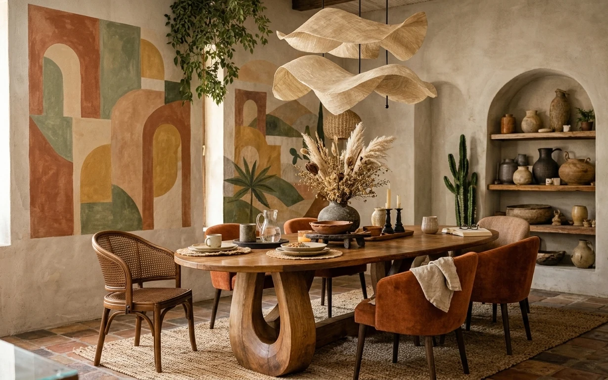
How to build an earthy dining corner for under $500
A renter-friendly way to get an earthy, boho dining corner look using 7 no-drill swaps, including a patterned rug, framed abstract art, and…
6 no-drill swaps for a sage-and-rust coffee table zone, $600
A sage-and-rust coffee table zone, styled for shared housing and easy moves. This $600 refresh leans boho-modern with an abstract rug, warm…