- Best for
- Color + wall polish
- Cost
- $610 total
- Difficulty
- Confident DIY
- Renter-safe
- Weekend-friendly
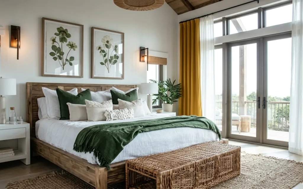
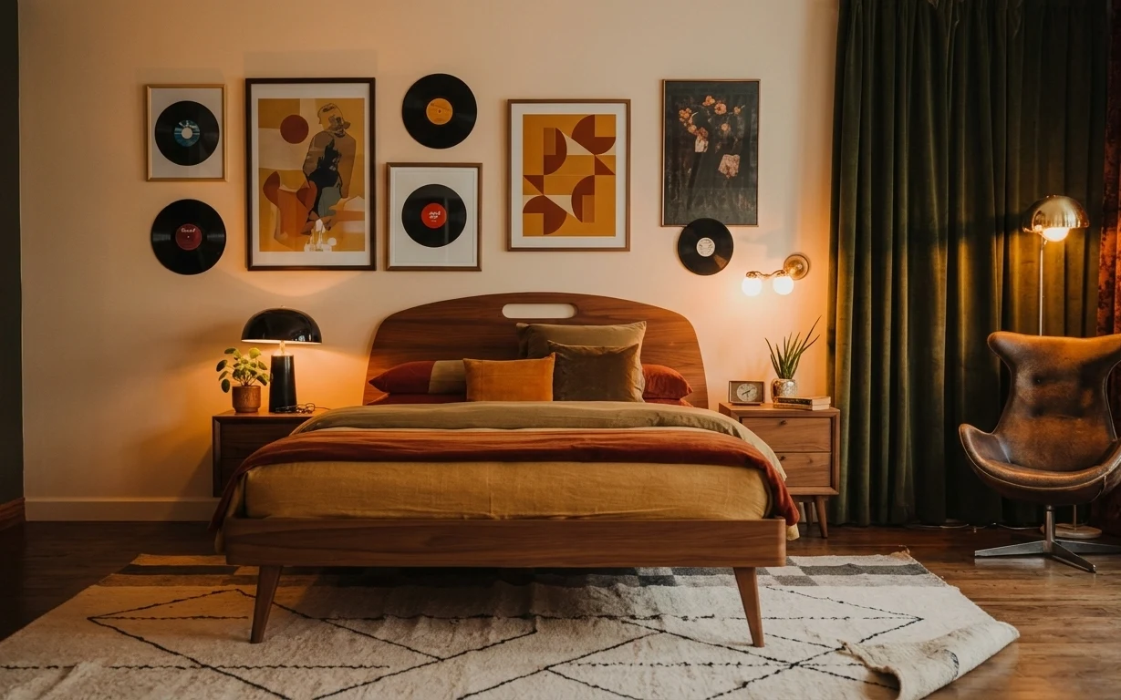
Why mustard-and-emerald styling is the bedroom of 2026
The fastest way to make a bedroom feel finished is to repeat a couple of strong color choices in fabric, wall art, and lighting—then let the neutrals do the quiet work. In this setup, the mustard curtains, deep green throw blanket, and botanical prints all show up within the same visual “family,” even against white sheets and a warm wood headboard. The textures matter too: woven rug fibers, the curtain’s heavier drape, and the matte wall-sconce shade keep everything from feeling flat. For homeowners, it’s a satisfying weekend mix because you can pick impact over maximum reversibility.
I used to treat curtains as a last step—like, “whatever’s on sale” until the rest was done. This time, I noticed how the curtain weight changes the whole room: mustard reads richer when it’s hung with real fullness, and the sheers soften the edges around the windows. The other mistake I caught myself making is overmatching everything. The winning choice here is not perfect sameness; it’s two repeated cues (mustard + green) with room for white and wood to breathe.
Layer 1 — Woven area rug ($180) anchors the bed’s footprint
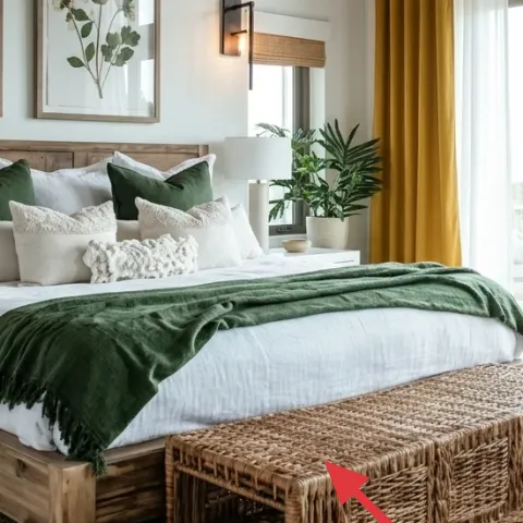
A woven area rug under the bed is doing more than adding softness—it defines the bedroom’s shape so the bed doesn’t feel like it’s floating above the floor. This one reads warm and textural, with a slightly uneven, handmade-looking weave that pairs naturally with the light wood bed frame and the pale walls. The deep neutral tone also lets the mustard curtains and deep green accents stay bold without getting louder. The trade-off: rugs take longer to vacuum properly than a smooth carpet, but the payoff is that every piece around it starts to look coordinated.
Rug size check before checkout
Pick a 5×7 if your bed sits against a wall; aim for the rug edges to land under (or just beyond) the front legs so it frames the whole zone.
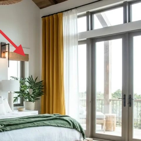
Layer 2 — Mustard yellow curtain panels ($80) adds height and warmth
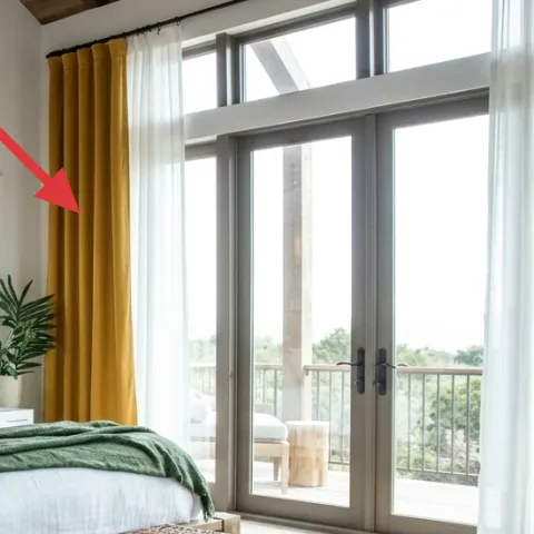
Mustard yellow curtain panels bring the room’s warm tone right at eye level—especially near a bright window bank where color usually gets washed out. In the photo, the heavier drape creates clean vertical lines, and the mustard reads richer next to the sheer white curtains. Hanging curtains with fuller gathers also makes the window feel taller and more intentional than blinds alone. The trade-off is maintenance: heavier fabric shows dust more than sheer-only setups. Still, swapping to a matching pair (with the right length) is one of the quickest ways to make a bedroom look styled.
Let sheers stay airy
Keeping sheer panels in the mix helps the mustard keep its glow in daylight instead of turning flat or dark.
Layer 3 — Framed botanical print (left) ($80) ties the wall to the bedding palette
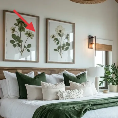
This left botanical print repeats the same botanical shapes as the right frame, but it’s the frame color that matters for tying the wall to the warm wood bed and nightstand. The leaves are mostly muted greens and soft creams, which makes them play nicely with the deep green throw pillows instead of competing. Rather than swapping the artwork entirely, a paint refresh on the frame is a practical way to get a tighter match to your wood tones. The trade-off: you have to prep and let paint dry fully before reinstalling so the frame looks even, not tacky.
Make it instead of buying it
Paint a used or thrifted frame in a warm wood-tone finish so the left botanical print matches the bed frame’s color.
Materials
- Interior primer for wood/metal frames — 1 can — Home improvement store — $12
- Warm neutral paint (satin) — 1 pint — Home improvement store — $8
- Fine-grit sandpaper (220–320) — 1 pack — hardware store — $6
- Painter’s tape — 1 roll — hardware store — $4
- Clear matte topcoat — 1 can — hardware store — $10
Steps
- Remove the frame from the art and pull out the print if it’s easy to do without tearing corners.
- Sand the frame lightly to scuff the surface for better paint grip.
- Wipe off dust with a tack cloth or a damp microfiber cloth and let it fully dry.
- Apply a thin primer coat, using light strokes around edges.
- Let primer dry completely (follow the can’s dry time) before sanding with a very light pass.
- Paint on 1–2 thin coats of warm neutral satin, allowing full dry between coats.
- Lightly sand any raised spots with fine sandpaper for a smooth, even look.
- Seal with a clear matte topcoat, then let it cure fully before handling.
- Reinsert the print, remount, and step back to confirm the frame reads warm next to your wood furniture.
Total DIY cost: $40 — saves about $40 over buying.
Layer 4 — Framed botanical print (right) ($80) keeps the wall from feeling random
Two matching botanical frames do the heavy lifting of making the wall look composed instead of “a couple things we liked.” The right frame sits slightly differently in height, which helps the wall feel lived-in rather than symmetrical. Because the art colors are soft—mostly green and off-white—it supports the deep green bedding without taking over from the curtains. If you go with two pieces, keep their frames in the same finish so your eye reads one design decision. The trade-off is choosing placement carefully: if one frame is too high or too low, the wall instantly looks accidental.
Match frame finish, not necessarily print size
To keep the wall cohesive, prioritize the frame tone and spacing over getting identical print dimensions.
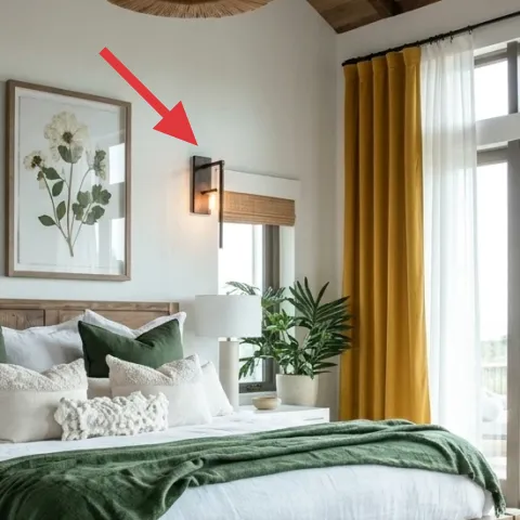
Layer 5 — Wall sconce with rectangular shade ($120) gives warm light at eye level
A wall sconce is what turns a bright bedroom into an evening one—because it adds light without crowding the surfaces. In the photo, the rectangular shade style creates a crisp, architectural line that works with the clean bedding and the straight window framing. The glow also pairs well with warm wood tones, so the headboard and nightstand don’t feel cold after dark. The trade-off is placement: sconces need correct height so they land visually beside the bed, not above it. Once it’s right, it’s a huge mood upgrade compared with relying only on one table lamp.
Don’t mount too low
If the sconce sits near shoulder height, it can feel harsh; aim for a comfortable viewing position from the bed.
Layer 6 — Small potted indoor plant on nightstand ($40) adds life near the bed
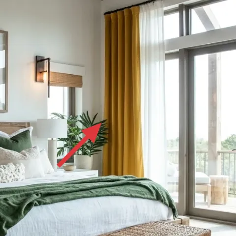
A small potted indoor plant on the nightstand adds an organic shape that softens the right angles from the headboard and window mullions. In this room, the plant’s deep green leaves also echo the throw pillows, which means the greenery looks intentional instead of “extra.” It’s a smart place for it because the plant sits right in the natural sightline when you’re lying down, so it reads as part of the bed zone. The trade-off: plants need consistent light and occasional dusting on the leaves, especially near large windows.
Choose leaves, not just the pot
A fuller top growth reads better at nightstand height than a plant with sparse leaves.
Layer 7 — Deep green throw pillow covers ($30) ties bedding to the accents
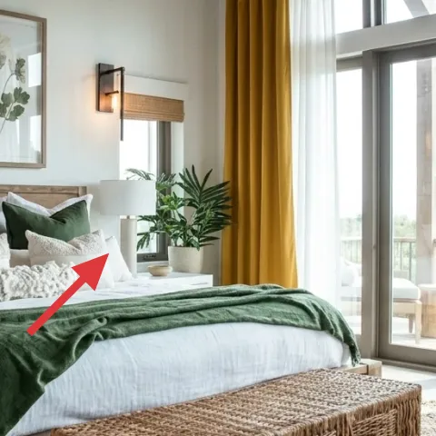
Deep green throw pillow covers are the quickest way to repeat your accent color without committing to a large furniture purchase. Here, the green pillows sit on top of white bedding, so they frame the headboard area and make the mustard curtains feel connected rather than separate. Using pillow covers (instead of swapping the whole comforter) is a practical choice for homeowners who want high visual impact with low risk. The trade-off is that deep colors show lint and hair more than off-whites, so plan on regular spot care. This is also where you can keep experimenting—add one or two new covers and the room updates fast.
Stick to one green shade family
Keep the green in the pillows and throw related (similar undertones) so the room looks curated, not mixed.
The cost, layer by layer
| Layer | Item | Cost |
|---|---|---|
| 1 | Area rug (5×7 woven, neutral tone) | $180 |
| 2 | Curtain panel pair (84") in mustard | $80 |
| 3 | Framed botanical print (left) (DIY frame paint version) | $80 |
| 4 | Framed botanical print (right) | $80 |
| 5 | Wall sconce with rectangular shade | $120 |
| 6 | Small potted indoor plant (4–6 ft class) | $40 |
| 7 | Deep green throw pillow covers (pair) | $30 |
| Total | $610 | |
If you want a cheaper version, go one step simpler: choose a budget woven rug in a similar neutral tone, and swap to faux-silk or cotton-blend curtain panels that keep the mustard color rich. For art, hunt a set of matching botanical prints at the same frame width—then keep one warm frame finish consistent.
What worked, what didn't (across the whole room)
The overall look works because the color story repeats in fabric (mustard), bedding (deep green), and art (botanical greens). The sconce adds nighttime light that feels deliberate, not just practical. The only area that needs careful tuning is spacing—especially with two frames and full curtains.
What worked
- The woven rug defines the bed zone and makes the floor feel softer underfoot.
- Mustard curtains add warmth and vertical height, especially against the bright window glass.
- Botanical prints keep the green accent from looking random next to white bedding.
- Wall sconces give comfortable light without eating nightstand space.
- Deep green pillow covers tie the throw and plant together visually.
- A small plant adds organic movement near the bed’s sightline.
What didn't
- If curtains aren’t hung high enough, the window bank looks shorter and less styled.
- Artwork alignment matters—one frame out of level makes the wall feel “temporary.”
- Deep green accents can show lint; without spot care, they look less crisp.
- Rugs that are too small let the bed float; the footprint needs proper coverage.
- If the sconce sits too low, the shade can feel harsher when you’re lying down.
What we'd skip if we did it again
Skip buying a matching “bedroom set” where everything is from the same line. The fastest way to get this look is repeating a color story—mustard plus deep green—across separate pieces, not copying one manufacturer’s aesthetic.
Skip cheap wall décor frames that arrive with uneven finishes. Even if the print is right, the frame color is what ties the botanical art to warm wood, so paying a bit (or DIY-painting one frame finish) is worth it.
Skip hanging curtains only at the window trim level. Going higher and using full panel width keeps the room feeling taller and more polished without needing any renovation.
Frequently asked
How long does this bedroom refresh usually take on a weekend?
For most homeowners, plan on about a day and a half if the hardest part is frame painting and hanging two curtains. Art and plant styling can happen in an hour once the major decisions are made. If you’re also installing a wall sconce, build in extra time for measuring and wiring coordination—layout and alignment matter more than speed here.
What if I rent and can’t keep nail holes in the walls?
Swap the wall sconce and heavier art approach for options that don’t require permanent mounting. Use a plug-in lamp to replace the sconce’s warm glow, and hang the botanical prints with renter-safe methods (depending on your building rules). Curtain rods can often be tension-mounted or installed with existing holes if available.
My room is smaller—how do I scale this look?
Keep the palette, but reduce the visual weight. Choose a rug that still tucks under the bed front legs, then hang curtains slightly wider than the window so the vertical lines remain. For art, keep the frames but increase spacing only enough to avoid cramming. Two frames are still enough—just don’t stack everything at once.
Where should I shop differently to keep the budget under control?
Spend on the items that anchor color and texture: curtains and the rug. Look for botanical prints at art markets, home stores, or secondhand shops where frame finishes vary—then DIY-paint the frame if needed. For lighting, compare sconce styles by shade shape (rectangular reads crisp here) rather than matching the exact brand.
What’s the biggest mistake people make with this kind of bedroom styling?
The biggest miss is buying pieces that don’t repeat the same two cues. If mustard appears only in curtains, but green shows up only in one throw pillow, the room can look like separate purchases. Aim for one repeated warm tone and one repeated accent color across at least three elements.
More in Bedroom

How to refresh a bedroom for under $700 with mustard and emerald
A bedroom refresh that leans on mustard curtains, deep green accents, botanical art, and warm lighting. This weekend project fits a $700 bu…
7 no-drill bedroom swaps for $600
A warm, olive-and-wood bedroom refresh that packs into boxes: update a beige patterned rug, swap in dark velvet curtains, add a bedside lam…
What $800 buys: a warm rust-and-brown cozy bedroom update
A warm rust-and-brown cozy bedroom refresh built for a weekend—$725 in parts, capped at $800. You’ll swap in a statement patterned rug, sha…