- Best for
- Weekend refresh
- Cost
- Under $1,000
- Difficulty
- Weekend DIY
- Time
- About a day for paint + 2 afternoons for styling
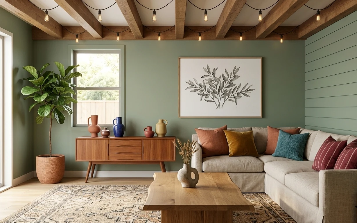
Why sage-and-walnut palette is the living room of 2026
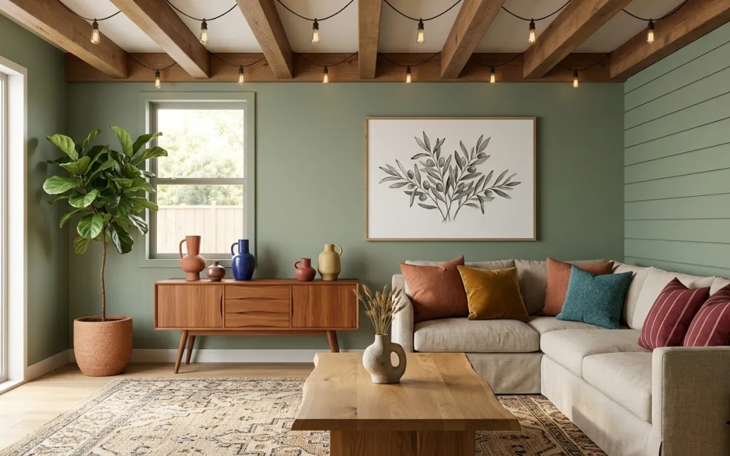
What makes this space feel finished isn’t one expensive piece—it’s the mix of a patterned area rug, a framed botanical print, and warm wood accents that sit against the sage green painted wall. The ceiling wood beams and cream trim keep everything airy, while the gray sofa and layered throw pillows soften the edges. It’s very “mid-century modern meets natural textures,” like the styling you see in Domino and The Selby: one bold color, one graphic print, and the rest in warm neutrals. For homeowners, the biggest win is choosing the high-impact option you can actually afford.
I used to overthink paint and bought “decor first” stuff—then realized the wall color was doing all the heavy lifting. In this room, the sage green makes the walnut tones look richer and makes the botanical art feel intentional instead of random. I also almost picked matchy pillows from one set, but the best part here is that the throw pillows read like a mini color study (rust, mustard, and teal tones) rather than identical cushions.
Layer 1 — Patterned area rug ($200) Defines the seating zone
The patterned area rug anchors the gray sofa and the wood coffee table, so the whole layout feels like it belongs together instead of “furniture in a room.” I’d choose a rug with a similar mix of light neutrals and subtle pattern so it doesn’t fight the framed botanical wall art. The trade-off with patterned rugs is that you’ll want to keep the rest of the room fairly calm—no busy curtains or extra wall prints. In this photo, the rug also hides daily life: paw marks, coffee drips, and the inevitable dusty edge near the sofa.
Pick the rug pile to match your day
If you have pets or lots of foot traffic, a lower pile shows less lint and still looks crisp under natural light.
Layer 2 — Framed botanical wall art ($80) Adds a graphic focal point
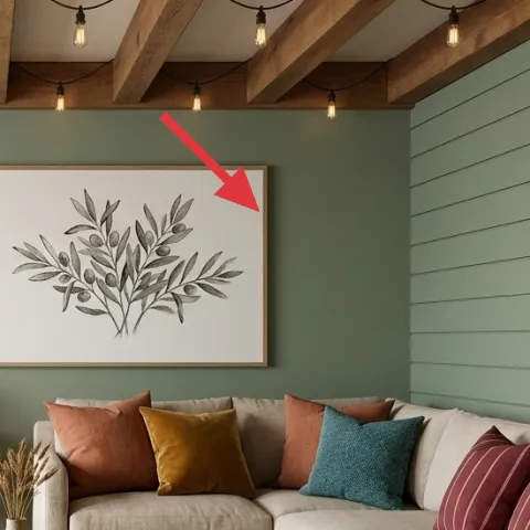
The framed botanical wall art gives the eye somewhere to land above the sofa, and the clean illustration style works with both the wood beams and the mid-century shapes below. This beats swapping in multiple small prints, because one strong piece keeps the wall from looking crowded next to the sage green painted wall. The trade-off is scale: a tiny print under a big ceiling beam reads lost, while this size feels balanced. If your wall is blank right now, this is one of the fastest ways to make the room look “styled” rather than merely furnished.
Keep it centered over the sofa
When the art sits in the middle of the seating area, the rug and coffee table feel like they’re part of the same picture.
Layer 3 — Painted sage green wall ($60) Makes everything look warmer
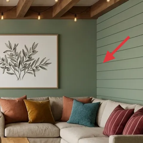
Make it instead of buying it
Paint one accent wall in sage green so the walnut wood tones and framed botanical art look richer without adding new furniture.
Materials
- Paint (1 gallon) — enough for one accent wall — home improvement store — $40
- Painter’s tape — 1 roll — home improvement store — $6
- Roller cover + tray liners — 1 set — home improvement store — $5
- Drop cloth or plastic sheeting — 1 roll — home improvement store — $4
Steps
- Clean the wall so the new color sticks evenly.
- Apply painter’s tape along trim lines and edges.
- Lay down a drop cloth and protect the floor near the baseboards.
- Cut in around corners and window trim with an angled brush.
- Roll the first coat in smooth, overlapping strokes.
- Let the first coat dry completely before checking for thin spots.
- Roll a second coat for full, even coverage.
- Remove tape while the final coat is still slightly touch-dry to avoid peeling.
Total DIY cost: $55 — saves about $5 over buying.
Layer 4 — Woven planter pot ($35) Brings in texture at eye level
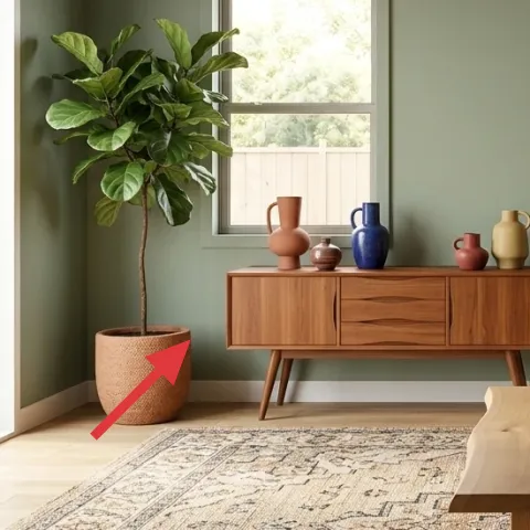
The woven planter pot helps the large leafy potted plant look intentional instead of “left on the floor.” Texture matters here: the woven fiber echoes the natural feel of the wood coffee table and keeps the sage-green wall from looking flat. I’d rather invest in the pot texture than add another small decorative item, because the plant is already a major silhouette. The trade-off is that woven planters can shed lint—so it helps to place a simple liner inside and wipe the rim before styling. This keeps the overall look clean even with a big, leafy plant in the corner.
Let the plant be the color
With a sage wall, keep the pot neutral so the green leaves stay the freshest note.
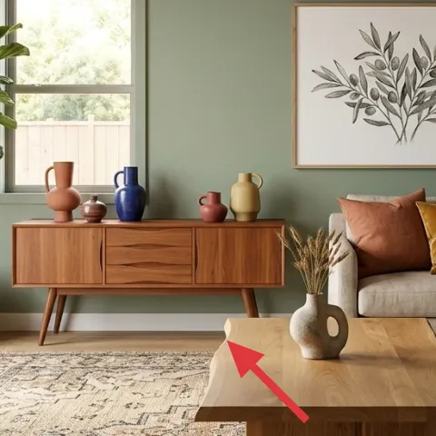
Layer 5 — Wood sideboard cabinet ($250) Adds mid-century storage and warmth
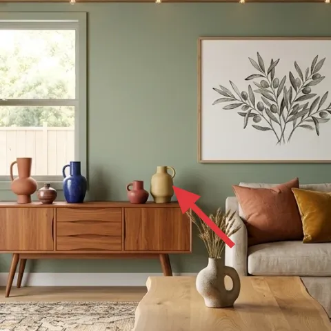
The wood sideboard cabinet gives you a place for everyday styling—ceramic vases, dried grass stems, and small objects—so the room never feels empty. It also bridges the warm wood tones from the coffee table and the ceiling beams, which is why this combo feels cohesive. The obvious alternative is a smaller media console, but that usually means less surface area for the decorative ceramics you can see here. The trade-off with a sideboard is that it occupies more visual weight than a narrow console, so the rug pattern and wall color need to stay calm. That balance is exactly what this room is doing.
Style it with odd-height groups
Cluster ceramics by height—tall vase, medium vase, and one low accent—so the sideboard looks designed from across the room.
Layer 6 — Wood coffee table ($150) Grounds the center of the room
The wood coffee table ties the seating area to the sideboard and keeps the look mid-century instead of overly modern. The warm tone also makes the gray sofa feel less cool, especially in daytime light. I’d choose a flat top with visible wood grain rather than a glossy finish, since matte wood photographs more naturally and hides minor scuffs. The trade-off is maintenance: wood needs a little care to stay looking even. Still, the payoff is worth it because the coffee table is the most-used horizontal surface here, and it’s right in the viewer’s line of sight.
Avoid matching everything exactly
If the coffee table matches the sideboard and ceiling beams too perfectly, the room can look one-note instead of layered.
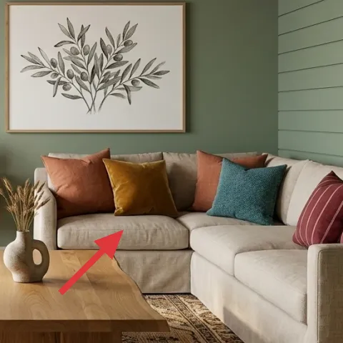
Layer 7 — Throw pillows ($60) Adds color without changing the layout
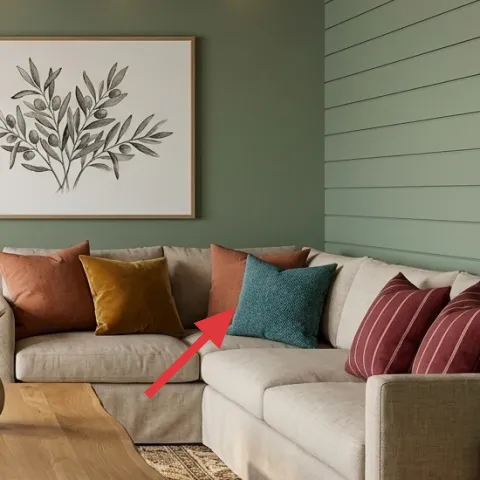
The throw pillows are doing the playful work: rust, mustard, and teal tones pop against the gray sofa and cream rug field. This is the easier path than replacing upholstery, because pillows give you color control without committing to a new couch. The trade-off is that cheaper pillow covers can look wrinkled or flat, so prioritize fabric that holds shape. In this photo, the mix of solid colors and one striped pillow keeps the pattern interesting without competing with the botanical print on the wall. If you’re keeping your sofa, this is one of the fastest, most reversible upgrades.
Use one neutral pillow to calm the set
A cream or taupe pillow in the mix prevents the whole sofa from feeling too loud.
The cost, layer by layer
| Layer | Item | Cost |
|---|---|---|
| 1 | 5×7 patterned area rug | $200 |
| 2 | Framed botanical wall art (16×20-ish) | $80 |
| 3 | Sage green paint for one accent wall | $60 |
| 4 | Woven planter pot (medium) | $35 |
| 5 | Wood sideboard cabinet | $250 |
| 6 | Wood coffee table | $150 |
| 7 | Throw pillow covers (set) | $60 |
| Total | $835 | |
If you want to spend less, downgrade one big item (usually the sideboard or coffee table) and put the budget into the rug and wall color. A simpler framed botanical print and a smaller pillow set still keep the sage-green palette looking intentional.
What worked, what didn't (across the whole room)
The room’s best trick is the combination of one bold wall color, one framed botanical focal piece, and warm wood furniture that repeats across surfaces. Layering the patterned rug and color-forward pillows keeps the gray sofa from feeling flat in daylight. Where it gets shaky is when any one element becomes too busy—then everything stops looking curated and starts looking accidental.
What worked
- The patterned area rug defines the seating zone and hides everyday wear in high-traffic spots.
- The framed botanical wall art adds a single focal point without needing a full wall of prints.
- Sage green paint makes the walnut wood tones feel warmer next to the gray sofa.
- The woven planter pot gives the large leafy plant texture that matches the wood and beams.
- The wood sideboard provides a stable styling surface for vases and dried stems.
- Colorful throw pillows bring rust, mustard, and teal tones without replacing upholstery.
What didn't
- Skipping a neutral pillow in the mix can make the sofa look overly saturated.
- Choosing a glossy coffee table finish can reflect light and flatten the wood tone.
- Adding too many small wall pieces would compete with the framed botanical print.
- A busy rug pattern paired with extra prints can make the wall and furniture feel crowded.
- Relying on the plant alone for texture can leave the room feeling a bit one-dimensional.
What we'd skip if we did it again
Skip replacing the sofa first. Gray upholstery is already a great neutral base for sage green and warm wood, and throwing effort into a new couch usually delays the real high-impact choices like paint and the rug.
Skip adding a gallery wall if the framed botanical print already feels centered. One larger botanical image is easier to align with the ceiling beams and keeps the wall from competing with patterned textiles.
Skip matching every wood tone exactly across furniture. Keeping the coffee table, sideboard, and ceiling beams in the same “warm family” but not identical in shade adds depth—especially in bright daylight.
Frequently asked
How long does this living room refresh take?
Plan for about a day for painting prep and two full coats of paint, plus drying time between coats. Shopping and styling are the second chunk: one afternoon for the rug and pillows, and another for centering the framed botanical wall art and arranging the ceramics on the wood sideboard. If everything already matches your layout, it can feel “done” in a weekend.
What if I rent and can’t repaint the sage wall?
This plan is homeowner-friendly, but you can get a similar feel with peel-and-stick wallpaper on one wall (if your lease allows) or a temporary removable paint roller technique isn’t a safe option. A runner-up is leaning harder on the patterned area rug and framed botanical wall art, then using throw pillows to echo the sage green tones.
My living room is smaller—should the rug and art scale change?
Yes. In smaller rooms, choose an area rug that still sits under the front legs of the sofa, even if you reduce it from the 5×7 vibe. For wall art, keep the framed botanical piece proportionate to the sofa width—large enough to read from across the room, but not so oversized it crowds the ceiling beams. Pillows can stay bold; just reduce the total count.
Where should I shop for the mid-century wood sideboard look on a budget?
Start with local marketplace listings for the wood sideboard cabinet and coffee table, then filter for solid wood grain and mid-century legs. For the rug and framed botanical wall art, big-box options often have good selection in the exact neutral-and-pattern range. Woven planter pots and throw pillow covers are easiest to mix-and-match without committing to one retailer.
What’s the biggest mistake people make with this kind of palette?
Overloading the room with too many patterns at once. The rug is patterned, the wall art is graphic, and the pillows add color—so the rest should be calmer. If the sideboard vases become cluttered, or you add extra prints around the botanical frame, the sage green backdrop stops feeling intentional and starts feeling busy.
Can I do this refresh in phases?
Absolutely. Phase one can be the rug and pillows, because they change how the seating area feels right away. Phase two is the framed botanical wall art and the wood sideboard styling. Phase three is the sage green paint accent wall—often the easiest to justify once you see which pieces you truly like against the new color.
More in Living Room
Under $1000: sage-and-walnut living room refresh with 7 layers
A sage-green-and-walnut living room refresh that looks intentional (not spendy). This weekend-friendly plan uses 7 visible upgrades—rug, fr…
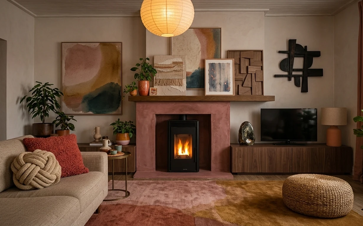
Under $600: warm clay-and-olive fireplace living room refresh
A warm clay-and-olive fireplace living room refresh with 7 move-friendly swaps, all packable for shared housing. The total lands under $600…
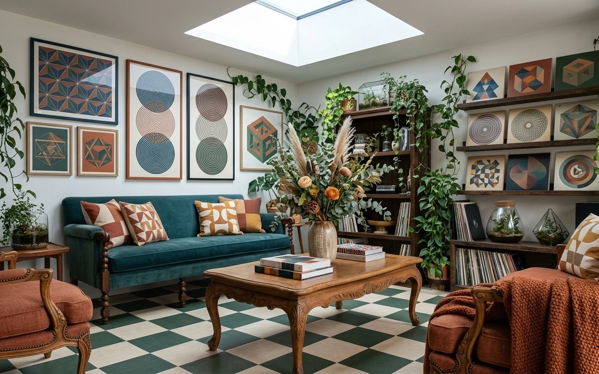
Under $400: teal-and-rust renter living room refresh with 7 layers
A bright, boho-leaning living room gets a coordinated look without drilling or permission. This renter-friendly refresh uses 7 swaps (inclu…