- Best for
- Weekend living room refresh
- Total cost
- $890 (under $1000 plan)
- Renter-safe
- Yes (swap in reversible options as needed)
- Time
- 2–3 weekends
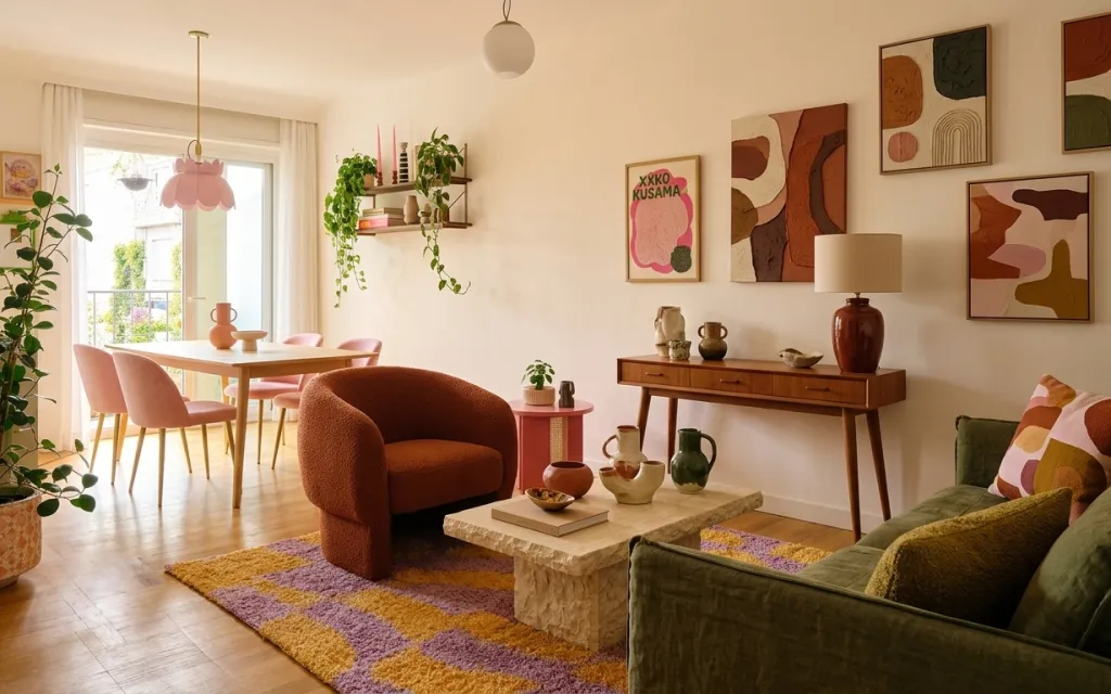
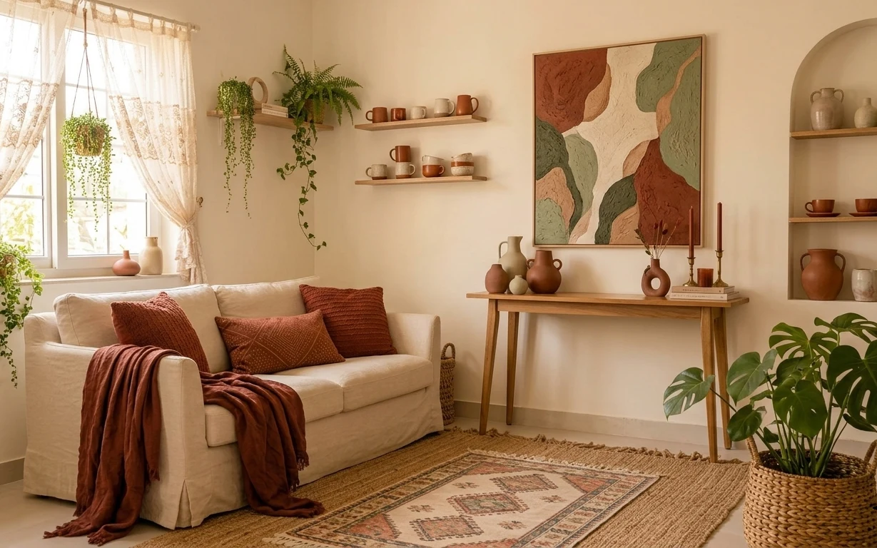
Why terracotta-and-olive pattern is the living room seating area of 2026
The room already has that inviting mix of olive upholstery and terracotta ceramics, so the refresh is mostly about dialing in texture and rhythm. Start at the floor with the patterned area rug, then frame the window with soft beige curtains that make daylight feel intentional. On top, a pink pendant repeats the terracotta mood from the ceramics without turning the space into one-note warm neutrals. The final step is wall styling: framed abstract prints and floating shelves bring a gallery feel without needing a full renovation.
I used to overthink “matching” and try to buy the whole set at once—curtains, art, and accessories in the same exact shade. This time, I chased contrast instead: warm terracotta next to deep olive, and matte ceramics next to the glossy pendant glass. That’s the mistake I corrected here—letting imperfect tones work together by sharing one color family.
Layer 1 — patterned area rug ($200) grounds the sofa-and-chair zone
This patterned area rug sits under the brown arched armchair and the front edge of the green sofa, so it visually “holds” the seating area together. The warm mustard-and-purple pattern adds movement that plain carpet can’t, and the rug’s texture helps hide everyday scuffs better than a flat weave. If you went with a solid neutral instead, the room would still be calm, but it would lose the playful focal point that keeps the space from feeling staged. The trade-off with a bold rug is you’ll want fewer competing patterns on cushions and the curtains—so the rest stays simple.
Anchor the seating by lining up one rug edge with the front of the sofa
That small alignment makes the whole room feel planned, even when everything else is eclectic.
Layer 2 — beige curtain panels ($80) softens the window and boosts daylight
These beige curtain panels frame the tall window and add that easy, airy “finished” look that still reads warm in the daytime. Because the fabric is light and the color is close to the wall tone, the curtains don’t block light—they diffuse it. I’d pick this over thicker blackout curtains because the room already has lots of warm ceramics and a patterned rug; going too heavy would make the space feel smaller. The trade-off is you’ll need to live with a bit of visibility at night, unless you add blinds behind the curtains.
Sheers aren’t required—lightweight beige is the key
Even if the panels aren’t fully sheer, choosing a light neutral keeps the window from becoming a hard rectangle.
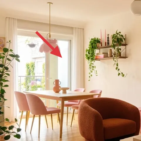
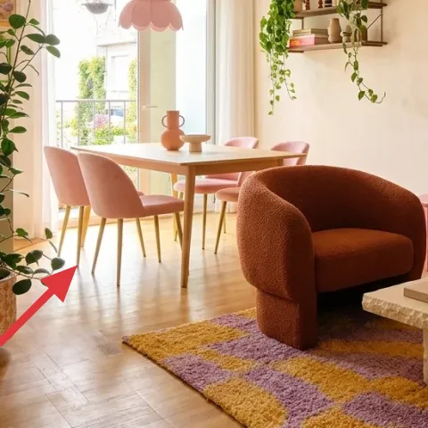
Layer 3 — pink pendant light ($120) repeats terracotta in a softer way
The pink pendant light hangs over the dining area, and it’s the one lighting decision in this setup that clearly “speaks” in color. That hue ties back to the terracotta ceramics without matching them exactly, which is what keeps the room from looking like a single themed shopping cart. Choosing a plain white or clear glass pendant would be safer, but it would also erase the cheerful accent the room already has. The trade-off with a colored pendant: it looks best when the rest of the room stays mostly in warm neutrals and greens.
Don’t let pendant size fight the ceiling height
If a pendant hangs too low, you’ll feel it every time you pass the dining table.
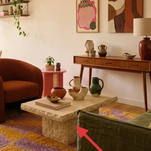
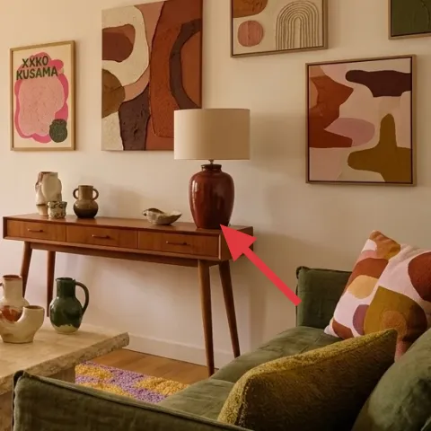
Layer 4 — walnut sideboard console ($300) gives you a stylish staging surface
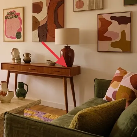
The walnut sideboard console is doing heavy lifting here: it provides horizontal space for ceramics, a place for small-height styling, and storage that keeps counters from turning into a clutter catch-all. Its warm wood tone works with the terracotta and matches the mid-century energy of the dining table area. If you replaced it with a lighter, less textured piece, the room might feel brighter but it would lose warmth and depth. The trade-off is practical—wood surfaces show dust and fingerprints more than flat painted finishes, so quick wipe-downs matter.
Style by height: vase, small jar, then books or ceramics
Three heights is enough to look curated without turning the surface into a showroom.
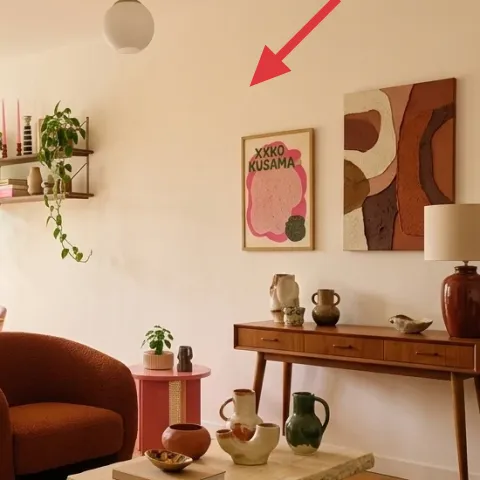
Layer 5 — framed abstract print ($80) adds an “intentional gallery” moment
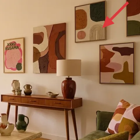
One framed abstract print pulls focus on the wall above and beside the seating zone, and the layered shapes echo the room’s mix of organic plants and curved furniture. I like this choice over a single landscape because abstract art tolerates color variety—olive upholstery, terracotta pottery, and the patterned rug can all sit nearby without everything needing to match perfectly. The trade-off is that you need to pick a frame color that won’t fight the wood tones; a warm wood or neutral frame keeps it coherent.
Make it instead of buying it
DIY a simple abstract print (painted shapes on cardstock) and swap it into an existing frame so you get the same wall “gallery” effect for less.
Materials
- Cardstock or heavyweight paper — 1 pad — craft store — $6
- Acrylic paint set — small set — craft store — $15
- Stencil or painter’s tape (for crisp edges) — 1 roll/pack — hardware store — $10
- Fine paintbrush set — 3–5 brushes — craft store — $12
- Clear acrylic sealer (matte) — 1 small can — craft store — $7
Steps
- Sketch 3–5 abstract shapes lightly with pencil so the composition feels balanced.
- Tape off edges (or use a stencil) and paint the first flat-color layer.
- Let the first paint layer dry completely (about 30–45 minutes).
- Apply a second color layer using smaller brush strokes to add variation.
- Let the second layer dry completely again (about 30–45 minutes).
- Peel tape, then add small marks or lines for contrast.
- Let the paint fully dry before sealing (about 1 hour).
- Spray a light coat of matte sealer, then let it cure until fully dry (about 2–3 hours).
Total DIY cost: $50 — saves about $30 over buying.
Layer 6 — large leafy floor plant in a terracotta pot ($80) brings movement and softness
The large leafy floor plant in a terracotta pot sits near the left edge and adds the most natural texture in the room—big leaves, soft shadows, and a grounded color that matches the ceramics. This is an easy win because it doesn’t require coordination like artwork often does; plants naturally look “designed” once you give them space to spread. Swapping to a smaller plant would work, but it would read more decorative than architectural, and it wouldn’t fill the corner’s visual weight. The trade-off is maintenance: big plants want consistent watering, and rotating them helps keep the shape even.
Keep the pot color, not the exact plant species
Terracotta supports the palette even if you choose a different leafy plant.
Layer 7 — ceramic vase on sideboard ($30) makes the styling feel lived-in
This ceramic vase on the sideboard works because it’s the right “in-between” piece: not too tall, not too small, and textured enough to play well with smooth wood. The color sits right in the terracotta family, so it echoes the pendant and rug warmth without demanding a full match. If you used only glossy objects, the shelf would feel more formal; matte ceramics add quiet depth. The trade-off is you’ll want a few pieces, not one—style looks better when the vase has companions (a small jar, a book stack, or a tray) so it feels intentional rather than accidental.
Use a tray to corral small ceramic pieces
A tray keeps the sideboard from becoming a dust magnet and makes rearranging easy.
The cost, layer by layer
| Layer | Item | Cost |
|---|---|---|
| 1 | Patterned area rug 5×7 | $200 |
| 2 | Beige curtain panel pair (84") | $80 |
| 3 | Pink glass pendant light | $120 |
| 4 | Walnut sideboard console (medium) | $300 |
| 5 | Framed abstract print (DIY ~$50 in materials) | $80 |
| 6 | Large indoor plant in terracotta pot (4–6 ft) | $80 |
| 7 | Ceramic vase (medium) | $30 |
| Total | $890 | |
If the budget needs to breathe, the easiest swap is to downsize the rug pattern (or buy a smaller 5×7) and start with one framed print instead of building out multiple pieces at once. The pendant can also wait if the dining area already has usable light.
What worked, what didn't (across the whole room)
The strongest wins came from stacking texture: a bold rug underfoot, light beige curtains framing the window, and ceramics across the walnut sideboard. The warm olive color reads calm instead of heavy because the lighting is soft and the wall art includes organic shapes that match the plants. My only miss was going a little too “matchy” with terracotta on the tabletop at first—once more green and one cooler print shape were added, the room felt more balanced.
What worked
- The rug pattern visually connects the armchair and sofa into one seating conversation.
- Beige curtain panels keep daylight feeling bright instead of blocked by heavier drapery.
- The pink pendant repeats the terracotta palette without making the whole room red-orange.
- The walnut console provides the right wood warmth for mid-century and boho styling.
- Framed abstract art brings structure to the wall while staying forgiving with color variety.
- The terracotta pot plant adds shadow and organic movement where the eye naturally rests.
What didn't
- One overly similar terracotta shade looked flat until a second green accent was added.
- A too-small plant would have made the left corner feel empty next to the window.
- Too many small wall frames at once can read busy against a mostly white wall.
- Heavy curtains would have compressed the room and dulled the light in the daytime.
- Using only tall decor on the sideboard made the shelf look top-heavy.
What we'd skip if we did it again
Skip replacing big furniture first. A patterned rug, curtain panels, and one framed print DIY can get you most of the “new room” feeling without the headache of moving and re-measuring everything.
Skip matching every accessory exactly. This setup works because terracotta, olive, and purple share a family vibe, but each item has its own shape and finish—ceramic matte, glass light, and fabric texture.
Skip going too dark with window treatments. If the curtains read heavy, the room loses the airy balance that makes the plants and ceramics feel friendly instead of cluttered.
Frequently asked
How long does this living room refresh usually take?
For homeowners working at a relaxed pace, plan for about 2–3 weekends. Textile updates (curtain panels and rug) are fast, and styling the sideboard with ceramics is usually a single afternoon. The DIY framed art print is the wildcard—mostly because you’ll want paint to dry and the sealer to cure before handling.
What if I’m renting—can I still copy this look?
You can keep the overall palette and layering, but swap anything permanent. For wall art and shelves, use removable hanging options if your landlord prefers it, and choose a tension rod for curtains. The rug and pillow styling are fully renter-friendly, and colored pendant swaps can be avoided by sticking with your existing fixture and adding accent lighting elsewhere.
My living room is smaller—should I scale anything down?
Yes: use the same color family, but reduce “visual weight.” A slightly smaller rug can still anchor the seating area—just keep it centered under the chair/Sofa edge. For wall art, consider one larger framed abstract print instead of multiple small frames. Plants can also be slightly shorter as long as the leaves still reach above sofa height.
What if my room is larger—how do I keep it from feeling sparse?
Add repeaters. Keep one bold patterned rug, then add another layer of visual rhythm with a second framed print or a larger plant. On the sideboard, increase height variation (vase + jar + book stack) so the surface reads balanced. Curtains can also be extended wider than the window so the ceiling-to-floor effect holds.
Where should I shop if I want the mid-century/boho look on a budget?
Start with secondhand for the console and any furniture accents, then use online retailers for rugs and curtain panels. For wall art, search for abstract prints and framed sets that match the terracotta/olive palette. Pendant lighting can be a splurge moment—buy one strong piece—while ceramic styling can come from small, affordable decor finds.
What’s the biggest mistake people make with this type of room?
The most common mistake is buying every color item at once and forcing them to match exactly. This room works because colors relate, not because they’re identical—olive upholstery sits next to terracotta ceramics and a purple/yellow patterned rug. Another big pitfall: skipping scale, especially with plants and rug size.
More in Living Room

Under $1000: terracotta-and-olive living room refresh with 7 layers
A warm, mid-century–leaning living room refresh built from 7 budget-friendly layers—patterned rug, beige curtains, a pink pendant, and cura…
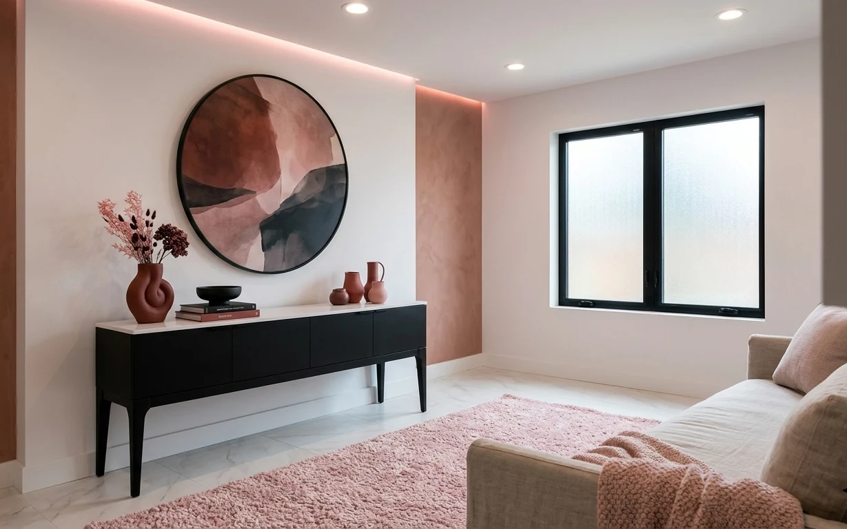
Under $500: sofa-and-console corner refresh with earthy pink accents
A renter-friendly living-room refresh built around a pink textured rug, black-framed oval art, and console styling. This look lands under $…
Under $800: earthy living room sofa corner refresh with 7 layers
A bright, earthy living room sofa corner refresh you can finish in a weekend. This $800 plan leans into cream upholstery, terracotta accent…