
- Best for
- textiles + console styling
- Cost
- about $440 total
- Difficulty
- easy (mostly styling)
- Time
- 1 afternoon
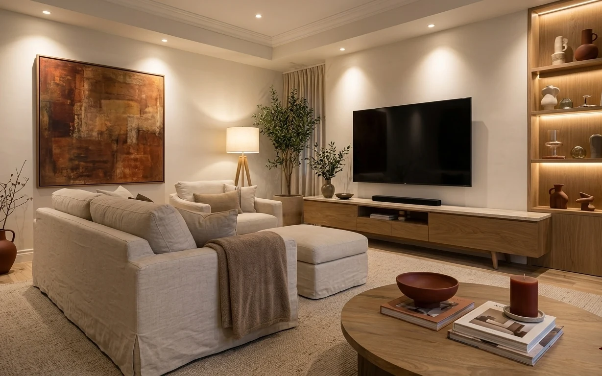
Why earthy pink accents are the sofa-and-console corner of 2026
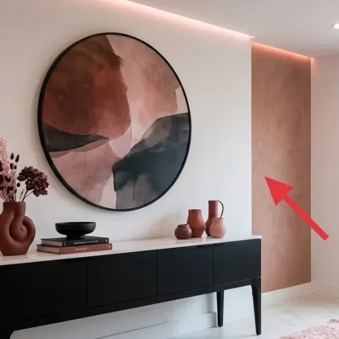
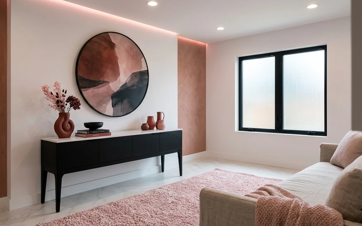
What I love here is the contrast: a soft, textured pink rug anchors the room, while the black-framed oval wall art keeps everything graphic. The console styling leans into matte ceramics—terra-cotta pitchers and a sculptural vase—so the palette stays grounded. If you’re thinking “pink rug” sounds too loud, look again: the rest of the scene is mostly beige and black with clean surfaces, so the rug reads intentional, not accidental. I first saw this type of contrast in a Scandinavian furniture spread, and it’s the same formula: one bold textile, then calm objects with warm, natural textures.
I used to overdo it with decor—if a room had one main color, I’d start adding matching knickknacks until it felt fussy. This time, I’m stealing the restraint from the console: two or three ceramic pieces max, plus something with height (the dried stems) and something flat (the books). That’s the difference between “a few thoughtful things” and “a pile of stuff.”
Layer 1 — pink textured area rug ($200) Soft texture that hides foot traffic
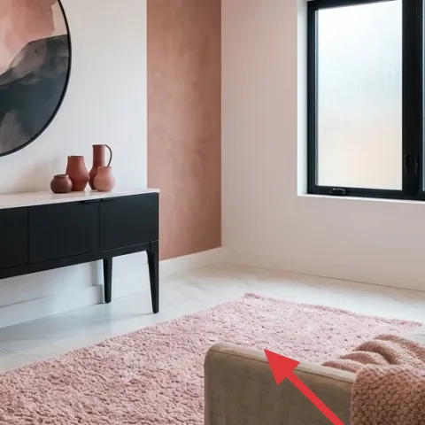
This pink textured area rug is the anchor because it brings tactile warmth to an otherwise minimal, light-beige backdrop. Pick a rug with visible pile or a boucle-like texture so it doesn’t read flat against the smooth floor. The trade-off with a high-pile pink rug: it will show lint faster than a low-pile neutral, so plan on a routine vacuum pass. The reason this works in a renter setup is simple—swap the rug when you move, and the color story can follow you to the next place. In the photo, the rug also provides a soft buffer under the sofa edge, so the whole corner feels intentional.
Anchor with texture, not pattern
When the rest of the room is mostly solids, a textured rug gives depth without competing with wall art or console objects.
Layer 2 — large oval wall art print with a black frame ($80) One graphic shape for the wall
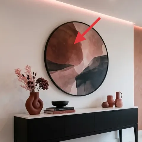
The large oval wall art print gives you a strong silhouette with black framing, which is what keeps this corner from becoming too sweet from the pink rug alone. Use an oval print (or mirror-style frame) so the shape repeats the soft curves in the console ceramics and the vase neck. The trade-off here is that black frames can look heavy if the surrounding wall is very dark—so keep the print size big enough to read as the focal point and let the wall stay light. If you try the obvious alternative (a small rectangular print), it usually ends up feeling like it’s “hanging there,” not belonging. The oval scale in the photo is what makes the console feel curated.
Match the frame color to console hardware
Black on the wall art echoes black details so the corner reads like one design decision, not separate purchases.
Layer 3 — beige knit throw blanket ($30) Adds warmth without changing your layout
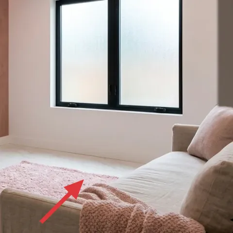
This beige knit throw blanket works because it’s visually quiet—neutral, light in tone, and chunky enough to show texture. Drape it over the sofa cushion so it creates an organic edge where the rug meets the seating area. The trade-off is that a knit can catch on pets or snag if you have rough handling, so choose a knit with a tighter weave if that’s a concern. The obvious alternative would be a patterned throw, but in this palette the pattern would fight with the pink rug’s texture and the wall art’s graphic shape. Keeping the throw solid beige preserves the earthy-neutrals direction and lets the ceramics stay the color accent.
Skip glossy fabrics with pink
If the throw has a shiny finish, it tends to reflect light oddly and can make the rug look more saturated than intended.
Layer 4 — terracotta vase with dried stems (DIY foraged stems) ($45) Height that makes the console feel styled

Make it instead of buying it
This replaces a purchased dried-stems arrangement by building your own foraged dried floral look in a terracotta vase, using locally gathered stems and simple tying tools.
Materials
- Dried stems bundle — 1 small bundle — craft / florist supply — $12
- Terracotta vase — 1 — thrift / home goods — $15
- Floral tape — 1 roll — craft store — $3
- Twine — 1 spool — craft store — $2
- Kraft paper wrap — 1 sheet pack — craft store — $5
Steps
- Gather and sort stems by length; trim only at the very end so the top stays airy.
- Bundle stems in groups of 2–4 by height, then wrap the base tightly with twine.
- Reinforce the base using floral tape for a sturdier “cluster” shape.
- Test the height in the terracotta vase, then adjust by removing or shortening the bottom stems.
- Lay the cluster into the vase and secure with a small additional twist of twine if needed.
- Wrap extra stems in kraft paper and store them so you can swap the look again later.
Total DIY cost: $37 — saves about $8 over buying.
If you want the dried-stems moment without paying for a ready-made bundle, DIY-ing the arrangement is the sweet spot: it creates height and movement while staying true to the photo’s warm terracotta. In the hero, the stems lean outward from a sculptural vase, which is what makes the console feel less “flat.” The trade-off is messiness—stems can shed a little at first—so keep a small tray or paper nearby while arranging. Once it’s set, the look is stable for weeks and packs up easily with the rest of your decor. It’s the kind of styling that reads intentional, even when it’s just a handful of gathered shapes.
Keep stems uneven, not symmetrical
A slight lean and staggered heights make the arrangement look collected, not constructed.
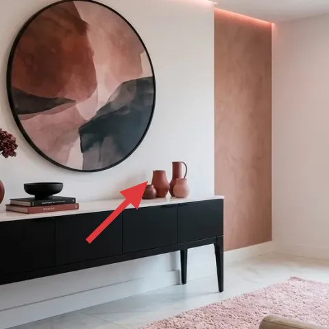
Layer 5 — small terracotta pitchers and vases ($40) Matte warmth on the console top
These small terracotta pitchers and vases add the warm color note that keeps the corner from feeling like just “pink + black.” Aim for matte ceramics rather than glossy ones; matte surfaces blend better with textured textiles and don’t glare under daylight. The trade-off is that tiny pieces can look fussy if you over-cluster them, so stick to a tight grouping and keep negative space around them. If the obvious alternative is a single large vase, the console can end up looking sparse and flat. The photo’s set works because the pieces vary slightly in height and silhouette, creating a small rhythm on the console without turning into a cluttered shelf.
Use height variation in mini form
Even a 1–2 inch difference between pieces adds dimension when viewed from standing height.
Layer 6 — book stack on the console ($20) Keeps styling grounded and layered
The book stack is doing more than filling space—it creates a flat “platform” for the ceramics and helps the arrangement sit at the right visual height. Choose books with neutral spines or muted covers so they don’t compete with the pink rug. The trade-off: if you select bright, high-contrast titles, they’ll steal attention from the wall art and throw off the earthy balance. If you skip this and place ceramics directly on the console, the top can read a little random, because the eye needs a reference point. In the photo, the books also soften the look of the console drawers by adding a visual pause.
Flip one book backward
That one small change gives you color variation without adding a full third palette.
Layer 7 — decorative black bowl or tray on the console ($25) A dark “landing” for small objects
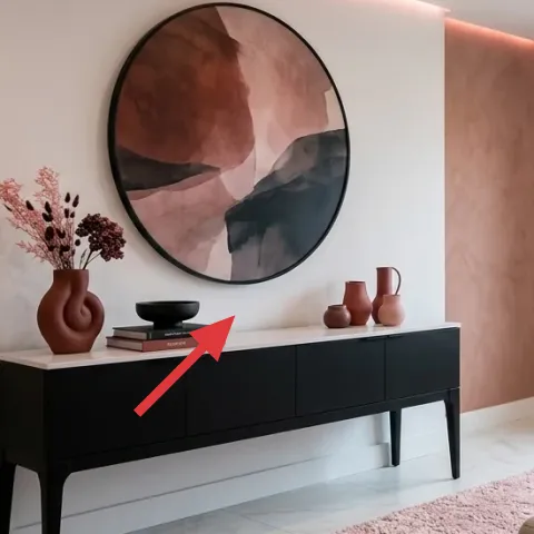
The decorative black bowl or tray works like a visual landing pad: it ties into the black framing of the oval wall art and creates a place for small objects to rest. Look for something with a matte or satin finish rather than reflective glass; the goal is contrast that feels grounded, not shiny. The trade-off is that a dark tray can look dusty—so wipe it quickly when you dust the console. The obvious alternative would be adding more ceramics, but that often makes the console feel busy. In the photo, the bowl/tray keeps the styling cohesive by repeating the black accent from the wall art.
Let one black object be “the anchor”
When the wall and tray share the same color family, the rest of the palette stays calmer.
The cost, layer by layer
| Layer | Item | Cost |
|---|---|---|
| 1 | Pink textured area rug | $200 |
| 2 | Large oval wall art print with a black frame | $80 |
| 3 | Beige knit throw blanket | $30 |
| 4 | Terracotta vase with dried stems (DIY foraged stems) | $45 |
| 5 | Small terracotta pitchers and vases | $40 |
| 6 | Book stack on the console | $20 |
| 7 | Decorative black bowl or tray on the console | $25 |
| Total | $440 | |
If you want a cheaper version, keep the rug and swap the wall art to a smaller 16×20 framed print, then choose one terracotta piece instead of a set. Those changes usually shave about $80–$120 while keeping the same earthy pink + black contrast.
What worked, what didn't (across the whole room)
This corner works because it uses one bold color (pink) in a textured textile, then repeats black and terracotta in smaller pieces. The result feels designed without requiring changes to the layout. The only place it can fall apart is when console objects become too matchy or when the rug texture is replaced with something flat.
What worked
- The pink textured rug creates a soft visual buffer between the sofa and the console wall.
- The black-framed oval wall art gives a graphic focal point that balances the room’s warm beige tones.
- Matte terracotta ceramics add warmth without introducing too many new colors.
- The dried stems bring height, so the console reads styled rather than randomly placed.
- The throw blanket adds comfort texture while staying neutral enough to keep the palette calm.
- The black bowl or tray repeats the wall-art frame color for an easy visual “tie.”
What didn't
- A patterned throw would compete with the rug texture and make the room feel busy.
- If the terracotta pieces are all the same height, the console loses its built-in rhythm.
- Glossy ceramics can reflect daylight and make the pink rug look more saturated than planned.
- Skipping the book stack often leaves the console styling feeling too low and flat.
- Over-clustering too many small objects on the console reduces visual clarity.
What we'd skip if we did it again
Skip swapping in a low-texture pink rug. In this corner, the visible pile is doing the heavy lifting by softening the clean lines of the wall art and console, and by making the pink feel intentional instead of flat.
Skip adding a full decorative set on the console. One terracotta cluster, one black “landing” piece, and a book stack keep the composition readable from the sofa; extra items tend to crowd the eye.
Skip glossy finishes on the ceramics and tray. Matte terracotta and matte black play better with the beige sofa tones and daylight, while shiny surfaces can introduce unwanted glare and make the palette feel louder than the photo.
Frequently asked
How long does this sofa-and-console refresh take?
For most renters, it’s about an afternoon. The wall art and rug are quick to place, and the console usually takes the longest because you’ll want to adjust the heights of the terracotta pieces and the dried stems. If you DIY the foraged dried arrangement, plan extra time for trimming and bundling stems. Overall, it’s a low-commitment refresh—once the rug and wall art are in, everything else is optional fine-tuning.
Is this renter-safe if I’m not allowed to drill or paint?
Yes—this look is built around move-friendly upgrades: a rug, removable decor objects, and a console styling approach. The layers here don’t require drilling or permanent fixes. The dried stems arrangement is also easy to pack up. Even the “wall look” can stay non-invasive if the oval print is hung using landlord-approved, removable hardware (or already-existing wall-friendly methods).
What if my living room is smaller than the photo?
In a smaller room, scale the rug first. A smaller rug can still work if it has the same pile texture, but keep the rug proportions so the sofa’s front edge has a clear landing area. On the wall, choose the next size down for the oval print, but keep it centered over the console area. For the console, reduce ceramics to a tighter grouping—one pitcher, one vase, and the black tray.
What if my living room gets a lot more direct sunlight?
Direct sun can make pink look more saturated, so choose a rug with a dusty pink or rose tone rather than a bright fuchsia. Stick to matte ceramics for the console so reflections don’t bounce around the room. If the dried stems shed or fade faster, swap stems in season—store extra bundles in paper wraps so you can refresh without buying an entirely new centerpiece.
Where should I shop for the key pieces?
For the rug, look for textured boucle or high-pile options at home goods retailers and online rug sellers. The oval wall art is easiest to find as framed prints or mirror-style frames at decor stores, art marketplaces, or resale shops. Terracotta vases and black trays are common in home goods sections and thrift stores—sorting there is part of the fun because you’re matching shapes. Books can be thrifted or stacked from your own shelf.
What’s the biggest mistake people make with this color palette?
Over-supplying the console. It’s tempting to add a lot of matching mini items, but the photo’s success comes from restraint: one height moment (dried stems), one warm terracotta cluster, one black grounding piece, and a book platform. If you add too many small objects, the rug and wall art lose focus and the room starts to feel cluttered rather than curated.
More in Living Room
Under $500: sofa-and-console corner refresh with earthy pink accents
A renter-friendly living-room refresh built around a pink textured rug, black-framed oval art, and console styling. This look lands under $…
Under $800: earthy living room sofa corner refresh with 7 layers
A bright, earthy living room sofa corner refresh you can finish in a weekend. This $800 plan leans into cream upholstery, terracotta accent…
Under $500: warm neutral living room renter refresh
A warm neutral living room refresh that reads expensive without renovations: start with a soft area rug, add a throw-and-pillow stack, swap…