
- Best for
- Cozy, warm layered seating zones
- Cost
- $1500 total refresh ceiling
- Difficulty
- Confident DIY (curtains + framed art)
- Time
- One weekend to style
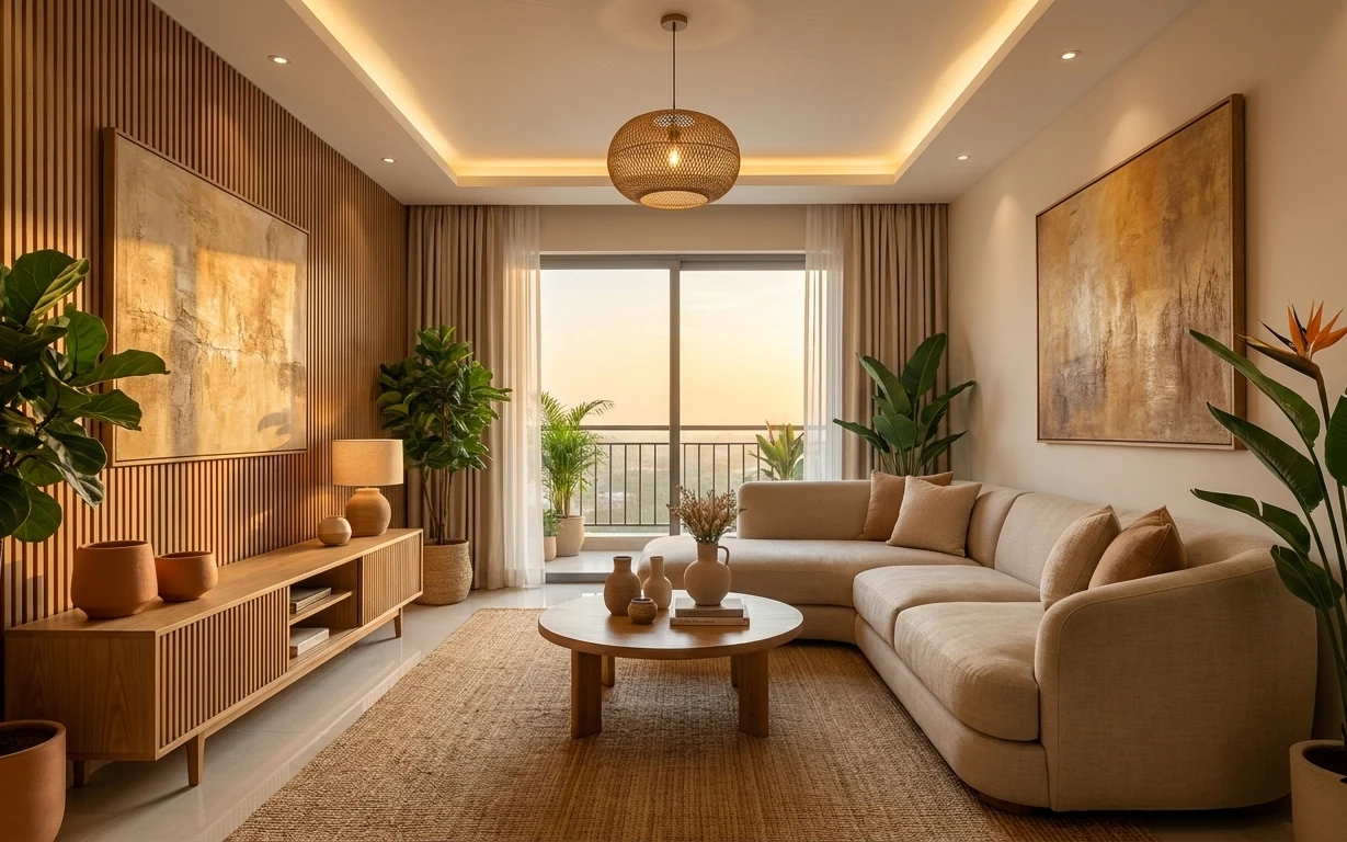
Why warm wood-slat and rattan light is the beige sectional living room of 2026
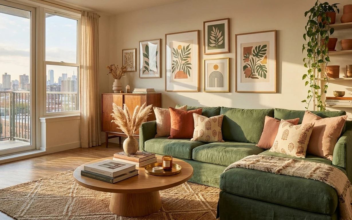
The first thing you notice in this setup is how the warm light bounces off the light wood slat wall, then softens on the beige curtains and jute rug. The second is how the room keeps repeating natural textures: woven fibers underfoot, linen-like tones on the seating, and matte surfaces on the coffee table. I’ve seen this exact combo in Scandinavian styling spreads, and it always reads calmer than “full-on matching” rooms. The good news: homeowners can pick the highest-impact pieces (like rug size and one large frame) without waiting for a bigger renovation.
I used to overthink wall art first, then wonder why the whole room still felt flat. One mistake I kept making: choosing a tiny print and letting it compete with the scale of the window and sofa. Once I started anchoring the room with big curtain panels and a properly sized rug, the framed pieces finally looked intentional instead of decorative. Warm neutrals stopped feeling beige-and-boring and started feeling composed.
Layer 1 — Table lamp with beige shade ($60) makes the console feel intentional
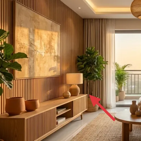
This table lamp sits on the low wood media console and does two jobs at once: it adds a warm pool of light and gives the console top a clear focal point. Choose a beige shade (fabric, not glossy) so it blends with the curtain color instead of introducing a new tone. A common alternative is a brighter white shade or a metallic lamp base, but those pull focus from the room’s wood-and-woven palette. The trade-off here is that table lamps look best when the shade is centered and the bulb isn’t too blue—aim for a warm color temperature so the lamp matches the rattan ceiling light’s tone.
Match the lamp shade to the curtain
When both read “linen-beige” in daylight, your eye stops hunting for contrast and the whole corner looks designed.
Layer 2 — Beige curtain panels ($80) frame the seating without blocking light
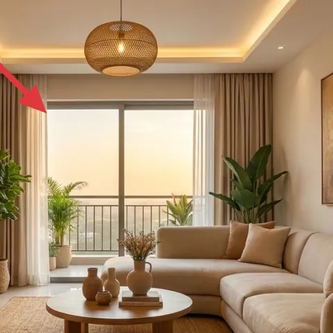
Those beige curtain panels stretch across the window opening and soften everything around the sofa—especially the straight lines of the wood slat wall. For this look, prioritize length (so they puddle slightly or kiss the floor) and a medium weight that falls in relaxed folds. The obvious alternative is short curtains or sheer-only panels, but then the room loses that grounded, “finished” feel. The trade-off is cleaning and light control: thicker panels hold onto dust, and in bright rooms you may need to pair them with a lighter inner layer if you want privacy without dimming. Still, the payoff is scale.
Let the folds do the styling
Even with neutral décor, layered folds create depth without adding extra objects.
Layer 3 — Large framed abstract artwork (right) ($80) balances the window with wall scale
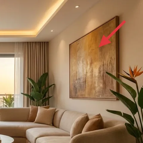
The large framed abstract artwork on the right wall keeps the room from feeling like a furniture showroom: it brings motion, warm neutrals, and a vertical “pause” next to the ceiling line. Go for a big size that visually holds its own—this is one place where small prints look timid. A cheaper, tempting alternative is a set of smaller prints, but then you end up grouping them and competing with the window proportions. The trade-off I’d accept is committing to one strong frame color story (warm taupe, sand, and subtle darker lines) so it doesn’t fight the sofa cushions or the rug texture.
Make it instead of buying it
DIY an abstract warm-neutral print on a small canvas board, then slide it into the same frame size to get a similar look for less.
Materials
- Acrylic paint set (warm neutrals) — 1 set — $20
- Canvas board or thick paper (for painting) — 1 board (11×14 or similar) — $10
- Painter’s tape — 1 roll — $6
- Sponges/foam daubers — 1 pack — $8
- Matte clear sealant (for a finished look) — 1 can — $10
Steps
- Prime or lightly prep the canvas surface with a thin base coat so color doesn’t look patchy.
- Sketch a loose layout with a pencil: a big soft block, then one lighter area, then a darker vertical move.
- Tape off one shape at a time for crisp edges, then paint the first layer.
- Dab a second layer over the dried base using sponges for a cloudy, abstract texture.
- Remove tape while paint is still slightly tacky for clean borders.
- Let everything dry fully, then seal with matte clear in two light coats.
- Dry flat, checking edges for any drips or bubbles.
- Slide the finished art into the frame and adjust centering so it looks intentional.
Total DIY cost: $54 — saves about $26 over buying.
Layer 4 — Jute area rug ($200) grounds the beige sofa and hides daily life
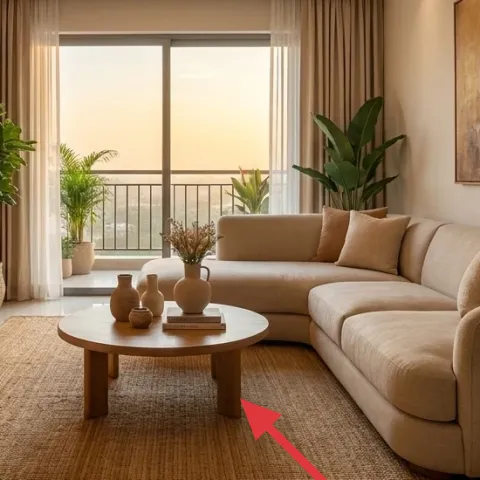
A jute area rug is the anchor of this whole palette: it softens the wood tones, adds texture under the coffee table, and makes the sofa feel less “floating” in the room. Choose a size that reaches under the front edge of the seating so your eye reads the seating as one zone. The obvious alternative is a flat-weave rug in a similar color, but jute’s variation is what keeps the space from looking flat and staged. The trade-off is practicality—jute can mark if you ignore spills—but the same texture is also what makes light scuffs disappear faster than smoother rugs. Pair it with a rug pad for comfort and less shifting.
Don’t rush the rug size
If the rug is too small, the sofa legs end up “floating,” and the room loses cohesion fast.
Layer 5 — Round wooden coffee table ($180) keeps traffic lanes calm
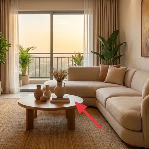
The round wooden coffee table is a smart shape for this arrangement because it interrupts all the straight lines—from the slat wall to the sofa arms—without stealing attention. The warmth of the wood tone also keeps the room unified with the console and wall. A rectangular table is the easy swap, but in a beige-heavy room it tends to feel boxy and more “furniture-store.” The trade-off with a round surface is that you’ll need slightly fewer bulky items on top; the styling should be airy. If the table feels empty, lean on smaller decorative vases rather than adding a big centerpiece that blocks the line of sight.
Style in odd numbers
Three small vases read balanced on a round top and stay proportionate to the sofa.
Layer 6 — Low wood media console with open shelves ($180) adds storage and keeps the room from looking cluttered
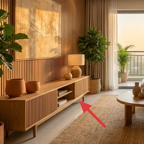
This low wood media console gives the room its “designed corner” energy: it holds the table lamp, supports plants, and gives you curated surfaces instead of piles. The open shelves matter because they let you repeat the natural-material palette—wood cubbies, woven planters, and matte ceramics—without making the console feel heavy. The alternative is using baskets everywhere, but you lose the crisp structure that makes japandi-style rooms look calm instead of messy. The trade-off is you’ll still need to edit what goes on top; even beautiful décor looks cluttered if everything is different heights and colors.
Use shelves like a still life
Pick one plant height plus one ceramic shape, then repeat it on the other side.
Layer 7 — Beige sectional sofa ($600) creates the soft base for everything else
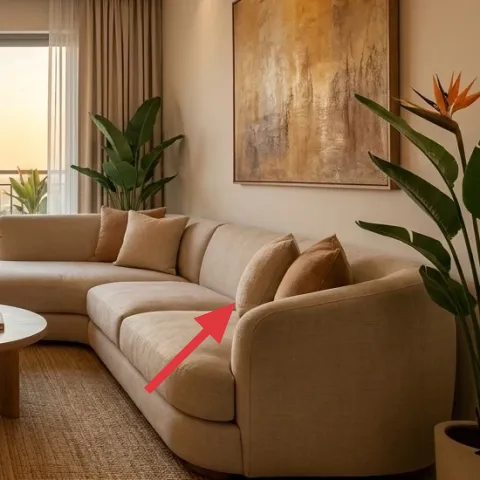
The beige sectional sofa is the real foundation here: its curved seating shape matches the round coffee table and makes the whole room feel relaxed instead of angular. In a warm japandi palette, the sofa fabric finish is everything—look for a matte, tightly woven upholstery that won’t reflect overhead light. The alternative is a darker or patterned sofa, but that forces every other layer (rug, curtains, art) to get quieter in different ways. The trade-off with a light sofa is obvious: stains show more easily, so plan on regular vacuuming and quick spot treatment. When the upholstery reads clean and matte, the rest of the room looks “effortlessly coherent,” without being fragile.
Pick cushions in one beige family
Vary textures (slub, smooth, linen-look) rather than hopping between unrelated colors.
The cost, layer by layer
| Layer | Item | Cost |
|---|---|---|
| 1 | Table lamp with beige shade | $60 |
| 2 | Beige curtain panels (pair) | $80 |
| 3 | Large framed abstract artwork (DIY ~$54 in materials) | $80 |
| 4 | Jute area rug 5×7 | $200 |
| 5 | Round wooden coffee table | $180 |
| 6 | Low wood media console with open shelves | $180 |
| 7 | Beige sectional sofa | $600 |
| Total | $1,380 | |
If you want a cheaper version of this room, start with curtains and a jute-style rug in a slightly smaller size, then swap the framed art for a single large gallery print instead of two big frames. You’ll still get scale and warmth, just with fewer “premium” objects on the walls and shelves.
What worked, what didn't (across the whole room)
The wins here are mostly about scale and texture repetition: the rug anchors the sofa, the curtains soften the tall lines, and the large frame keeps the wall balanced. The room also benefits from warm lighting layered at different heights, so it stays flattering even when the day turns darker.
What worked
- The jute rug grounds the seating zone so the sofa doesn’t feel stranded on hard flooring.
- Long beige curtain panels add softness and create a taller visual frame around the window.
- One large framed abstract artwork matches the wall scale instead of looking like a “leftover” print.
- The round coffee table keeps traffic flowing and balances the sofa’s straight-and-soft geometry.
- The low wood console gives practical storage while also hosting the lamp and plants like a vignette.
- The beige shade lamp reinforces the warm tone of the overhead rattan light.
What didn't
- Too-small rug sizes make the sofa leg lines look disconnected from the rest of the room.
- Glossy upholstery or a shiny lamp shade can look colder under warm bulbs.
- Splitting the wall into many tiny frames interrupts the calm rhythm next to the window.
- Overloading the coffee table with large objects reduces the airy look of the palette.
- Console styling with mixed heights but no repeating shapes can read as clutter.
What we'd skip if we did it again
Skip “cheap print” shopping when you’re working with warm neutrals and big wall space. In this room type, small art looks timid next to the window and the large sofa silhouette, even if the colors are close. Instead, commit to one large framed abstract piece—or DIY one warm-neutral version—so the wall feels intentional.
Skip short curtains or purely sheer panels. They can be pretty, but they don’t create the grounded frame effect around the seating. For this look, length and fold depth matter more than a specific fabric brand, and the extra inches are what make the room feel taller and calmer.
Skip overcrowding the coffee table and console tops. When every surface has something bulky, warm beige tones start to feel busy instead of composed. Keep a small set of repeated shapes (vases, one lamp, one plant grouping) and let texture carry the rest.
Frequently asked
How long does a refresh like this usually take?
If you’re buying curtains and a rug, plan for about 4–8 hours across a weekend: hanging curtains, swapping the lamp, and setting the rug so it sits under the sofa front. Styling the console and coffee table is where the extra time goes—give yourself 1–2 evenings if you want it to look curated, not “placed.” DIY framed art adds another half-day for drying time and cleanup.
What if I’m renting and can’t make changes to the walls?
This photo-style look still works without drilling. Use ceiling or tension rods only if your setup allows, and choose framed art that you can hang with removable hooks. For the rug and curtains, the biggest visual gains don’t require wall changes. You can also focus DIY on things that stay with you—like a painted abstract print you can reframe later.
My living room is smaller—what do I adjust?
In smaller rooms, reduce the rug size only one step, then keep at least the front legs of the sofa on the rug. Swap “full-length” curtain coverage for panels that still reach near the floor, and don’t go wider on the framed art than the wall allows. The key is scale harmony: big pieces should still feel big, even if the room is tight.
How do I shop for the right warm-neutral palette without it looking beige-on-beige?
Pick one base beige (sofa or rug), then vary textures instead of chasing new colors. Jute texture, linen-look curtains, and matte ceramics will read as different even when color families match. Add contrast only through a single framed art with slightly darker lines, or through a plant with deeper green leaves.
Where should I splurge versus save?
Splurge on pieces that set the room’s proportions: curtains length, rug size, and one large frame. Saving is most successful on smaller decorative items like vases and plant pots, or by choosing a simpler table lamp shade that still matches your curtain tone. The sofa is the biggest splurge only if you truly need it—if you already own a sofa, start the budget with rug and curtains.
What’s the most common mistake for this kind of living room?
Buying decor in the right colors but the wrong scale. Small rugs and small prints can make even an expensive sofa feel awkward, because your eyes measure everything against the window and seating. Another frequent issue: adding too many objects on the coffee table and console at once—keep it edited so the warm neutrals stay calm.
More in Living Room
Under $1500: beige sectional living room weekend refresh with 7 layers
A warm, modern japandi living room with a beige sectional, jute rug, rattan ceiling light, and framed abstract art—refreshed with 7 buy-or-…
Under $700: boho living room refresh with green sofa accents
A boho living room look built around a green sofa—updated with a patterned rug, warm curtain panels, botanical framed prints, and terracott…
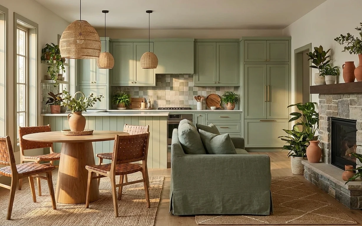
Under $1500: modern farmhouse living room refresh
A $1500-or-less living room dining-kitchen refresh built around a warm rug, a green sofa, and terracotta plants. This weekend project uses …