- Best for
- Counter + dining styling in shared kitchens
- Cost
- Under $250
- Difficulty
- Easy
- Time
- A weekend afternoon
Why sage-and-wood palette is the kitchen dining zone of 2026
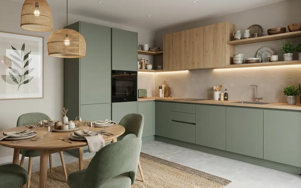
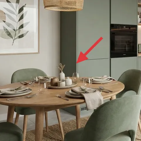
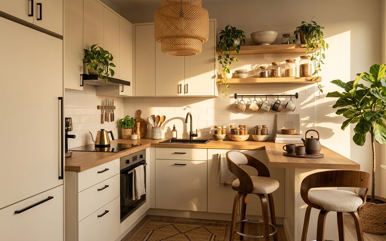
Warm modern kitchens usually look expensive because of the big, fixed surfaces—but the details are what make them feel pulled together. In this photo, the creamy wall and light wood countertop meet sage-green cabinetry, then soften with a jute-look area rug and a light table runner/cloth. Two woven pendant lights add a texture you can’t fake with flat surfaces. The good news for roommates and students: you can recreate the same balance with textiles, framed art, and small decor swaps that pack into cardboard boxes.
I used to overdo the “perfect centerpiece” on dining tables, then realized it became clutter the moment someone needed real counter space. What changed my mind was choosing styling that’s grouped by height: rug on the floor, art on the wall, then small ceramics and a single potted plant. That one plant gives the shelf and counter a focal point without taking over the whole room.
Layer 1 — jute-look area rug ($80) defines the dining footprint
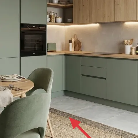
This jute-look area rug grounds the dining table and visually separates “eating zone” from the rest of the kitchen. It sits under the chairs, so even when you’re not hosting, it still reads intentional. I like this choice over a thinner flat rug because the texture adds warmth against the smooth tile floor without needing anything permanent. The trade-off is that you’ll want a quick vacuum routine and careful placement of anything sharp or wet from cooking—but it’s still one of the easiest pieces to pack and move.
Vacuum with the grain
For a jute-look weave, run the vacuum in the same direction as the fibers to reduce fuzzing.
Layer 2 — framed botanical print ($25) repeats the plant theme
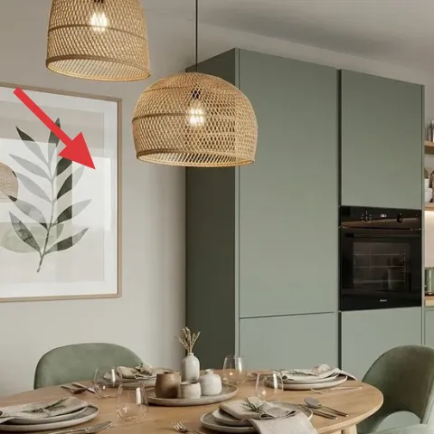
The framed botanical print brings in a leaf motif that matches the greenery on the table and counter, keeping the whole kitchen from feeling like “just cabinets.” It also creates a vertical axis, which is helpful when your lighting and shelving are doing most of the work. Choosing framed art is usually easier than adding extra decor objects because it’s one item, one focal point, and it travels well. The trade-off is that art needs to be protected in transit—bubble wrap and a flat box go a long way.
Go for matte paper
Matte prints reduce glare from overhead lighting, especially if your kitchen tends to be bright.
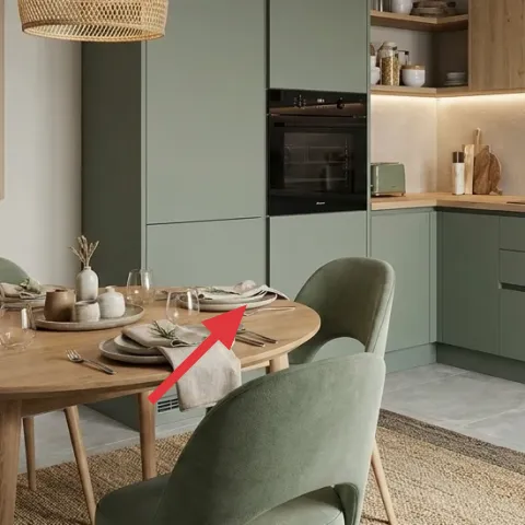
Layer 3 — light table runner/cloth ($25) softens the tabletop
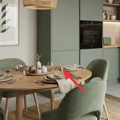
The light table runner/cloth adds a calm, creamy layer between the plates and the warm wood table, so the dining surface doesn’t feel bare or overly glossy. Textile at this scale is also roommate-friendly: one cloth is easy to share, easy to wash, and easy to swap for seasons. I chose it over matching “set” table decor because it keeps the look cohesive without needing a full matching suite. The trade-off is frequent laundering—expect a quick cycle when dinner gets messy, then a simple press or hang-dry.
Match one undertone, not the whole palette
If your wall is warm gray and your wood is light, keep the runner in cream or warm white so it blends naturally.
Layer 4 — ceramic vase cluster on the table ($15) adds small-scale warmth
On the table, the ceramic vase cluster brings in that “collected” feeling that reads more elevated than a single generic bottle. Because it’s small and breakable, it’s also the kind of detail that’s worth getting right visually but still easy to pack—each piece can go in its own box section. A ceramic grouping also gives height variation near the center, which makes the whole dining setup feel styled even when the rest of the kitchen stays simple. The trade-off is that ceramics can get knocked; placing them slightly back from the table edge helps.
Keep the cluster height under your placemats
That way, conversation stays clear and the decor doesn’t block views when plates move around.
Layer 5 — decorative ceramic canisters on shelf ($20) ties together the storage line
Decorative ceramic canisters on the shelf echo the table’s ceramics and make the shelf feel curated instead of random. They’re also a smart move-friendly swap because you can keep your kitchen “look” consistent even as you change what’s in the cabinets. I like ceramics here because they contrast the wood shelf with a matte texture that doesn’t reflect overhead light. The trade-off is that you’ll need to edit the number of items you display—too many canisters reads busy, especially in a room with a lot of built-in lines.
Don’t line everything up perfectly
Arrange canisters with slight spacing so the shelf looks collected rather than showroom-straight.
Layer 6 — small potted plant on kitchen counter (right side) ($40) brings life to the busiest surface
A single small potted plant on the counter right side creates a living focal point where your eyes already land, without adding any permanent changes. It also connects the room’s plant language: the dining table has greenery and the wall art has botanical leaves, so the counter plant feels like a continuation—not an isolated decoration. Buying a ready-made plant works, but for shared housing budgets, DIY planters keep the look consistent while you switch plants as needed. The trade-off is that counter plants need light and an occasional water check, so set them where you’ll actually remember.
Make it instead of buying it
This painted terracotta planter set gives you the same “small pot of greenery” look using inexpensive pots, so the plant reads styled even when you’re not changing cabinets or fixtures.
Materials
- Terracotta planters (2 small) — 2 pcs — local craft store — $12
- Water-based acrylic craft paint (sage/cream) — 1 set — craft store — $8
- Small foam brush set — 1 pack — craft store — $6
- Painter’s tape — 1 roll — hardware store — $2
- Clear topcoat (leftover) — 1 jar — on hand — $0
Steps
- Wash and fully dry the terracotta so paint sticks evenly.
- Mask simple stripes or a rim with painter’s tape.
- Brush on the first thin coat of sage paint.
- Let it dry completely, then add a second coat for solid coverage.
- Remove tape while paint is slightly set (not fully dry) for sharper edges.
- If using a leftover topcoat, apply a light seal coat and let it dry fully.
Total DIY cost: $28 — saves about $12 over buying.
Layer 7 — salt-and-pepper shakers on the table ($15) finishes the dining styling
Salt-and-pepper shakers may sound minor, but they’re the kind of small object that makes the table feel “ready,” especially in a shared kitchen where people grab what’s already out. In this photo, the wooden set visually continues the light wood theme from the table and counters, so the dining area feels cohesive rather than mismatched. I like this over buying a whole new table centerpiece because the shakers are functional and stay relevant all year. The trade-off is that you’ll want to wipe them down after cooking hands-on meals so the wood finish stays clean and doesn’t look dull.
Match metal tone to your countertop hardware
If your faucets feel warm, keep lids and accents in a similar warm tone.
The cost, layer by layer
| Layer | Item | Cost |
|---|---|---|
| 1 | Jute-look area rug | $80 |
| 2 | Framed botanical print | $25 |
| 3 | Light table runner/cloth | $25 |
| 4 | Ceramic vase cluster | $15 |
| 5 | Decorative ceramic canisters on shelf | $20 |
| 6 | Small potted plant in DIY painted terracotta planters | $40 |
| 7 | Wooden salt-and-pepper shakers | $15 |
| Total | $220 | |
If you want a cheaper variant, start with the rug and the runner, then swap the shelf canisters for one simple ceramic piece plus a small refillable jar. Art can be a smaller framed print or a budget-ready print, and the plant can be a lower-cost live herb in a similar terracotta pot.
What worked, what didn't (across the whole room)
The strongest win here is how the styling repeats a single theme—sage, warm wood, and matte ceramics—without requiring any permanent changes. The second win is the mix of textures: a woven rug, soft textiles on the table, and greenery at counter height. The main downside is that small decor edits require maintenance, like keeping the counter plant tidy and the table textiles clean.
What worked
- The jute-look rug made the dining area feel intentional against the tile floor.
- The framed botanical print echoed the greenery so the wall didn’t feel separate from the table.
- The light runner/cloth softened the tabletop and made the setting look “set” without extra clutter.
- Ceramic canisters on the shelf repeated the matte texture found on the dining ceramics.
- A single potted plant gave the counter a focal point at an eye-catching height.
- Wood-toned salt-and-pepper shakers connected the dining table and countertop materials.
What didn't
- Too many small shelf items can make the space feel busy near the long cabinet line.
- A counter plant that’s placed too far back is easy to forget and ends up looking droopy.
- Table textiles need regular washing, especially if shared kitchens see frequent meals.
- Fragile ceramics require careful packing and break-proof storage for moves.
What we'd skip if we did it again
Skip a matching full table “set” if the kitchen already has a lot of cabinetry lines. A full coordinated set tends to look stiff in a shared space, and it’s harder to pack room to room. The runner/cloth and a small cluster of ceramics are enough to create cohesion without needing matching plates or decorative extras.
Skip over-styling the shelf with lots of small objects. In this kitchen dining zone, the wood shelf and cabinet geometry already do heavy lifting, so the goal is one clear rhythm: matte ceramics, a plant, and a bit of spacing. More pieces than that can turn “collected” into “messy” fast.
Skip counter decor that can’t handle everyday kitchen use. If an item needs constant repositioning, it won’t survive roommates, cooking, and moving. A plant in a painted terracotta planter, plus simple shakers, holds up better and stays functional even when routines change.
Frequently asked
How long does this kind of kitchen dining refresh take?
Most of the work is staged styling: rug placement, art hanging setup that doesn’t damage walls, and arranging small ceramics and a potted plant. For a typical shared kitchen, expect 2–4 hours the first time, mainly because you’ll want to test sightlines from the dining chairs and the counter before you commit.
Is this renter-friendly / shared-housing friendly if I can’t drill or paint?
Yes—this approach relies on textiles (rug, table cloth) and moveable decor (framed print, ceramics, plant). It avoids swapping fixed kitchen components, and every item is realistically boxable for the next lease. The only “care” item is protecting fragile ceramics and art during packing.
What if my kitchen dining zone is smaller than the photo?
Go down one rug size or choose a runner-length that keeps the tabletop visible. Keep only one “center cluster” on the dining table (the vase cluster or the runner, not both heavily layered). For wall balance, choose a smaller framed print or keep it centered at eye level so it doesn’t feel visually crowded.
What if the room is larger—how do I scale this up without spending more?
Keep the same palette, but increase spacing rather than adding more matching items. Add a second plant only if there’s enough visual breathing room on the counter or shelf. If you need more warmth, swap to a slightly larger rug and keep art and ceramics as the main texture moments.
Where should I shop for these kinds of pieces?
For the rug and textiles, look for jute-look or sisal-style options at home goods retailers and marketplaces. Framed botanical prints are easiest to find through art-print shops and thrifted frames. For ceramics and planters, craft stores and small home decor shops often have good starter pieces that match wood-and-sage palettes.
Biggest mistake people make with this look in kitchens?
Overbuying small decor items and trying to make every surface match. In kitchens, that usually reads as clutter because there’s already a lot of built-in structure. The cleaner version is one rug foundation, one wall focal point, and then repeated matte ceramics plus a single plant—enough to feel styled without competing with daily use.
More in Kitchen & Dining

Under $250: sage-and-wood kitchen dining refresh
A move-friendly kitchen dining zone refresh for roommates and shared housing, built around a jute-look rug, framed botanical print, and eas…
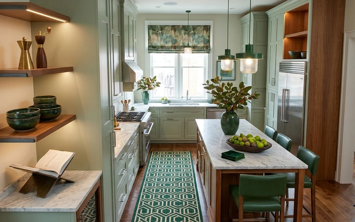
Under $400: move-ready kitchen dining nook refresh with 7 swaps
A move-friendly kitchen dining nook refresh under $400, built around removable swaps: a patterned rug runner, a framed print above the wind…
Under $400: 7 renter-friendly kitchen swaps for a warmer peninsula
A renter-friendly peninsula refresh that leans japandi: a pattern rug, softer textiles, a woven pendant shade, and styled countertop plants…