- Best for
- Renter-safe kitchen styling
- Cost
- Under $400
- Difficulty
- Easy swaps
- Time
- 1–2 hours total
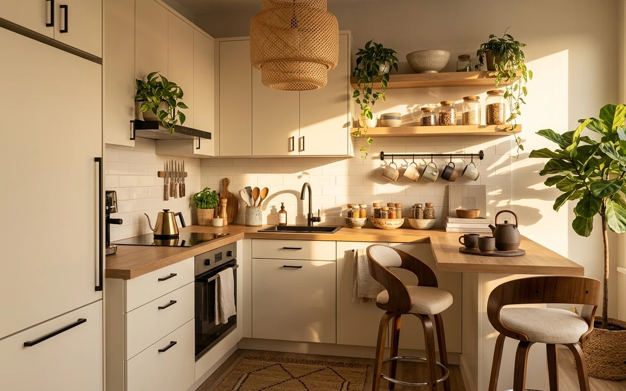
Why sage-and-brass accents are the kitchen dining nook of 2026
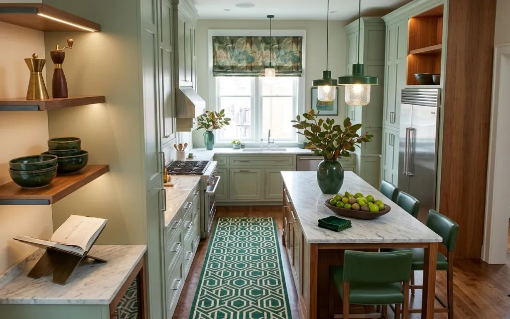
That green-and-brass palette does a lot of heavy lifting in this kitchen dining nook. The runner rug brings pattern to the long aisle, while the framed botanical print adds a calm focal point at eye level. On top of the marble-look counters, the styling stays tactile—glossy ceramic bowls, a leafy plant, and warm brass decor on the wall shelves. This setup is achievable for shared housing because nothing requires drilling, and the “make it feel finished” pieces all dismantle into boxes.
I used to reach for “big” changes first—new lights, new hardware, new wall stuff—then I’d remember I was the one hauling it later. What changed my mind was watching how three soft anchors (rug, art, and a real plant) make the rest look intentional. Here, the greens feel coordinated instead of accidental, even though the room is doing a lot already. The trick is choosing removable items that share one color story.
Layer 1 — green patterned rug runner ($120) Maps the walkway with pattern
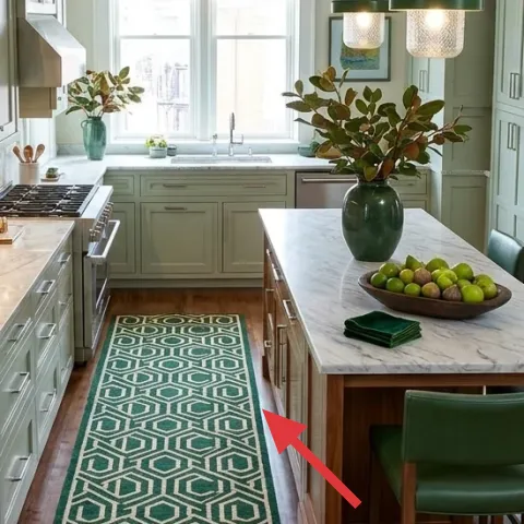
A green patterned rug runner keeps the long kitchen line from feeling like just “floor plus appliances.” In the photo it sits down the middle, so it visually anchors the dining area and makes the space feel styled instead of purely functional. Runner shape matters in shared housing: it’s wide enough to read as a design choice, but it still rolls up for moving day. The trade-off is that a patterned rug forgives small messes more than a light flatweave, but it does take a little more care when shaking crumbs out. Still, it’s one of the easiest swaps to bring to the next lease.
Pick a pattern that matches your plant color
When the rug’s green repeats in the plant moment, the room looks cohesive even if everything else changes later.
Layer 2 — framed window-area botanical print ($80) Makes the window wall feel designed
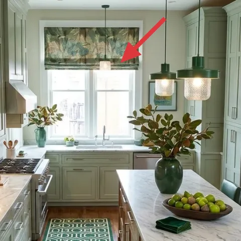
The framed botanical print above the window area turns a bright, busy backlight into an actual focal wall. In the hero image, the print’s muted greens and soft texture echo the rug, so the eye has somewhere to land without fighting the cabinetry. This layer is an “easy pack” win: a frame can be bubble-wrapped and stacked in a moving box. The trade-off versus a bigger art statement is scale—you’re not covering an entire gallery wall—so the print has to be well-chosen for the proportion of the window wall. It’s still a strong move because it works with natural light instead of against it.
Let the frame share the room’s metal tones
If your decor leans brass or warm metals, a frame that follows that warmth keeps the print from looking pasted on.
Layer 3 — leafy plant in green vase ($60) Adds life without changing anything fixed
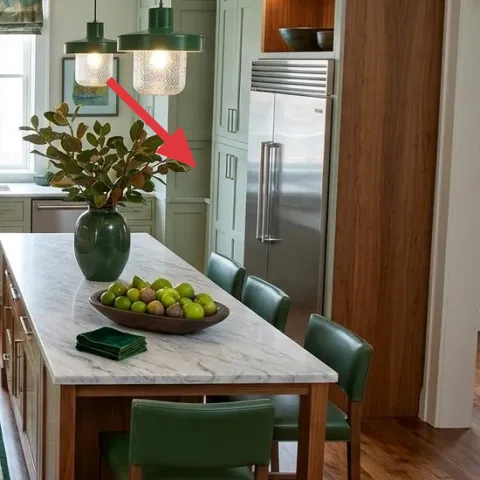
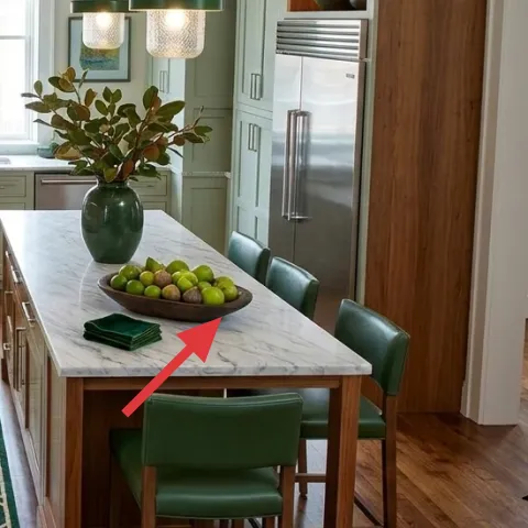
A leafy plant in a green vase gives you movement and depth right where meals happen, and it also keeps the palette from becoming “just paint and counters.” Here, the vase color pulls from the rug and napkin tone, so the dining table looks styled even when the rest of the kitchen is doing the practical work. For shared housing, the advantage is simple: you can move the plant to the next place. The trade-off is that you’ll want a container that’s easy to carry and a plant that tolerates indoor light. A planter swap also lets the look evolve without replacing fixed elements.
Make it instead of buying it
DIY a painted terracotta planter set in a matching green so you can swap the look of the green vase moment when you move.
Materials
- Small terracotta planters — 2–3 planters — craft store — $20
- Acrylic paint (green) — 1 small bottle — craft store — $12
- Acrylic paint (cream or off-white) — 1 small bottle — craft store — $8
- Painter’s tape — 1 roll — hardware aisle — $6
- Foam brush or small sponge brush — 1 pack — craft store — $5
Steps
- Wipe terracotta planters clean and let them fully dry.
- Use painter’s tape to map a simple banding or chevron pattern.
- Paint the base green, then remove the tape while paint is still slightly tacky.
- Paint a cream accent stripe in thin coats.
- Let everything air-dry until the surface feels fully dry to the touch.
- Plant a rooted cutting or transplant, then style it into the dining table grouping.
Total DIY cost: $51 — saves about $9 over buying.
Layer 4 — decorative bowls on the wall shelf ($30) Gives the countertop “collected” texture
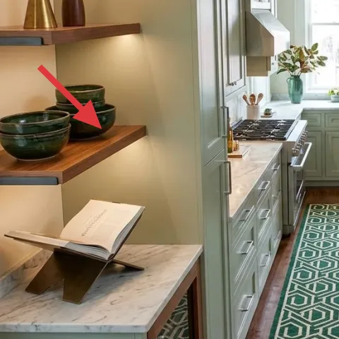
Those ceramic bowls on the wall shelf add warmth and texture at standing height, which matters in a kitchen that’s otherwise horizontal lines and hard surfaces. The bowls’ glossy surfaces catch light differently than matte paint, so they feel “alive” even when nothing else changes. For a shared house, this is the kind of layer that’s both visible and easy to box: bowls are small, stackable, and can be wrapped individually. The trade-off is that you can’t rely on them to solve storage needs—they’re mainly styling objects—so the kitchen still needs functional organization. Still, they make the space look intentional rather than temporary.
Stack by height, not just by color
Mixing slightly different heights keeps the shelf from looking flat, especially with warm brass nearby.
Layer 5 — brass decor objects on the wall shelf ($35) Adds a warm metal thread
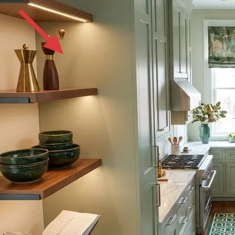
Brass decor objects on the wall shelf tie the room together because they echo the warm undertones in the cabinetry and wood floor. In the photo, the brass pieces sit above the ceramic bowls, creating a clear “top to bottom” styling rhythm: metal at the upper shelf, ceramic below, and a lighter counter ledge nearby. Choosing decor with a warm metal finish is a practical alternative to changing fixed lighting fixtures—everything else stays intact. The trade-off is that brass can feel busy if there are too many small items, so limiting the number to a couple of pieces keeps it refined. This layer packs easily in one small box.
Avoid clutter on a high-use counter
In a kitchen, leave space for everyday grab-and-go—styling objects work best when they don’t interrupt cooking and cleanup.
Layer 6 — green napkin/towel folded on dining table ($18) Makes the table look “set”
The folded green napkin/towel on the dining table is a small textural detail that reads like a full table setting. It also repeats the rug’s green, which is why the dining nook feels coordinated instead of random. This is a shared-housing friendly move because textiles are easy to wash, easy to replace, and always packable—no fragile frames, no heavy pieces. The trade-off is that towels shift with use, so the “just right” fold might not last through every meal. Still, swapping fresh cloths is cheaper than replacing decor, and it keeps the table looking styled more often.
Choose a towel that can handle mess
A patterned or darker green tone hides kitchen splashes better than a pale linen in high-traffic areas.
Layer 7 — decorative book on the shelf ledge ($15) Adds a lived-in edge
A decorative book on the shelf ledge gives the kitchen dining nook that lived-in, “someone actually uses this” feeling. In the hero image, the open pages create a subtle vertical interruption in an area dominated by shelves, counters, and cabinetry lines. The best part for move-friendly styling is that books are already part of most people’s boxes—so you’re not adding a weird extra object to haul. The trade-off is that book styling looks best when the pages and cover are clean and not overly scratched, so it’s more of a quick swap than a permanent solution. It’s the kind of detail that feels small, but it makes the shelf feel finished.
Match the book color to your metal + plant
A neutral cover with a warm undertone pairs naturally with brass and green decor without clashing with cabinetry.
The cost, layer by layer
| Layer | Item | Cost |
|---|---|---|
| 1 | Green patterned rug runner | $120 |
| 2 | Framed botanical print 16×20 | $80 |
| 3 | Leafy plant in green vase | $60 |
| 4 | Decorative ceramic bowls (set) | $30 |
| 5 | Brass decor objects (set) | $35 |
| 6 | Green napkin/towel | $18 |
| 7 | Decorative book | $15 |
| Total | $358 | |
If going cheaper, keep the same layout but swap the framed botanical print for an unframed print or smaller frame and choose a simpler rug pattern. You can also pick one statement bowl instead of a set while keeping the green towel and plant moment.
What worked, what didn't (across the whole room)
This kitchen dining nook works because the removable layers repeat one palette: green textiles, green plant container, and warm brass details. The rug runner is especially effective since it anchors a long, narrow area without needing any wall changes.
What worked
- The green rug runner creates an obvious “path” so the dining zone feels intentionally placed.
- The framed botanical print brings eye-level calm and gives the window wall a focal point.
- The plant-and-vase moment adds height and softness that counters the hard, linear cabinetry.
- Ceramic bowls on the shelf make the space feel collected instead of purely functional.
- Brass decor adds warmth without changing fixed lighting or installing anything new.
- The folded green napkin makes the table look set, even on a normal day.
What didn't
- Small decor objects can look cluttered if too many textures compete on the wall shelf.
- A rug runner with a pale base tone would show everyday kitchen dirt and footprints faster.
- If the plant container color doesn’t repeat the rug or napkin green, the palette starts to feel random.
- Using only neutrals in styling would make the window wall feel less purposeful against bright light.
What we'd skip if we did it again
Skip buying a new “statement” chair set to match a single photo angle. Chairs are heavy, harder to bring to the next lease, and the room already has strong seating lines—textiles and styling do more for less.
Skip a light-colored rug runner in a high-traffic kitchen. Even if the look is pretty on day one, the practical cleanup burden makes it harder to keep the dining nook looking styled week after week.
Skip adding too many small decorative items to the wall shelf ledges. When the brass, ceramics, and books all compete, the shelf starts to feel busy instead of curated—keep it to a tight cluster.
Frequently asked
How long does a kitchen dining nook refresh like this take?
Most of the time is spent on choosing which rug and which framed print feel right next to the window light. If the decor objects are already on hand (books, small ceramics), the install is mostly unbox-and-style. Expect about 60–90 minutes for the first pass, plus another 20–30 minutes to adjust placement once everything is sitting out together.
Is this renter-friendly for shared housing?
Yes—this plan focuses on packable items: textiles, frames, and countertop/shelf styling objects. Nothing here requires drilling, replacing fixed fixtures, or swapping cabinetry hardware. Even the plant container is meant to be carried in one trip and set up again later, so the kitchen can be “rebuilt” at your next lease without starting from zero.
What if my kitchen is smaller than the photo?
Keep the rug runner, but choose a shorter length that stays contained under and around the dining area. Scale down the framed print if the window wall is tight, and rely more on one plant moment plus a single textile accent (like the green napkin) rather than multiple decor clusters.
What if my kitchen has more open counter space?
Use the extra surface area for a second small styling height—either another ceramic bowl or an additional plant grouping—without adding more colors. The goal is layered height and repeated tones, not more objects. Keep the same palette logic: green repeat from rug and textiles, and warm brass echo from metal details.
Where should I shop for these exact types of items?
For the rug runner, look at online rug retailers and discount home sites that offer return windows. Framed botanical prints and decorative books are easiest to source through home decor marketplaces. Ceramics, brass decor, and vases are often the most affordable at thrift shops or secondhand platforms—just match the tone (green/cream/brass) rather than the exact shape.
What’s the biggest mistake in this room type?
The most common miss is adding visual changes that don’t travel—like replacing fixed fixtures or committing to heavy furniture upgrades—when removable layers would have solved the styling problem. The second biggest mistake is mismatched green tones, where the plant container and rug green don’t relate at all, making the dining nook look accidental instead of coordinated.
More in Kitchen & Dining

Under $400: move-ready kitchen dining nook refresh with 7 swaps
A move-friendly kitchen dining nook refresh under $400, built around removable swaps: a patterned rug runner, a framed print above the wind…
Under $400: 7 renter-friendly kitchen swaps for a warmer peninsula
A renter-friendly peninsula refresh that leans japandi: a pattern rug, softer textiles, a woven pendant shade, and styled countertop plants…
Under $700: warm terracotta kitchen counter-and-shelf refresh
A bright, terracotta-accented kitchen counter-and-shelf corner built in one weekend. Use a jute runner, a brass faucet, and styled open woo…