
- Best for
- under-$300 bathroom makeovers
- Time
- under 2 hours
- Total cost
- about $252
- Renter-safe
- no-drill decor swaps + textiles
Why gray-and-black materials are the bathroom vibe of 2026
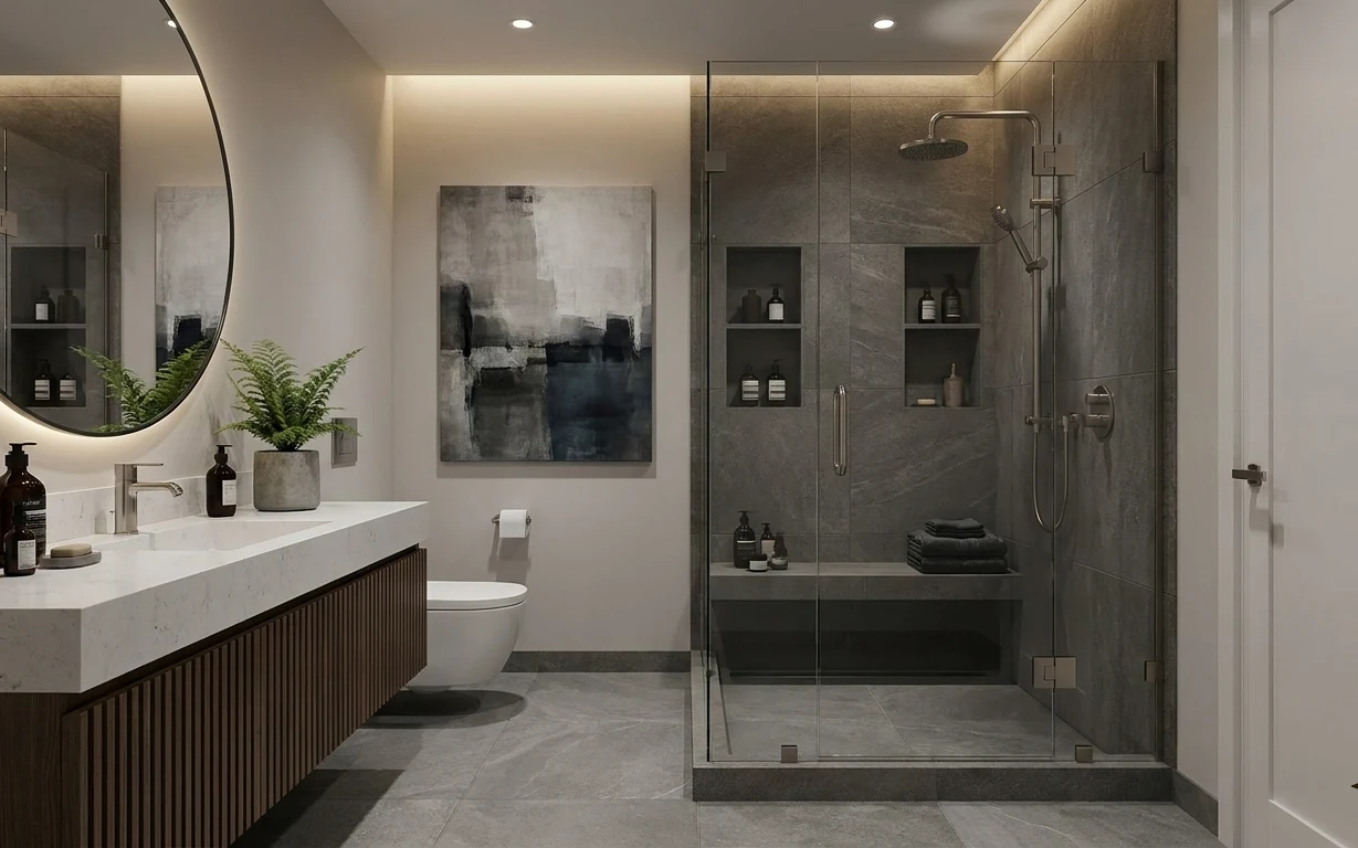
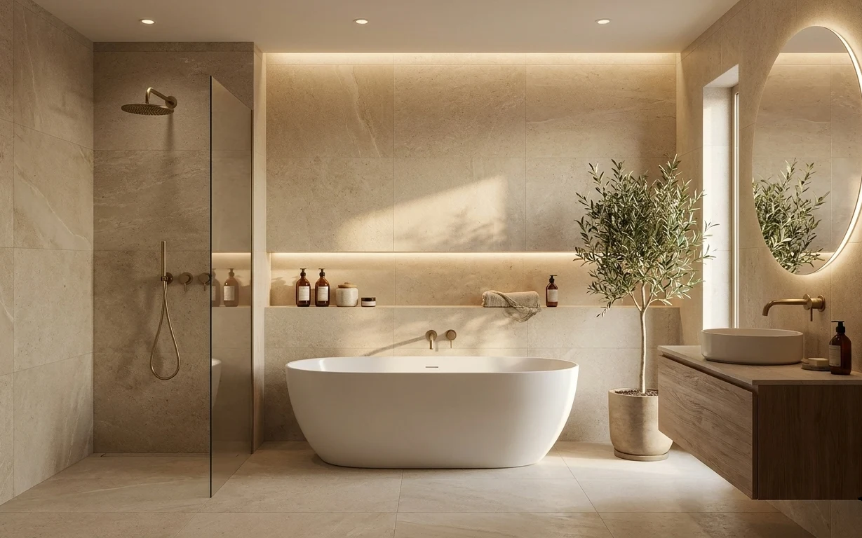
The hero already shows the “calm core” of a modern bathroom: gray tile as the backdrop, then warm hardware and crisp white surfaces. The round mirror, framed abstract wall art, and the wood vanity front with vertical slats give structure, while textures do the softness—folded towels on the shower niche ledge and the leafy potted fern on the counter. For shared housing, this is the part you can actually take with you: swap decor, keep the fixed plumbing alone, and style the visible surfaces every time you clean.
My first shared-bathroom mistake was treating it like a bedroom—too many random small items on every surface. The result looked busy, even when everything was “nice.” What changed my mind was noticing how the best setups repeat finishes and shapes: a round mirror echoes the curves of the shower glass, and the towel stack reads clean because it’s folded to the same height. When the styling is disciplined, you get that spa feeling without any permanent work.
Layer 1 — bar soap (decorative + travel-friendly) ($12) Small shape, same palette
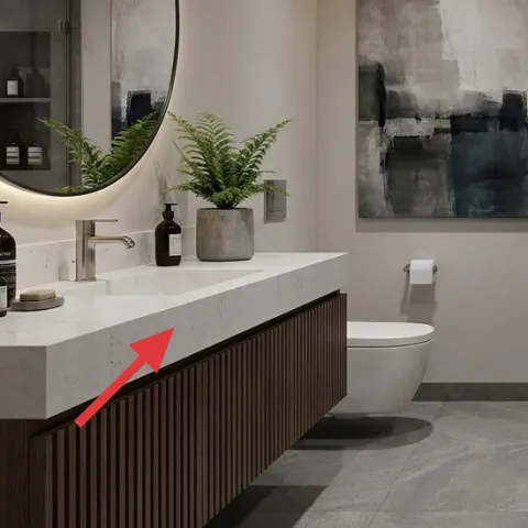
That little bar of soap on the bathroom counter matters more than it looks. Choose one with a matte label and a neutral color—cream, light gray, or even charcoal—so it blends into the gray-and-white base instead of fighting it. In the photo, it sits near the pump bottles, acting like a visual “breather” between taller items. The trade-off: bar soap is fussier than a plain refill, but it packs flat and stays move-ready when you’re swapping leases.
Use one label style
If the pumps are minimalist, keep the bar soap similarly simple so the counter reads intentional instead of curated-chaos.
Layer 2 — soap pump bottles on bathroom counter ($25) Matching glass + metal finish
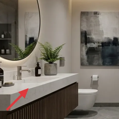
The pump bottles are the biggest “product styling” move in the whole bathroom. Go for a set in similar glass and dark-metal tones so the counter looks cohesive next to the round wall mirror. This is also why the scene feels spa-like: the bottles create a tidy grid, and the materials repeat with the warm hardware on the shower side. The trade-off versus buying a single matching pump: you’ll need a small refill routine, but the payoff is a clean, camera-ready surface you can rebuild anywhere.
Keep them off the edges
On a vanity with a white counter, a little breathing room around each bottle makes the wood slats feel calmer instead of crowded.
Layer 3 — folded towels on shower niche ledge ($30) Folded to one height
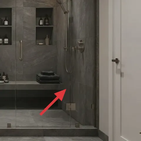
That folded towel stack on the shower niche ledge is doing heavy visual lifting. Pick two towel colors that match the photo’s temperature: warm white or soft light gray for the clean base, then one darker neutral for contrast. Fold them the same way every time (same width, same height) so the stack looks deliberate, not “I grabbed whatever was clean.” The trade-off: you have fewer opportunities to toss towels casually, but it’s also the fastest way to make the bathroom feel curated without any permanent install.
Avoid “ultra-plush” bulk
If towels are too thick, they’ll slump and lose the crisp stack shape you see here.
Layer 4 — potted fern plant ($35) Real greenery softens the gray
The potted fern adds that living texture the whole space needs—especially against gray tile and the dark wood vanity front. Choose a plant with lots of upright fronds so it fills vertical space like the photo, not something sprawling that spills over the counter edge. The ceramic pot tone is also important: aim for a neutral, stone-like finish that doesn’t compete with the warm metal on the mirror. The trade-off is upkeep, but it’s worth it for the instant “occupied but not cluttered” effect that still packs into a move.
Pick a plant you can lift easily
Choose the pot size you can carry one-handed; it keeps moving days realistic.
Layer 5 — round wall mirror ($80) Round shape for a modern counterpoint
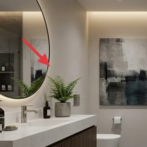
The round wall mirror is the visual anchor on the left side. A mirror like this instantly makes the bathroom feel more open because it bounces light across the white counter and the gray tile plane. For a shared-housing refresh, the key is choosing something you can take down cleanly—either a freestanding option or a version with renter-friendly mounting hardware. The trade-off: the round silhouette is less “rectangular grid” than some people prefer, but it’s exactly why the bathroom feels balanced instead of boxy.
Match the finish temperature
If the hardware is warm bronze, keep the mirror frame warm too; cool metals can fight the scene.
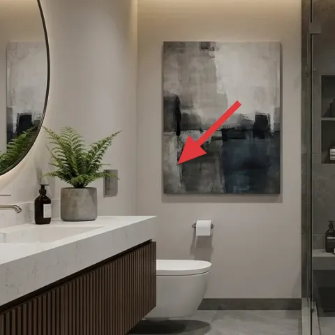
Layer 6 — framed abstract wall art ($45) One larger print, not a cluster
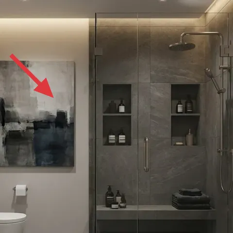
Instead of a tight gallery wall, the photo uses one larger framed abstract piece—an easier move-friendly choice because it’s one item to pack and protect. The grayscale brushwork and soft edges echo the tile and keep the look modern, not decorative-noisy. For renters, choose a frame that’s lightweight and easy to remove or pack flat; thick, heavy frames are the pain point during a move. The trade-off versus adding multiple prints: you lose some variety, but you gain clarity and a calmer focal zone.
Pick a frame size you can reuse
A standard 16×20-style print format is much easier to repurpose across future bathrooms.
Layer 7 — toiletry bottles on shower niche shelves ($25) Repeat the counter styling
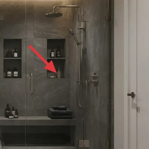
Those toiletry bottles on the shower niche shelves keep the styling consistent on both “sides” of the bathroom—the counter and the shower zone. Use the same bottle shapes and label style you picked for the counter so the gray-and-white environment stays cohesive. This layer works because it creates visual continuity: you’re not introducing new colors, just repeating the same rhythm at a different height. The trade-off: niche shelves are fixed, so this is only about swapping what you place there; still, it’s renter-friendly because bottles and accessories come with you.
Don’t overcrowd the shelves
Leave space between bottles so the gray tiles remain the dominant background.
The cost, layer by layer
| Layer | Item | Cost |
|---|---|---|
| 1 | bar soap (decorative + travel-friendly) | $12 |
| 2 | soap pump bottles on bathroom counter | $25 |
| 3 | folded towels on shower niche ledge | $30 |
| 4 | potted fern plant | $35 |
| 5 | round wall mirror | $80 |
| 6 | framed abstract wall art | $45 |
| 7 | toiletry bottles on shower niche shelves | $25 |
| Total | $252 | |
If you want a cheaper variant, keep the mirror and towels as the only “big” purchases, then downshift the rest to single-item essentials: one neutral soap bottle, one small plant, and a smaller framed print. That approach usually lands closer to a $200–$220 bathroom refresh depending on what you already own.
What worked, what didn't (across the whole room)
This bathroom reads polished because most of the changes are repeatable styling choices: tidy bottle groupings, one main piece of framed art, and a consistent towel fold height. The contrast between gray tile and warm tones stays soothing when the decor stays limited to a few materials.
What worked
- The round wall mirror gives soft shape contrast against gray tile and straight vanity lines.
- Repeating dark-metal cues in bottles and hardware keeps the countertop looking intentional.
- A folded towel stack reads clean from across the room, even with limited storage access.
- The potted fern adds organic texture so the palette doesn’t feel too sterile.
- One larger framed abstract print is easier to pack and less visually busy than multiple small pieces.
- Styling both the counter and shower niche shelves creates continuity at two heights.
What didn't
- Overcrowding the shower niche shelves makes the gray tiles feel visually noisy.
- Switching label styles between counter bottles and niche bottles breaks the spa-like rhythm.
- Using ultra-thick towels can ruin the sharp folded “stack” look.
- Picking a mirror frame with a cool undertone can fight the warm hardware temperature.
What we'd skip if we did it again
Skip adding a multi-piece wall gallery behind the toilet area. In a bathroom, wet-room humidity and limited wall space make small frames harder to keep aligned, and the result often feels busy next to the gray tile grid.
Skip towel sets with random colors “because they’re cute.” Pick one light neutral and one darker neutral so the towel stack echoes the gray-and-white palette instead of introducing new hues.
Skip mixing bottle finishes across zones. If the counter uses one kind of bottle glass and metal, keep the shower niche bottles consistent so the room feels designed rather than assembled from whatever was in the cabinet.
Frequently asked
How long does this bathroom refresh take?
Plan for about 60–120 minutes. The fastest part is swapping what’s visible: stacking towels to one height, clearing the counter, and replacing soap bottles. If you also change the framed abstract wall art and the round wall mirror, add time for careful packing and alignment. Everything here is designed to be move-friendly rather than permanent, so there’s no cure time or complicated installation.
Is this renter-friendly if I can’t drill into the walls?
Yes—this look is built from removable decor and textile swaps. For the round wall mirror and framed abstract wall art, choose renter-friendly mounting methods (or freestanding alternatives) that don’t damage paint. The tile and plumbing stay exactly as-is; the transformation comes from what you place on surfaces and walls.
What if my bathroom is smaller or has less counter space?
Go smaller and simplify. Keep one larger framed piece rather than multiple prints, and choose fewer bottles—one set for the counter plus a minimal arrangement for the shower niche shelves. For the towel stack, fold to the same height but use one color instead of two if you need to reduce visual mass. The key is repeating shapes and finishes, not adding more items.
Where should I shop for the mirror, art, and towels without overspending?
Start with towels and basics at mid-range home stores or reputable discount brands, then move to mirrors and framed art on sale. A good strategy is to buy the mirror and framed art from a retailer with easy returns, and buy bottles in a set so the label and finish style stays consistent. Thrift can work for decor, but make sure glass and frames are lightweight enough to move.
What’s the biggest mistake people make with a spa-like bathroom look?
The most common miss is using too many different styles at once—different label fonts, mismatched bottle shapes, or a towel stack that doesn’t match itself. Spa-style bathrooms usually rely on repetition: fewer materials, consistent finishes, and one main focal point. When the surfaces stay organized, the gray tile can look intentional instead of cold.
More in Bathroom
Under $300: 7 move-friendly bathroom swaps for shared housing
A modern, spa-like bathroom look you can rebuild for under $300 using 7 move-friendly swaps that pack into a few boxes. The checklist focus…
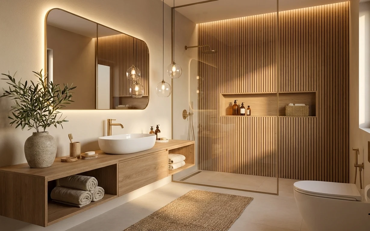
Under $800: 7 spa-style bathroom upgrades that fit a weekend
A spa-style bathroom refresh under $800: swap in an oval mirror, tune up the vanity area, and add warm brass and greenery. This weekend pro…
Under $500: a bathroom spa corner refresh with 7 renter swaps
A renter-friendly bathroom spa corner refresh with 7 swaps that keep the same warm, natural feeling. Everything in this look is move-ready …