
- Best for
- earthy-neutrals layering
- Cost
- under $300
- Difficulty
- easy (textiles + swaps)
- Time
- 3–5 hours
Why olive-and-rust palette is the sofa nook of 2026
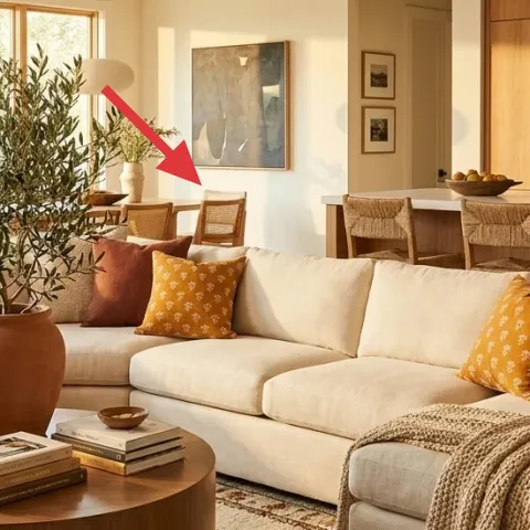
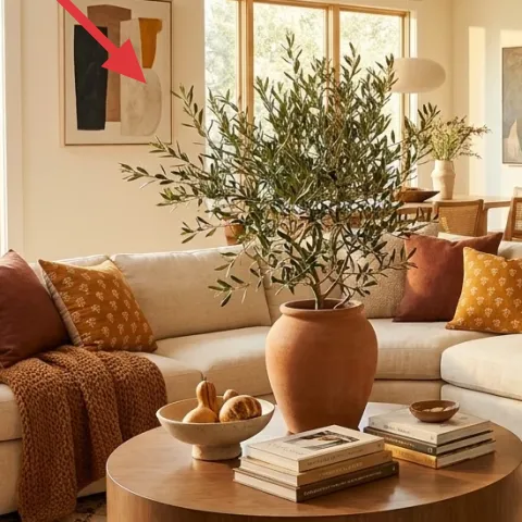
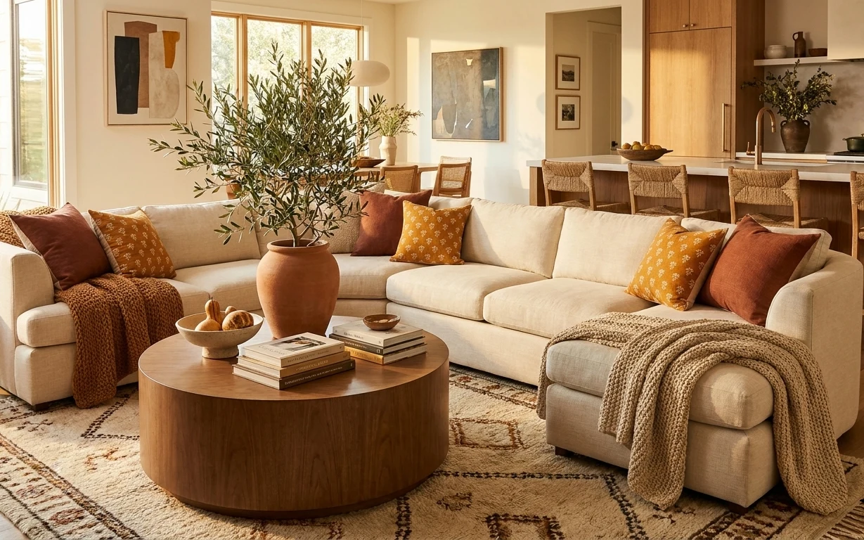
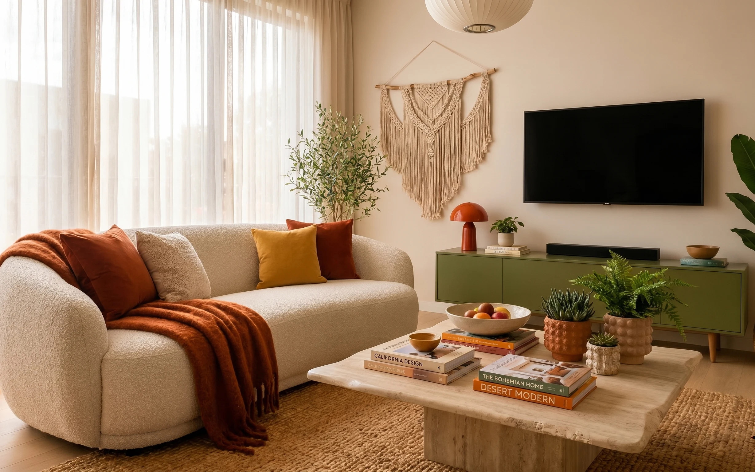
That cream sectional becomes a whole mood when it’s paired with olive foliage, warm clay tones, and soft texture you can swap without touching the room. In the photo, the chunky knit throw reads cozy against the smooth upholstery, while the rug adds a patterned anchor under the coffee table. The framed abstracts on the wall keep the look “finished” without committing to any permanent install. This kind of layered, earthy-neutral setup is achievable in shared housing because most of the changes are textiles, freestanding lighting, and boxed decor.
I used to overthink big-ticket items for rental living—then I caught myself buying decor that required wall hardware I didn’t actually have. What changed my approach was watching how easily the same palette works when the heavy lifting is done by rugs, throw scale, and one or two wall pieces. The result feels styled, but it’s still built to come with you when the lease ends.
Layer 1 — area rug (5×7) ($80) Pattern you can roll
The 5×7 patterned area rug is the move-friendly foundation here: it visually widens the seating zone and makes the coffee table feel intentional. A rug like this also hides the exact kind of small, real-life chaos that happens in shared homes—shoe scuffs, drink rings, and the occasional pet nail. The trade-off is that a pattern means you should keep pillow colors limited, or the rug can start to fight the textiles on the sofa. Compared with replacing the couch, a rug is cheaper, easier to pack, and the biggest visual payoff per box.
Pick a rug pattern with one dominant background
Use cream or tan as the base so your pillows and throw can keep their warm, earthy notes.
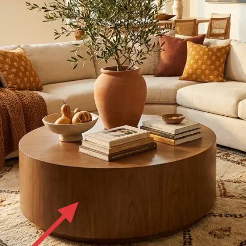
Layer 2 — round wooden coffee table ($80) Wood warmth without commitment
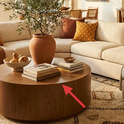
A round wooden coffee table brings the same warmth as the hero photo’s mid-century shape, and the rounded edge keeps the seating area from feeling too strict. If the current table in the space is already similar, this layer can be read as “style the existing table the same way,” but the swap idea is still furniture-light: smaller diameter tables fit in pickups and stack easily in transit. The trade-off is that round tops can look clutter-prone, so the styling matters more—fewer objects, more negative space. That’s why a simple book stack plus one bowl reads right.
Round shapes photograph softer
Because edges curve, the scene feels more organic next to olive leaves and warm textiles.
Layer 3 — chunky knit throw blanket ($25) Texture over matching
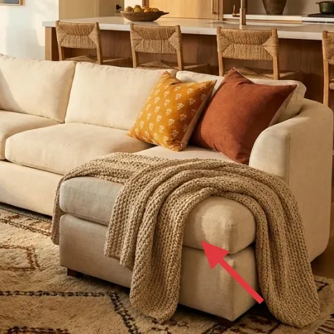
The chunky knit throw blanket does the visual heavy lifting on the sofa side—its ribbed texture catches warm light and makes the cream upholstery feel less plain. Choosing a throw over “more pillows” is a budget-friendly way to add depth because one large textile reads as a style choice from across the room. The trade-off: knit fabrics shed lint if they’re new, so a quick shake-out and gentle care matters. Compared with buying a whole new sofa, a throw is easy to roll, tuck, and store between moves.
Lay it where the light hits
In the photo, the throw sits near the arm/seat area where it gets natural glow and looks intentional.
Layer 4 — plug-in floor lamp with off-white shade ($40) Warm light, no wiring
A plug-in floor lamp with an off-white drum shade gives the same warm, lived-in feel without any electrical changes. In the hero image, the lamp’s shade keeps the light diffuse, which flatters the cream sofa and makes the olive leaves look richer rather than harsh. The trade-off is brightness control: with a basic lamp, the “mood” depends on bulb warmth and how close the lamp sits to the seating. Still, the advantage for shared housing is huge—no drilling, no hardwired fixtures, and the lamp packs into a few pieces.
Don’t buy a lamp with a shade that’s too reflective
Shiny interiors can create glare on framed art and wash out the terracotta tones.
Layer 5 — framed abstract wall art print ($25) One print, two tones
The framed abstract wall art print keeps the palette modern and calm, especially because it echoes the warm neutrals and muted shapes already happening in the room. A single framed print is also easier than building a full gallery wall—more affordable, faster to place, and easier to transport in one flat bundle. The trade-off is scale: if the print is too small, it can look lost above a sofa, so measure the available wall zone first. Swapping wall decor is one of the most renter-safe “high impact” changes because frames can be carried directly to the next place.
Match frame color to the wood tones
That’s how the art stays cohesive with the coffee table and the kitchen wood in the background.
Layer 6 — large terracotta vase ($15) Clay color that reads from afar
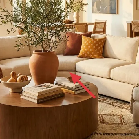
A large terracotta vase adds the same clay warmth that shows up in the cushions and throw, and it’s visible even when the coffee table is “doing its job.” It works because terracotta is a bridge color: it sits between olive green and cream upholstery, so everything looks connected. The trade-off is that a vase can look empty if the plant or stems are too sparse—so keep it filled, even if it’s just a simple branch or greens from the grocery store. Compared with buying multiple small decor objects, one statement vase simplifies packing and unpacking.
Use one vase, not five small pieces
One grounded object prevents the table from turning into visual clutter.
Layer 7 — dyed pillow covers (terracotta + ochre mix) ($12) A color pop you can undo
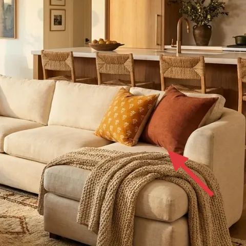
Dyeing pillow covers lets the sofa look more “curated” without buying new prints or trying to match every pattern in the room. The hero photo’s pillows blend warm oranges with the cream base, so dyed covers are the quickest way to pull that off while staying move-friendly—covers come off in minutes and fold into a box. The trade-off is that fabric type matters: dye takes differently on natural fibers than on synthetics. If the covers in the space are already decent, this approach upgrades color while keeping the overall look cohesive.
Make it instead of buying it
Dyed pillow covers so the sofa gets that terracotta-and-ochre warmth without hunting for the exact pattern match.
Materials
- Fabric dye — 1 packet — craft store — $3
- Salt — 1 small box — grocery store — $1
- Rubber gloves — 1 pair — drugstore — $1
- Plastic tub/large bowl (spare) — 1 — at home — $1
- Paper towels/drop cloth (spare) — 1 lot — at home — $0
Steps
- Pre-wash covers so they dye evenly (follow care label, no fabric softener).
- Fill a tub with warm water and dissolve the dye packet completely.
- Stir in salt to help set the color.
- Submerge the pillow covers and stir every few minutes for even saturation.
- Remove and rinse in cool water until it runs mostly clear.
- Dry flat or hang dry, then fluff and insert pillow forms.
Total DIY cost: $6 — saves about $6 over buying.
The cost, layer by layer
| Layer | Item | Cost |
|---|---|---|
| 1 | Area rug (5×7) | $80 |
| 2 | Round wooden coffee table | $80 |
| 3 | Chunky knit throw blanket | $25 |
| 4 | Plug-in floor lamp with off-white shade | $40 |
| 5 | Framed abstract wall art print | $25 |
| 6 | Large terracotta vase | $15 |
| 7 | Dyed pillow covers (terracotta + ochre mix) | $12 |
| Total | $277 | |
If a full round table swap isn’t realistic, a cheaper variant is styling your existing coffee table with the same “book stack + bowl” setup and prioritizing the rug and lamp first.
What worked, what didn't (across the whole room)
The overall look succeeds because it repeats a small set of warm materials—cream fabric, warm wood, terracotta, and olive foliage—across multiple heights. The textures do a lot of the calming work: the knit throw against smooth upholstery and the patterned rug under the coffee table keep the room from reading flat. The framed art also lands well because it doesn’t compete with the pillows.
What worked
- The rug anchors the sofa nook and makes the coffee table placement feel intentional.
- The chunky knit throw adds texture contrast without changing any fixed furniture.
- The plug-in floor lamp keeps the warm tone consistent after dark.
- One framed abstract print keeps the wall looking finished without a big install.
- The terracotta vase ties together the pillow colors and the wood tones.
- Dyed pillow covers adjust color fast for the next lease and pack away easily.
What didn't
- A lamp shade that’s too small can make the room feel dim even with a warm bulb.
- If the pillow dye turns blotchy, the whole palette looks less intentional.
- Using too many small objects on the coffee table competes with the rug pattern.
- A frame that’s undersized above the sofa can make the wall feel unfinished.
- A rug with a busy background can fight the terracotta pillows instead of grounding them.
What we'd skip if we did it again
Skip buying matchy-matchy “living room sets.” The photo works because pieces share color echoes, not because every item is from the same collection.
Skip hard-to-remove wall options that depend on strong adhesives. For a shared-housing setup, choose framed art that can be taken down cleanly and brought to the next place.
Skip overbuying pillows to solve the color problem. Start with one knit throw and one dyed cover set, then add only one more accent after the rug and lamp are in place.
Frequently asked
How long does this sofa nook refresh take?
Most of the changes are textiles and freestanding swaps, so the bulk is fast: rug + throw + pillow cover updates can be done in under an hour. Adding a plug-in floor lamp and placing one framed print usually takes another hour or two. The only slower part is dyed pillow covers—plan for drying and rinsing time, plus a short laundry-and-care pause.
Is this renter-safe for shared housing?
Yes, the plan is built around movable items: a rolled or folded rug, a plug-in floor lamp, and pillow covers that come off without touching fixed fixtures. The framed abstract print is also transportable, so it’s easy to re-hang later with renter-appropriate hanging methods. Nothing permanent is required, and everything fits into boxes when it’s time to move.
What if my living room is smaller than the photo?
Go smaller on the rug size but keep the palette consistent: cream background, warm wood tone, and one olive/terracotta accent. Use fewer pillows so the sofa doesn’t look crowded. Keep the coffee table styling minimal—one bowl or one book stack—so the tighter footprint still feels intentional.
What if my space is bigger and needs more presence?
Keep the rug pattern but size up, or add a second rug layer by placing a smaller textured mat over the larger one. Add a taller lamp or bring the lamp slightly closer to the seating so the light reads on the sofa. For wall art, scale up to a wider framed print so the art balances the sofa length.
Where should these pieces be shopped if prices matter?
For the rug, look for affordable area rugs in the classic neutral-cream palette and confirm the dimensions before buying. Floor lamps and side tables show up often in thrift stores with workable shades and cords. Framed prints are usually cheapest at discount home stores and thrift markets; use the same color tones to keep the palette cohesive.
What’s the biggest mistake to avoid in a sofa nook like this?
Overdoing the number of competing patterns. The rug already carries visual movement, and the pillows plus throw bring texture, so choose a limited set of colors. If a new item doesn’t echo terracotta, cream, or olive, it will stand out in a way that feels accidental.
More in Living Room
Under $300: olive-and-rust sofa nook refresh
A move-friendly living-room sofa nook refresh built around earthy textiles, warm lamp light, and two framed prints—no drilling, no permanen…
Under $1,000: olive-and-rust living room refresh
A cozy sofa seating area with rust-orange accents, cream textures, and an olive sideboard. This weekend refresh adds seven high-impact swap…
Under $600: earthy-green living room seating refresh
A move-friendly living room refresh that recreates the olive-green, terra-cotta, and warm-wood look. All-in for under $600 with 7 renter-sa…