- Best for
- Texture-rich living rooms
- Cost
- Under $600
- Difficulty
- Mostly shopping + arranging
- Time
- 1 weekend
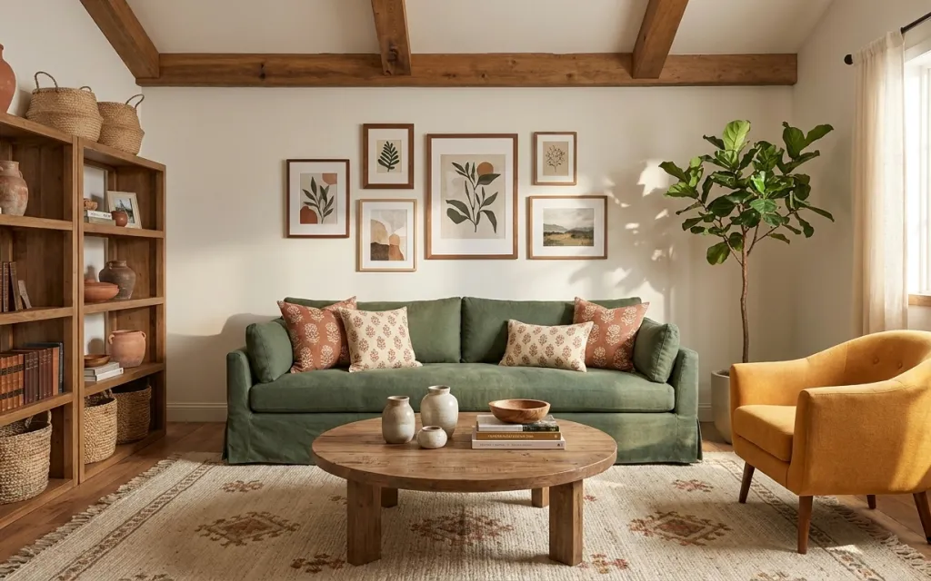
Why olive-and-terra-cotta styling is the sofa seating nook of 2026
Start with the big “color handshake”: the patterned rug under a deep olive sofa and warm wood coffee table. Then echo that palette in small, repeatable textiles—those terra-cotta patterned throw pillows work the same way as a magazine spread that mixes motifs instead of matching exactly. The room also gets structure from the framed botanical/leaf print cluster (clean frames, varied sizes) and softness from beige curtain panel pairs that sit right by the window. For a renter, this is achievable because it’s mostly fabric, art, and styling objects you can pack up when the lease ends.
I used to think wall art should be “exactly symmetrical.” On my own place, I tried to force five frames into the same grid and it looked stiff. The fix was paying attention to scale and spacing instead—the way this cluster gives you a strong center but still lets individual leaf prints read like separate moments. That’s what makes the whole nook feel styled, not fussy.
Layer 1 — patterned area rug (5×7) ($200) Ground the colors with a warm, patterned base

The patterned area rug is the foundation here: it brings the warm wood floor into the sofa zone and repeats the room’s terra-cotta tones without fighting the olive upholstery. A rug like this is also the easiest renter win—swap it in and out without touching the underlying flooring. I’d choose a 5×7 when the seating area is the only true “destination,” since it reads cohesive under the coffee table and front sofa edge. The trade-off is that patterns show foot traffic more than plain rugs, so occasional vacuuming matters, but the warmth payoff is worth it.
Pick a rug with a mid-tone in the pattern
That keeps your rug from looking either too busy or too washed out next to an olive sofa.
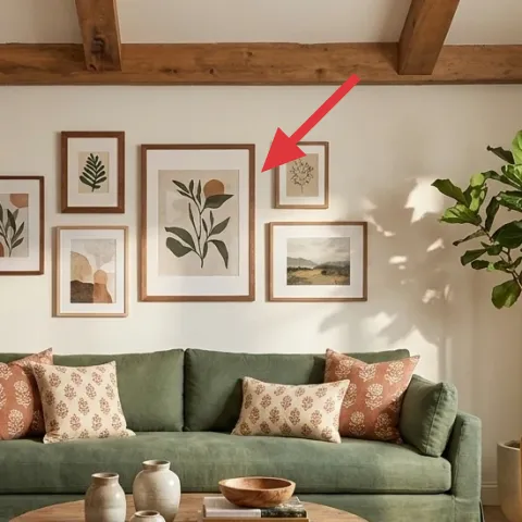
Layer 2 — framed botanical/leaf print gallery (5–7 prints) ($180) Use one repeat theme instead of random frames

This framed botanical/leaf print gallery is doing the heavy lifting on the wall: matching subject matter (plants) and keeping frame styles consistent gives you cohesion even when the leaf shapes vary. It also balances the sofa’s blocky, low line, so the wall feels intentional rather than empty. I went with a 5–7 print gallery approach instead of a single oversized piece because the smaller prints create movement and let daylight bounce around the arrangement. The trade-off is that spacing takes a little patience—measure the grid/spacing once, then follow it—otherwise the cluster can start to feel scattered.
Clean frames keep the look calm
When the print content is organic, the frame is what prevents the wall from going chaotic.
Layer 3 — throw pillow covers (patterned mix) ($30) Add terra-cotta accents without changing the sofa
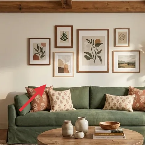
Those patterned throw pillow covers are the quickest way to connect the rug’s rust notes to the olive sofa. Notice the mix: the motifs feel related, not identical—so the room reads collected rather than “set dressing.” I’d pick one pillow cover with a bolder pattern and one with a smaller print (same color family) so the sofa looks styled from across the room. If the obvious move is buying a matching pillow set, this is the alternative: mix at the pattern level, then repeat color to keep it unified. The trade-off is that your pillow covers will need a quick fluff adjustment every week or two.
Keep one color constant across the patterns
Matching on color is what lets different pattern scales play together.
Layer 4 — tall leafy potted tree ($80) Bring vertical life to the corner by the window
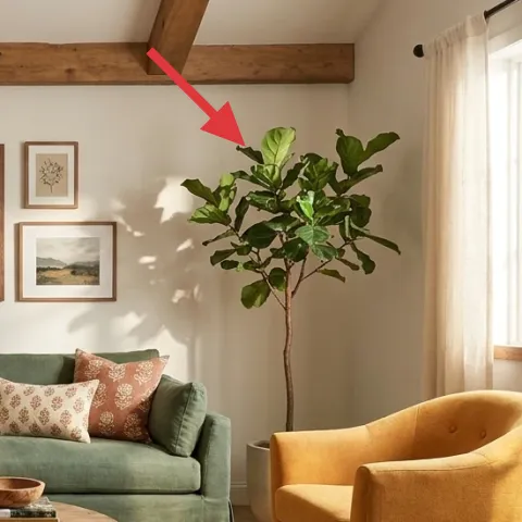
The tall leafy potted tree gives the room its vertical energy, which matters because the sofa and coffee table keep everything fairly low. Placing it near the window also helps it look “natural” in bright daylight—like it belongs there, not like a last-minute accessory. I’d choose a 4–6 ft tree because it can read as a focal point even with a busy rug and a framed print cluster nearby. The trade-off is ongoing light awareness: if the leaves start leaning, rotate the pot so the silhouette stays even.
Don’t tuck the pot behind the curtain
You want leaves visible above the curtain line so the corner reads full, not partially hidden.
Layer 5 — beige curtain panel pair (84") ($80) Soften the right side without blocking the light
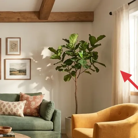
Beige curtain panel pairs do two jobs at once: they soften the hard line of the window frame and they warm the palette with a neutral that echoes the rug’s sandy tones. This length matters—the look here suggests panels that fall close to the bottom, so the fabric creates a calm vertical frame for the plants and sofa. I’d rather do curtains than swap hard elements because it’s renter-friendly and fully reversible at move-out. Trade-off: if panels are too short, the whole window zone starts looking unfinished; if they’re too long, they can drag, so measure before you buy.
Let the curtains repeat the wall warmth
When curtains are in the same beige family as the walls, they disappear visually in the best way.
Layer 6 — decorative tray (on coffee table) ($35) Style the tabletop like a small vignette
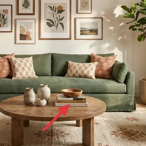
The decorative tray is how the coffee table stays curated instead of random. With small ceramic vases and a bowl grouped on top, the tray creates a boundary that makes the objects look like they’re intentionally “staged” for daily living. If you’re deciding between a tray and just loose décor, choose the tray: it reduces visual clutter and makes future swaps easier because you can re-arrange items within the same footprint. The trade-off is that you’ll need to keep the tabletop decluttered—if everything is “important,” the tray can’t do its job.
Use the tray to control height
Stack one short item with one slightly taller piece to avoid a flat row.
Layer 7 — framed botanical/leaf print (single 16×20) ($80) DIY one frame to match the gallery rhythm
Make it instead of buying it
DIY one framed botanical/leaf print by hand-painting an abstract leafy design on cardstock, then sliding it into a 16×20 frame to match the gallery wall.
Materials
- Cardstock (pack of 10–20) — A4 or letter — local craft store — $12
- Acrylic paint set — basic earth tones — craft store — $10
- Paintbrushes (small round + flat) — 2-pack — craft store — $6
- Painter’s tape — 1 roll — craft store — $8
- Matte varnish spray (optional for protection) — small can — craft store — $6
Steps
- Sketch a loose leaf silhouette on cardstock with light pencil marks.
- Tape simple bands or leaf veins so you get clean, graphic shapes.
- Paint one leaf at a time using acrylics, starting with lighter tones.
- Let the first layer dry completely (about 20–30 minutes).
- Add a second layer for depth with darker olive/russet strokes.
- Let the painting dry again fully, then remove tape.
- Optional: lightly varnish for a consistent, less-splotchy finish.
- Let the varnish dry fully, then press the paper under a book for 10 minutes.
- Slide the finished cardstock into the 16×20 frame mat opening.
Total DIY cost: $42 — saves about $38 over buying.
That single framed print keeps the gallery feeling cohesive because it shares the same botanical language as the other frames, while letting you personalize one “leaf” shape. I’d DIY this one instead of the whole wall because the spacing and frame alignment are already handled by the purchased set. The best part is that you can match palette by mixing muted olive greens with terra-cotta highlights—so it doesn’t stand out like a mismatch. The trade-off is drying time between paint layers, but once it’s framed, you can treat it exactly like the other prints.
Choose one dominant leaf color
If you keep one main tone consistent, your DIY still reads intentional among store-bought prints.
The cost, layer by layer
| Layer | Item | Cost |
|---|---|---|
| 1 | Area rug 5×7 | $200 |
| 2 | Gallery set (5–7 framed prints) | $180 |
| 3 | Throw pillow cover | $30 |
| 4 | Indoor plant (4–6 ft) | $80 |
| 5 | Curtain panel pair (84") | $80 |
| 6 | Decorative tray | $35 |
| 7 | Framed art print 16×20 (DIY equivalent) | $80 |
| Total | $585 | |
If you need it cheaper, swap the rug for a simpler flat-weave and reduce the framed set to 3 matching prints. Keep the tall leafy plant (it’s the vertical anchor) and put the budget into curtains that hit about the same visual height.
What worked, what didn't (across the whole room)
The winning combination is “one palette, multiple textures”: the olive seating, patterned rug, and botanical frames all share warm earth tones. The second win is vertical layering—curtains and the tall tree keep the nook from feeling too low and wide. The only area that takes restraint is the tabletop styling; it’s easy to overdo.
What worked
- The patterned rug ties together the wood floor warmth and the terra-cotta pillow accents.
- The botanical/leaf frames keep the wall cohesive even with varied leaf shapes.
- Beige curtains soften daylight and frame the plant without adding visual clutter.
- The tall leafy tree adds height so the sofa doesn’t feel visually heavy.
- The decorative tray organizes small ceramics into a deliberate coffee-table vignette.
- Mixing pillow patterns by color family prevents the sofa from looking flat.
What didn't
- If the framed prints are hung too high, the sofa looks separated from the wall.
- Using one pillow pattern without a second scale makes the seating look unfinished.
- Too-short curtains make the window feel chopped off against the tall tree.
- Leaving tabletop items loose makes the coffee table look crowded instead of styled.
What we'd skip if we did it again
Skip buying a full “matching set” of identical pillow covers. This nook looks right because patterns vary in scale while staying in the same olive-and-terra-cotta family.
Skip extra-large statement wall art if the goal is warmth and movement. A cluster of botanical frames reads more natural next to a green sofa and rug pattern.
Skip rushing the curtain decision. Get the length right so the fabric falls in the same visual zone as the plant and coffee table—then the whole seating nook looks planned.
Frequently asked
Is this renter-friendly if my lease doesn’t allow any holes?
Yes—this look is built from renter-safe swaps: a rug, removable-framed print gallery pieces, curtain panel pairs, a tall potted tree, and small styled décor on a tray. The only “wall” work here is hanging art using renter-appropriate methods that don’t damage paint, so you can pack it away at move-out.
How long does it take to set up everything like the photo?
Plan for about a day to shop and a couple of hours to assemble the coffee-table vignette and place the rug and plant. The longest part is the framed print cluster—measure once, dry-lay the arrangement, then hang. If the DIY print is included, add a few hours for paint drying between layers.
What if my living room is smaller than this one?
Keep the palette, but scale the composition down: use a smaller rug size and reduce the framed set to 3–4 prints while maintaining the same botanical theme and matching frame style. A slightly shorter plant (still leafy) can work, as long as it stays visually vertical by the window.
Can I recreate it with a different sofa color?
Definitely. The key is to keep the “handshake” colors consistent: warm rust/terra-cotta accents plus olive or green tones. If your sofa is neutral, the rug pattern and pillow covers become the color anchor, and the botanical frames will still tie the wall together.
Where should I shop for these items without it looking generic?
Start with sources that do textiles well: rug and curtains from places with lots of neutral patterns. For wall art, choose a set where the frames match and the prints share a theme (like leaves). For the plant and décor, prioritize quality shapes over exact species—healthy foliage reads better in photos.
More in Living Room

Under $600: earthy-green living room seating refresh
A move-friendly living room refresh that recreates the olive-green, terra-cotta, and warm-wood look. All-in for under $600 with 7 renter-sa…
Under $700: earthy living room refresh with move-ready swaps
An earthy living room refresh that leans on warm lighting, a patterned rug, and mix-and-match art. This renter-friendly setup stays move-re…
Under $350: airy boho living room refresh with 7 move-friendly swaps
A sunlit boho living room refresh built for shared housing: swap in a new rug, curtains, and textiles, then add framed art, a tray styling …