
- Best for
- warm neutral texture + renter swaps
- Cost
- about $545 total
- Difficulty
- easy (no drilling)
- Time
- about a weekend
Why warm beige-and-walnut styling is the renter-friendly living room of 2026
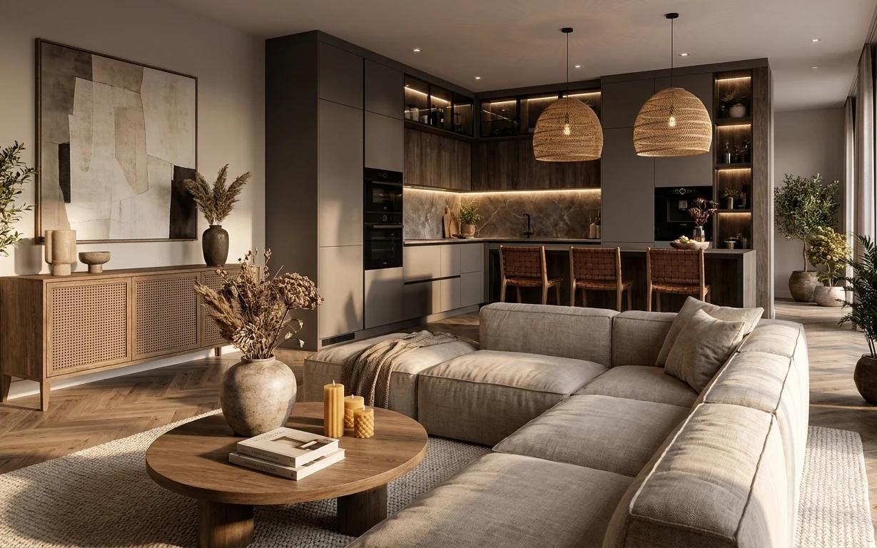
Look closely and it’s not “more stuff,” it’s texture and a repeatable color story: warm beige throw pillows, a soft, natural-looking rug underfoot, and wood surfaces that keep everything grounded. The coffee-table vignette—decorative tray, candles, and books—makes the room feel intentional even without changing any built-ins. I also love how the framed abstract print adds contrast with its charcoal-gray and off-white tones, then the floor plants soften the edges with green. This is achievable for renters because every swap here is removable or meant to move with you.
I used to overdo decor on coffee tables—like, three different heights plus a random candle holder, all at once. Then I realized the room was already busy with large architectural lines, so the styling needed restraint. In this setup, the tray anchors the whole moment, and the candles repeat the warm palette instead of adding another material family. The result feels curated, not cluttered.
Layer 1 — area rug (jute-look 8×10) ($200) texture underfoot
Start with the rug because it changes how the entire sofa reads. In the photo, the area rug looks like a jute or jute-look weave: light beige with a subtle pattern that warms up the charcoal-gray upholstery without going creamy-white. Choose an 8×10 style with low pile so it sits flat and doesn’t fight the clean lines of the furniture. A plain, thick rug can make the room feel heavy; the woven look keeps it breathable. The trade-off is vacuuming more often to avoid lint buildup, but the texture payoff is the whole vibe.
Pick the rug before the pillows
A rug sets the neutral temperature, so pillow covers look “matched” instead of randomly beige.
Layer 2 — round wooden coffee table ($120) one wood shape to repeat
The round wooden coffee table is doing a quiet job: it softens the straight kitchen lines behind it while echoing the console’s wood warmth. Aim for a medium walnut or oak tone with a matte finish, so it doesn’t glare under overhead lighting. A rectangular coffee table would feel more formal and boxy against the sectional, while a smaller round one can disappear under the pillow pile. This size keeps the styling centered and readable from the sofa. The trade-off is that round tables can be slightly harder to decorate symmetrically, but a tray makes it simple.
Match the undertone, not the exact shade
If your console is slightly warmer or cooler, a “close enough” wood tone still reads cohesive.
Layer 3 — throw pillow covers (neutral textured mix) ($45) softens the charcoal sofa

Those throw pillows are what make the sofa look inviting without adding color. The covers in the image mix neutral textures—think linen-like and subtly patterned fabrics—so the gray upholstery doesn’t look flat. For a renter-friendly version, buy pillow covers (not permanent upholstery changes) in 3 neutrals that relate to your rug: oatmeal, warm taupe, and a darker charcoal accent. Avoid bright whites; they pop too much against the warm wood. If you go too matchy, the sofa loses depth—texture is the point here. Keep inserts off the guest-bathroom vibe and choose plump but structured covers.
Let texture be your color
When your palette is beige + charcoal, varied weaves keep the look rich without introducing new hues.
Layer 4 — framed abstract art print ($80) makes the palette feel intentional
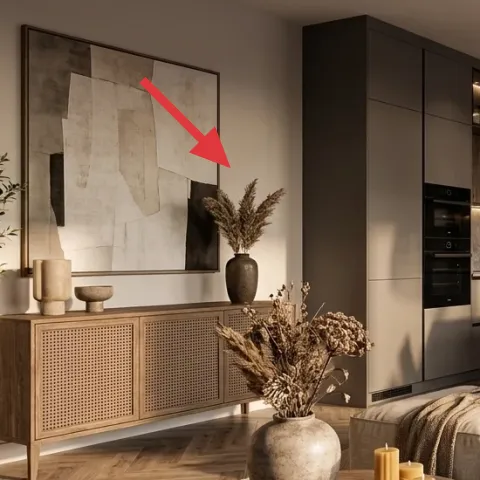
The framed abstract art print on the wall is the visual “permission slip” for the whole palette. It’s mostly off-white with charcoal-gray blocks, which is why the room feels coordinated instead of random. Choose a print that includes both light neutrals and at least one darker element (charcoal, graphite, or warm gray). If the art only has one tone, the sofa and rug will compete rather than harmonize. This layer is also easy for renters because framed prints are designed to be rehung with removable methods (like Command hooks) instead of renovations. The trade-off: keep it centered and level, or the whole room will look slightly off.
Skip metal frames with heavy shine
Glossy frames can reflect pendant and recessed light, creating distracting highlights behind the sofa.
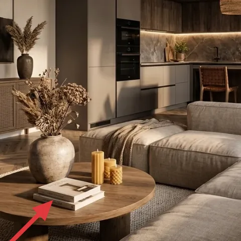
Layer 5 — decorative tray on coffee table ($25) turns loose objects into one vignette
On a coffee table, a decorative tray is the difference between “styled” and “stuff everywhere.” In the photo, the tray holds the candle moment and helps the books look like part of a plan. Pick a tray in a natural material that echoes your wood—walnut, light wood, or a woven/rattan look—or one in a warm neutral that won’t clash with the rug. Avoid overly cool-toned metals unless your wall art has matching grays, because they can make the whole room feel icy. A tray also protects the surface from candle drips and dust rings. The trade-off: you’ll need to clear the table briefly to dust under it.
Use the tray to control height
When everything sits on one base, you can layer candles and books without the vignette looking messy.
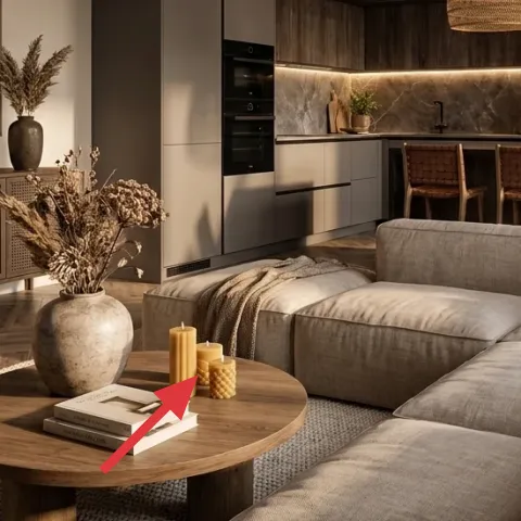
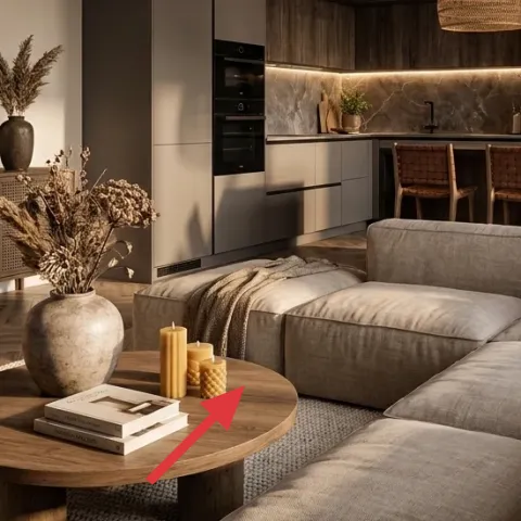
Layer 6 — candles in a tray grouping ($35) warm glow you can DIY

Make it instead of buying it
DIY a small candle pour to match the warm-beige palette, then pour right into reusable jars so you can pack everything up later.
Materials
- Candle wax — about 1 lb — craft store — $15
- Wick kit (pre-tabbed) — 2–3 wicks — craft store — $6
- Candle jar (reused jars or small glass jars) — 2 jars — home goods — $8
- Parchment paper or scrap cardboard for workspace — 1 sheet — at home — $0
Steps
- Clean and dry jars, then position wicks centered using a wick holder or a pencil bridge.
- Set up a water bath (double boiler) and melt wax slowly until fully liquefied.
- Pour wax into jars, keeping wicks upright and centered.
- Let candles cool at room temperature until solid.
- Trim wicks and test-burn for 30–60 minutes.
- Style the finished candles on your tray grouping.
Total DIY cost: $29 — saves about $6 over buying.
If you’re recreating the photo’s mood, the candle grouping is doing more than “smelling nice.” It adds warm, low light that makes the gray upholstery feel softer, and it reinforces the warm beige tones from the rug and wood table. Keep the candle shapes similar (tapered or pillar-style) and cluster them on the tray so they read as one composition. Buying can get pricey fast, so this pour keeps the candle look while staying renter-move-friendly. The trade-off: you’re committing a bit of time to pour and cool, but the jars pack up neatly for a move.
Keep flames small and centered
A short burn and centered wicks keep the tray grouping neat instead of melting unevenly.
Layer 7 — indoor plant in a floor pot ($45) green balance beside the sofa
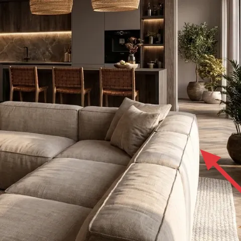
Plants are the easiest way to make a warm neutral room feel lived-in, and the floor pots next to the sofa help the green look “part of the architecture.” Choose a medium-height plant with small-to-medium leaves so it fills the space without blocking sightlines into the kitchen area. In the image, the pot sits near the right side of the room, creating a counterbalance to the large framed art on the left. If you go too tall, the plant can dominate the composition; too small and it disappears. The trade-off is occasional watering and dusting, but removable pots are perfect for renters.
Match leaf shape to your art
Organic leaf silhouettes soften the straight lines and geometric art blocks.
The cost, layer by layer
| Layer | Item | Cost |
|---|---|---|
| 1 | Area rug (jute-look 8×10) | $200 |
| 2 | Round wooden coffee table | $120 |
| 3 | Throw pillow covers (neutral textured mix) | $45 |
| 4 | Framed abstract art print | $80 |
| 5 | Decorative tray on coffee table | $25 |
| 6 | Candles in a tray grouping (DIY equivalent) | $35 |
| 7 | Indoor plant in a floor pot | $45 |
| Total | $545 | |
A cheaper variant: swap the coffee table for a lighter-tone round table from a discount home store, choose a lower-cost rug in the same warm beige family, and use one “hero” framed print instead of upgrading anything else. You can also stretch the pillow layer by buying two covers instead of three.
What worked, what didn't (across the whole room)
This look works because it’s built from a repeatable system: warm neutrals, wood warmth, and texture placed in the right spots (underfoot, on the sofa, and at coffee-table height). The framed art and tray make the palette feel intentional even when the kitchen behind it is darker.
What worked
- The jute-look rug grounds the charcoal sofa while keeping the room bright and breathable.
- The round coffee table softens the sectional’s blocky shape and makes styling easier to center.
- Neutral textured pillow covers add depth without introducing new colors that fight the wood tones.
- The framed abstract print ties wall and furniture colors together through off-white and charcoal values.
- The tray turns candles and books into one controlled vignette instead of scattered objects.
- The floor plant adds green balance so the warm palette doesn’t feel flat.
What didn't
- High-gloss accessories would reflect overhead lighting and make the coffee table look busy.
- Matching everything in one exact beige shade can flatten the sofa instead of adding dimension.
- A too-large framed print would overpower the console wall and pull focus from the sofa.
- If the rug is too dark, the room loses the warm-beige “lift” the photo has.
- Overstuffed candle groupings can look cluttered on a round surface.
What we'd skip if we did it again
Skip buying a second, darker throw blanket “just in case.” In this palette, extra fabric layers can make the sofa feel heavier than the room needs, especially with charcoal upholstery already present.
Skip a trend-led color accent (like bright teal or hot orange). The room already has strong neutrals and wood warmth, so adding a loud color usually creates a second theme instead of sharpening the first.
Skip an oversized framed print in a thin frame. A big frame can fight the console and pull focus from the sofa-and-kitchen balance, while very flimsy frames can warp visually against recessed lighting.
Frequently asked
How long does this kind of living room refresh take?
Plan for about a weekend. Rug sizing and pillow swaps take the longest because you’ll want to vacuum and adjust the placement until it feels centered with the sofa. Framed art usually goes up in under an hour if you measure first and use removable hanging hardware. Candle pouring adds a separate cooling window, but it’s largely hands-off time.
Can renters really do the art and candles without permanent changes?
Yes—framed art is exactly the kind of layer renters can move with. Use removable hanging methods (like Command hooks) that match the frame’s weight, and keep everything level. Candles are also fully renter-safe: you can pour, style, and pack the jars when the lease ends. The only part that’s “timing-dependent” is letting candles set and trimming wicks before styling.
What if my room is smaller than this photo?
Choose a rug that still feels proportional—usually a 5×7 or 6×9 rather than a full 8×10—so the sofa anchors the rug instead of floating over it. For pillows, keep the mix to two neutrals and one darker accent cover. Consider a slightly smaller framed print so the wall doesn’t visually crowd the console area.
What if my living room is larger and needs more “presence”?
Scale up the rug size first. A bigger rug makes the sofa feel intentional and prevents the coffee table vignette from looking isolated. You can also increase the plant presence by adding a taller floor pot or choosing a plant with fuller foliage, but keep the coffee table styling restrained so it doesn’t compete with the larger wall area.
Where can I shop for a similar warm beige-and-wood look without overspending?
Look for rug options in natural-fiber or jute-look categories, then match the palette with neutral pillow covers in oatmeal and taupe. Framed abstract prints are widely available, but keep an eye on the color values—off-white and charcoal matter more than the specific artwork. For candles and trays, department-home brands and craft stores are usually the sweet spot.
What’s the biggest mistake renters make with this style?
Most people add too many new colors at once—like mixing beige, cream, and random accent colors—then wonder why the room feels fussy. The photo succeeds because it repeats warm neutrals, wood warmth, and texture. Build from the rug outward: rug first, then pillows, then art, then the coffee-table grouping.
More in Living Room
Under $600: warm neutrals living room refresh with 7 renter swaps
A warm beige-and-charcoal living room look is easier than it looks. This renter-friendly refresh uses 7 swaps—rug, coffee table styling, th…
Under $600: warm wood-and-linen living-and-dining nook refresh
A warm, japandi-leaning living-and-dining nook refresh that keeps most changes renter-safe and easy to pack up. This look comes together fo…
Under $300: olive-and-rust sofa nook refresh
A move-friendly living-room sofa nook refresh built around earthy textiles, warm lamp light, and two framed prints—no drilling, no permanen…