- Best for
- easy renter styling
- Cost
- $600 total
- Difficulty
- easy
- Time
- 2 afternoons
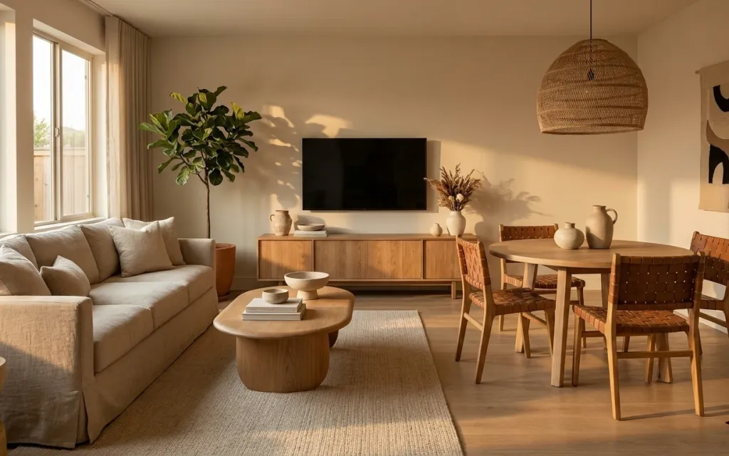
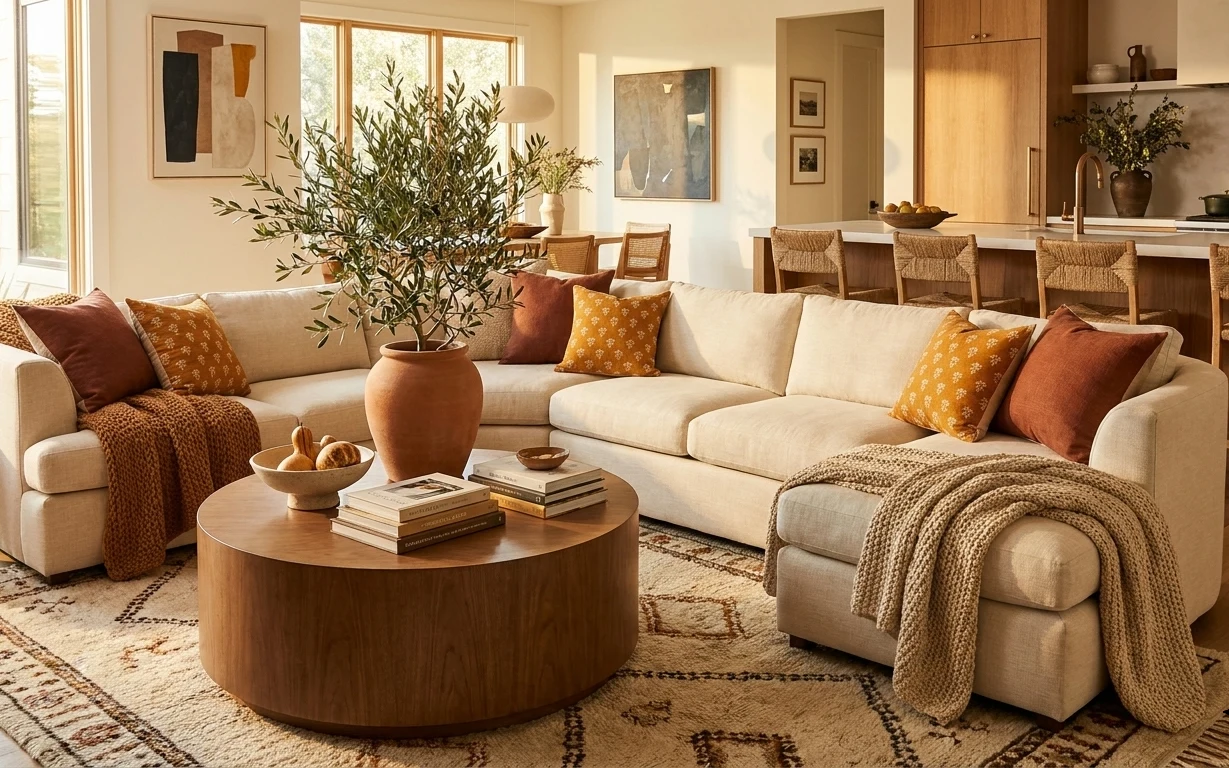
Why warm wood-and-linen is the living-and-dining nook of 2026
In the photo, the whole vibe is built on contrast: creamy upholstery and woven textures against warm wood and a few matte black accents from the TV screen. That combo echoes what you see in japandi styling—simple shapes, quiet neutrals, and one or two “anchor” items that hold the look. A large woven area rug, sofa cushions in soft light tones, and a round wooden coffee table create the repeating shapes your eye likes. Then ceramics—bowls and vases—bring that lived-in, slightly artisanal feeling without clutter.
I kept trying to “fix” this kind of room by adding more items—more plants, more little trays, more height. What finally clicked for me was restraint: change textiles first, then add one framed piece, and only style with things that look good from across the room. The result feels intentional in daylight, but it also holds up after dark because the materials stay warm and matte.
Layer 1 — large woven area rug ($200) Texture you can feel underfoot
A large woven area rug in a light oat tone is what makes the whole living-and-dining nook feel grounded. In the hero, the rug sits between the sofa and coffee table, visually uniting the two zones without needing any wall changes. Woven texture matters here: it reads warm and organic even when the palette stays neutral. The obvious alternative—an all-flat, low-texture rug—can look a little flat against wood floors and upholstered seating. I’d rather spend on a rug that hides everyday marks and gives you that tactile “soft landing” every time you walk in.
Lay the rug so your coffee table stays fully on it
Center the coffee table on the rug footprint so the wood + weave read as one scene, not two separate purchases.
Layer 2 — sofa cushions ($60) Light cushions for the cream-on-wood look
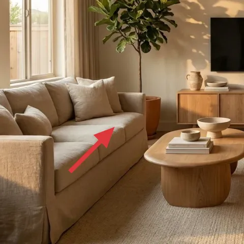
Those sofa cushions are doing more than comfort—they’re carrying the color story. Swapping to cushion covers (or a cohesive insert set) in a cream/ivory range gives the same airy contrast to the warm wood and keeps the whole room from tipping into beige-on-beige. This works especially well in renters’ spaces because textiles are the easiest “move-with-you” changes. A heavier throw or a single loud accent pillow would fight the calm lines of the coffee table and dining chairs. Instead, stick to soft, light tones and let the texture do the decorating.
Pick two cushion tones, not six
In a room like this, too many shades make the rug and wood floor feel louder instead of warmer.
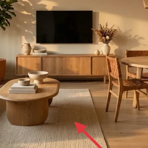
Layer 3 — round wooden coffee table ($180) A circular pause between straight lines
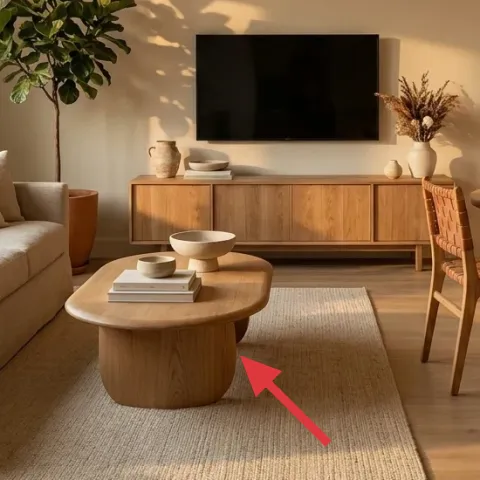
The round wooden coffee table is the visual break that keeps the space from feeling boxy. In the hero, its warm wood finish picks up the dining furniture, while the rounded top makes the rug and sofa feel less rigid. If you went with a square coffee table instead, you’d get more visual angles competing with the TV and dining chair backs. This piece also gives you a practical styling surface: you can stack a couple books and leave space for a small bowl or vase so it doesn’t look staged. Choose a finish close to your dining wood so the whole nook reads coordinated from both the living and dining sides.
Style the table with one low cluster
Keep ceramics grouped near the center so the tabletop looks intentional, even when you’re not actively arranging it.
Layer 4 — potted leafy plant ($35) One green silhouette, not a jungle
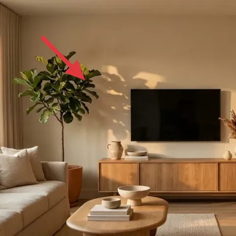
The potted leafy plant on the left side creates a natural “ceiling” for the room—its silhouette balances the pendant light above and softens the straight edges from windows and walls. This is a renter-friendly move because plants relocate easily when the lease ends. I like one grounded plant here rather than multiple small ones, because small plants can look fussy and require more upkeep. The trade-off is you’ll still need to rotate it occasionally so the leaves don’t lean hard toward the light. Go for a plant with broad leaves or a bushy shape so it fills the negative space beside the sofa.
Rotate monthly for an even canopy
Small rotations prevent the whole plant from growing lopsided in a bright window corner.
Layer 5 — framed abstract wall art ($80) Make one statement that matches the palette
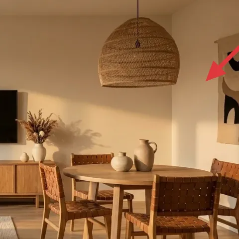
That framed abstract on the right wall acts like the room’s punctuation—black-and-cream shapes against a light background. Rather than adding a gallery wall (which can feel busy fast), this single piece keeps the styling calm and lets the ceramics and wood do the rest. If you choose art with earthy curves and negative space, it visually echoes the round coffee table. This is also the best “renter-safe” wall move: you can hang it without drilling using a removable hanging method. The key trade-off is scale—if the frame is too small, it won’t read from across the room, so pick a size that holds attention.
Make it instead of buying it
This hand-painted abstract on cardstock gives you the same black-and-cream punctuation, and it’s easy to take down when you move.
Materials
- Cardstock (thick, ~11×14 or larger) — 1 sheet — craft store — $12
- Acrylic paint (black + cream/ivory) — small set — craft store — $6
- Small foam roller or brush — 1 — craft store — $8
- Painter’s tape — roll — craft store — $9
- Frame (for the final size) — 1 — thrift or home goods — $5
Steps
- Cut the cardstock to fit inside the frame opening with a small margin.
- Use painter’s tape to map simple blocks and curves (leave some areas blank for negative space).
- Paint the light base tone, then let it dry completely.
- Layer black accents with a brush or foam roller, keeping the shapes slightly imperfect.
- Remove tape and touch up edges with the brush.
- Let the paint dry fully before sliding the paper into the frame backing.
Total DIY cost: $40 — saves about $40 over buying.
Layer 6 — ceramic vase on dining table ($25) Small height for an easy centerpiece
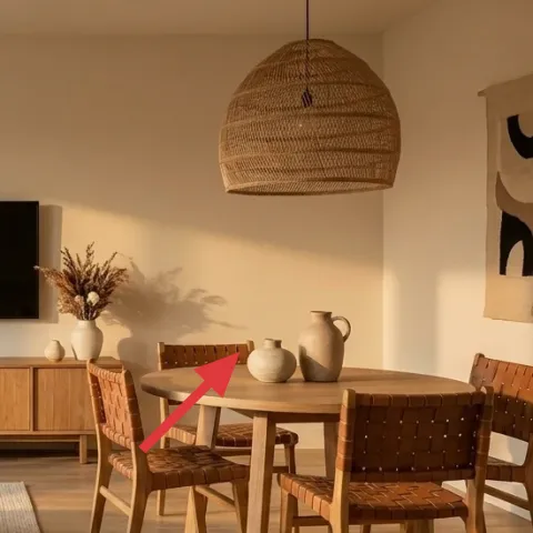
A ceramic vase on the dining table brings that same artisanal calm you see on the coffee table and console. In the hero, the vase sits among other ceramics, but it doesn’t dominate—the shape and neutral color let it blend into the wood-and-cream palette. This is the kind of decor that’s easy to swap seasonally, too: dried stems in a neutral tone in one season, then nothing but the vase when you want it extra quiet. The alternative—using a tall decorative centerpiece—can block sightlines across the table and feel too “special occasion.” Keep it low and creamy so it reads casual every day.
Don’t pick a glossy vase if your room is already matte
In a space with woven and matte ceramics, extra shine can look out of place instead of cohesive.
Layer 7 — ceramic bowls on media console ($30) A controlled cluster beats scattered decor
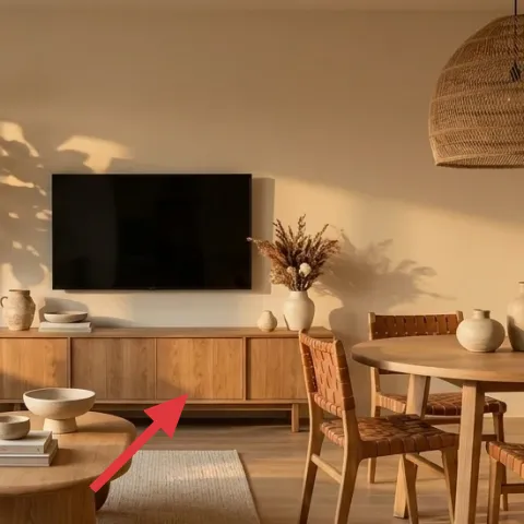
The ceramic bowls on the media console are small, but they’re crucial because they echo the room’s theme: simple forms, warm neutrals, and texture you notice up close. In the hero, the cluster sits centered under the TV, so it reads like a deliberate “still life” rather than random objects. When you style a long console, it’s tempting to spread things out evenly, but that can feel sparse and accidental. Instead, group two or three pieces close together so the arrangement looks intentional from the sofa. The trade-off is you’ll need to edit—every bowl has to earn its spot.
Use bowls in two sizes
Two small pieces plus one slightly larger bowl creates depth without making the console look crowded.
The cost, layer by layer
| Layer | Item | Cost |
|---|---|---|
| 1 | Large woven area rug (5×7, oat tone) | $200 |
| 2 | Sofa cushion covers (cream/ivory set) | $60 |
| 3 | Round wooden coffee table | $180 |
| 4 | Potted leafy plant (4–6 ft) | $35 |
| 5 | Framed abstract wall art (DIY equivalent retail) | $80 |
| 6 | Ceramic vase for dining table | $25 |
| 7 | Ceramic bowls set for media console | $30 |
| Total | $600 | |
If you want a cheaper variant, swap the coffee table for a lighter-budget round end table and choose an easier rug size match (a smaller 5×7 in the same oat tone). Keep the same framed abstract and ceramic cluster so the room still reads intentional from the sofa.
What worked, what didn't (across the whole room)
This nook works because the big items stay warm and simple, then the texture does the heavy lifting. The ceramics and one framed abstract create enough detail without turning the room into a collection.
What worked
- The woven rug grounds both seating and dining so the open plan feels intentional.
- Light sofa cushions keep contrast high against warm wood flooring and console furniture.
- The round coffee table softens all the straight lines from windows and the TV wall.
- One potted leafy plant adds a natural silhouette without cluttering every corner.
- Black-and-cream framed art ties into the TV screen and keeps the palette restrained.
- Grouped ceramics on the console look like a still life instead of random decor.
What didn't
- Trying to add multiple wall pieces can make the room feel busy instead of calm.
- Choosing glossy ceramics can look mismatched next to woven and matte textures.
- Over-styling the coffee table makes the tabletop feel staged instead of lived-in.
- Using a too-small frame reduces impact from across the room.
What we'd skip if we did it again
Skip a second framed piece on the opposite wall. With the TV, console styling, and dining table centerpiece already in play, a second print usually makes the palette feel busier instead of more layered.
Skip a high-gloss centerpiece and pick matte or textured ceramics. This room already has woven and wood textures; shine can fight the calm, especially when daylight hits at an angle.
Skip overfilling the media console. Two to three ceramic bowls and a simple visual rhythm read more intentional than spreading decor across the whole shelf length.
Frequently asked
How long does this living-and-dining nook refresh take?
Plan for about 4–6 hours total. If your rug already fits and your coffee table arrives quickly, the physical part (rug placement, furniture positioning, cushion swaps) can be an afternoon. The framed abstract DIY is the main variable: once the design is taped and painted, it’s mostly drying time. If you thrift a frame, add another quick stop for selection.
Is this renter-safe if I can’t drill or anchor?
Yes. The refresh focuses on textiles (rug, sofa cushions) and freestanding pieces (coffee table, plant, ceramics). For the framed abstract wall art, you can use removable hanging options intended for renters. The look doesn’t depend on changing the TV or media console itself—only styling the visible surfaces.
What if my living-and-dining nook is smaller than the photo?
In a smaller layout, prioritize proportion: use the rug size that lets the coffee table sit fully on top, and keep the ceramic cluster tight on the media console. You can still copy the palette—cream, warm wood, black accents—but consider fewer chairs or a slightly smaller round table if circulation is tight.
What if my room has cooler lighting (less warm daylight)?
Lean into warm neutrals. Choose sofa cushions and rug tones that read ivory or oat instead of cool gray, and pick wood finishes that look golden rather than washed out. For ceramics, stick to matte surfaces or off-white tones. You can also increase texture by choosing a rug with a more visible weave.
Where should I shop if I want this to stay under $600?
For the rug and coffee table, big-box home and general marketplaces are often the fastest route to staying on budget. Look for a mid-range coffee table in warm wood tones, then reserve your budget for a rug with real weave texture. For wall art, thrift frames and print shops can be cheaper than buying a finished framed piece—then DIY the abstract when you want to match the palette.
Biggest mistake to avoid in a japandi-leaning nook like this?
Avoid adding too many different textures and too many small objects at once. Japandi rooms look right because materials repeat (wood, weave, matte ceramics) and the styling is edited. If everything has to be decorative, nothing feels intentional. Aim for one clear “anchor” on the wall and one controlled cluster on each surface.
More in Living Room

Under $600: warm wood-and-linen living-and-dining nook refresh
A warm, japandi-leaning living-and-dining nook refresh that keeps most changes renter-safe and easy to pack up. This look comes together fo…
Under $300: olive-and-rust sofa nook refresh
A move-friendly living-room sofa nook refresh built around earthy textiles, warm lamp light, and two framed prints—no drilling, no permanen…
Under $1,000: olive-and-rust living room refresh
A cozy sofa seating area with rust-orange accents, cream textures, and an olive sideboard. This weekend refresh adds seven high-impact swap…