- Best for
- Weekend refresh + mood lighting
- Cost
- $450 total, DIY paint included
- Time
- One weekend (paint + styling)
- Difficulty
- Confident DIY
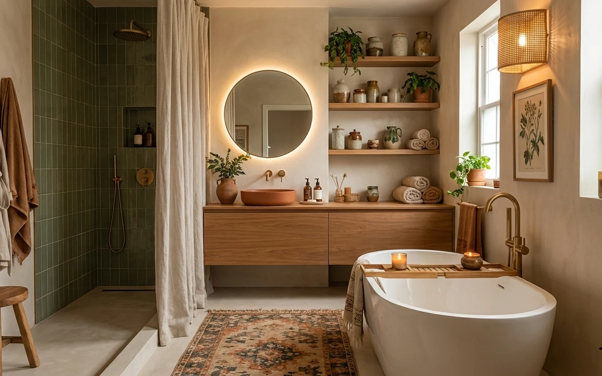
Why warm gray-and-cream lighting choices are the bathroom of 2026
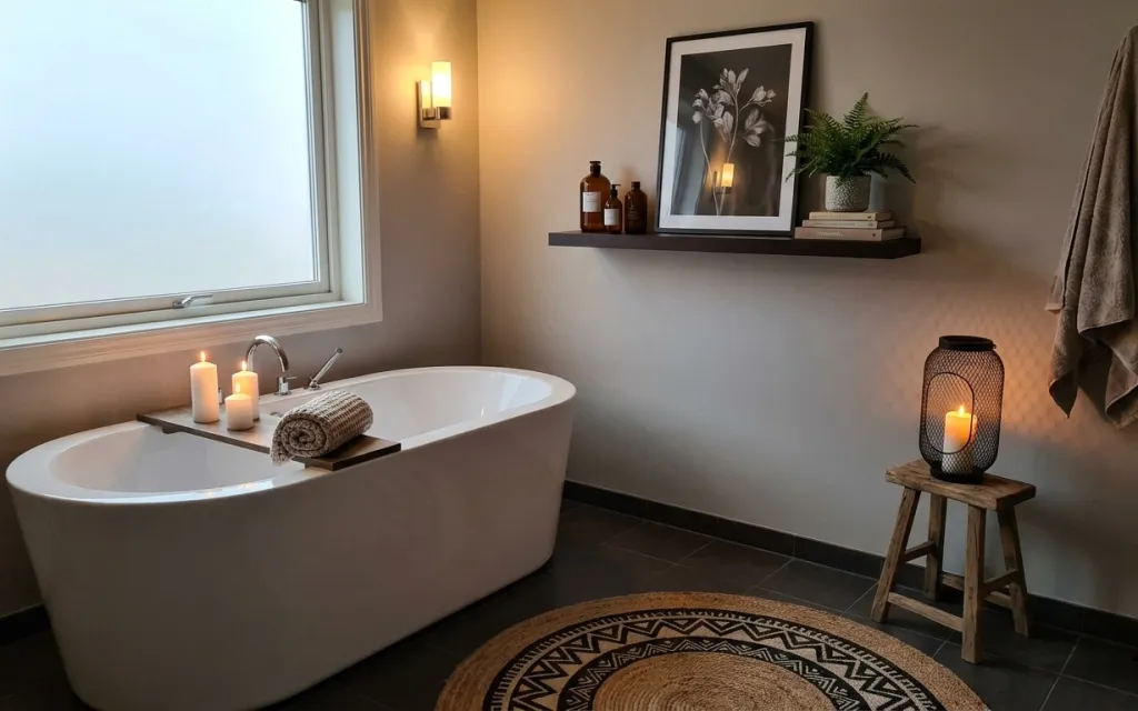
What’s pulling this bathroom together is less “fancy” and more carefully staged contrast: matte warm gray walls, a cream tub, and textured natural jute underfoot. I’ve seen this exact mix work in a lot of vintage spa spreads—think linen towels and botanical prints above a simple ledge—because the textures do the talking. The wall shelf styling adds height, while the candle glow and the lantern’s amber light keep the room soft instead of flat. For homeowners, this is one of those weekends where you can pick the highest-impact option first: paint, then the visuals.
I used to overdo bathrooms with “matchy” sets—same towel color, same frame color, same metal finish—and it always turned into a showroom. Here, the win is variety inside a tight palette: warm gray, cream, and walnut brown show up in different objects (rug, shelf, lantern) without needing to match exactly. The moment I stopped chasing perfect symmetry and started chasing texture, the whole room looked more lived-in and calmer.
Layer 1 — area rug (5×7) in natural jute ($80) Texture underfoot for a softer floor
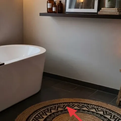
A natural jute rug in a 5×7 size anchors the tile floor and adds the kind of tactile warmth that keeps a bathroom from feeling cold. In the photo, the rug’s circular shape still reads as “natural fiber” because the weave and neutral tone sit right in the center of the action. The alternative would be a thin, synthetic rug—but tile doesn’t forgive that; it slides visually and feels less substantial. Jute also pairs beautifully with the warm gray wall because it doesn’t lean gray-blue. Trade-off: jute can be a little more sensitive to standing water than a fully synthetic option.
Layer texture, not color
Keep the rug neutral and let towels and light do the color work so the room stays calm.
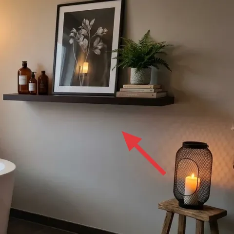
Layer 2 — framed botanical print on wall shelf ($80) A vertical focal point above the tub
The framed botanical print adds a clean vertical “read” to the wall shelf zone, balancing the curved tub edge and the horizontal shelf line. The print’s dark frame also gives your warm gray wall a crisp outline, which is why it doesn’t disappear into the background. If you went with an unframed print or a washed-out frame, the shelf would look less intentional and more like clutter. This choice works because it’s one clear graphic moment while the rest of the styling stays small and organic. Trade-off: you’ll need to center it on the shelf so it looks like a design decision, not a random placement.
Think “one print, not a cluster”
One framed piece keeps the shelf feeling serene, especially when bottles and books are already present.
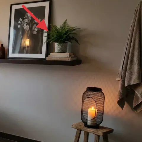
Layer 3 — potted fern on wall shelf ($80) Green that softens the hard tile
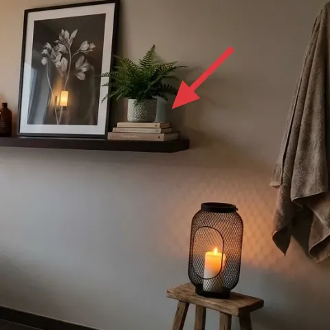
The potted fern brings movement and a natural shape language to a space that would otherwise be all straight lines and glossy surfaces. Placed on the wall shelf near the framed botanical print, it creates a matching botanical theme without needing more wall art. The easier alternative is a fake plant, but real fronds photograph (and look) richer, with depth in the highlights from warm light. This also helps the wall shelf feel styled instead of just “storing” items. Trade-off: real plants need basic watering habits, but a fern is forgiving if the bathroom isn’t fully dry.
Angle the fronds toward the room
Rotate the pot so leaves lean slightly outward; it makes the whole shelf feel fuller.
Layer 4 — pillars candle set ($35) Warm glow that makes everything feel calmer
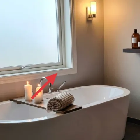
Pillars candles—especially in cream tones—give you that soft, lived-in light you see in spa photography. In the hero, candles sit on the tub ledge near the faucet, which means their glow bounces off the warm gray wall instead of getting swallowed by shadow. The obvious alternative is more overhead light, but that often flattens textures like jute and towel knit. Candles are also the fastest way to change the mood without touching plumbing or fixtures. Trade-off: you’ll want to place them safely and keep wick maintenance simple so they burn evenly.
Don’t crowd the ledge
Leave space between candles and the faucet area so the flame stays clear and the setup still looks neat.
Layer 5 — wood step stool for table lantern ($80) Height for lantern light and towel balance
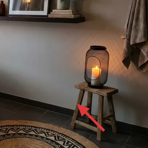
A wood step stool acts like a small side table, raising the table lantern so its light lands higher on the wall. That height is the difference between “lamp sits there” and “ambient glow,” and it helps the bathroom feel layered even in daylight. The lantern also looks more intentional when it’s on a piece of furniture, not directly on the tile. The alternative would be to place it on the floor, but then the glow drops and the room reads heavier. Trade-off: the stool adds visual warmth, so choose a natural wood tone that works with walnut-brown accents already in the shelf items.
Match the wood warmth, not the exact finish
Look for a similar undertone (walnut/honey), even if the sheen differs.
Layer 6 — interior paint, warm gray wall ($70) Refresh the base so every texture reads richer
Painting is the best “set the tone” upgrade because it changes how the light hits every other object: jute weave, towel knit, the dark frame, and the amber candle glow. In this bathroom, the warm gray feels creamy rather than icy, which is why the shelf styling looks curated instead of dull. If you paint a cool gray, the room can look harsher and the lantern light turns a little off. The realistic weekend approach is one warm gray coat to even out the walls, then let the textures do the rest. Trade-off: bathroom ceilings and corners need extra attention so the finish stays smooth.
Make it instead of buying it
This weekend, paint the warm gray wall so the framed print, fern, and candle glow look coordinated without swapping anything else.
Materials
- Interior paint, 1 gallon — for warm gray — home improvement store — $40
- Roller cover (bathroom-ready) — 1 pack — home improvement store — $7
- Angle brush — 1 — home improvement store — $5
- Painter’s tape — 1 roll — home improvement store — $3
- Sanding sponge — 1 — home improvement store — $3
Steps
- Sand lightly to dull any sheen and wipe off dust with a dry cloth.
- Apply painter’s tape along trim lines around the shelf wall area.
- Cut in edges with the angle brush first, then roll the main wall sections.
- Let the first coat dry fully (follow the paint label for drying time).
- Lightly inspect for missed areas and touch up with a small brush.
- Let everything dry completely again before removing tape.
- Re-check corners and the wall shelf height zone for coverage.
- Allow final curing time before running the bathroom at full humidity for long periods.
Total DIY cost: $58 — saves about $12 over buying.
Layer 7 — folded towel on bathtub ledge ($25) Softens the tub zone without adding clutter
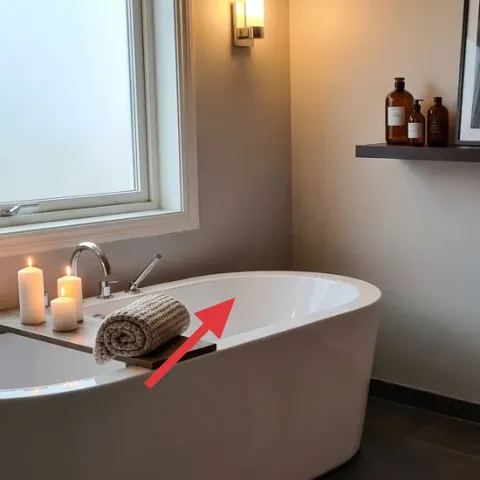
The folded towel on the bathtub ledge is small, but it’s doing a big job: it adds a soft, absorbent texture right where your eye lands near the faucet. The towel’s neutral tone keeps the palette cohesive with the jute rug and warm gray paint, and the simple fold looks intentional instead of “randomly placed.” If you skip this and leave the ledge bare, the tub area reads more utilitarian and less spa-like. Using a towel as styling is also budget-smart because you’re not buying new furniture—just choosing one high-visibility textile. Trade-off: towels can look wrinkled if they’re not steamed or folded fresh.
Fold with a “hotel” edge
A crisp roll or narrow fold looks cleaner in photos than a big, loose stack.
The cost, layer by layer
| Layer | Item | Cost |
|---|---|---|
| 1 | Area rug (5×7) in natural jute | $80 |
| 2 | Framed botanical print on wall shelf | $80 |
| 3 | Potted fern on wall shelf | $80 |
| 4 | Pillars candle set | $35 |
| 5 | Wood step stool for table lantern | $80 |
| 6 | Interior paint, warm gray wall | $70 |
| 7 | Folded towel on bathtub ledge | $25 |
| Total | $450 | |
If you want to come in under this number, swap the fern for a smaller tabletop version and choose a rug size that fits tighter (same natural jute vibe). For paint, buy only one gallon and just repaint the main wall zone that shows most in everyday sightlines.
What worked, what didn't (across the whole room)
The strongest win is how warm light and natural textures pull focus away from the hard tile and make the tub zone feel curated. The shelf area works best when there’s one framed print plus one green plant—everything else stays accessory-level. Painting the wall in a warm gray tone is also what keeps the lantern and candle glow from looking too harsh.
What worked
- Natural jute underfoot adds softness and warmth against the tile floor without competing for attention.
- A single framed botanical print creates a clean focal point above the tub zone.
- The fern adds depth and a softer silhouette that warms up the hard lines.
- Pillars and lantern light create layered brightness that flat overhead lighting can’t match.
- The wood step stool raises the lantern so the glow reaches the wall instead of staying low.
- Warm gray paint makes towels and shelf accessories look more cohesive in one glance.
What didn't
- Leaving the tub ledge bare makes the space read utilitarian, especially with bright daylight.
- Using a cool gray paint would clash with warm light and make the botanical palette feel off.
- Overcrowding the shelf styling turns the fern and frame into background clutter.
- Placing lantern light too low can make corners darker and reduce that spa-like softness.
- Skipping a textured textile near the tub makes the whole room feel visually “hard.”
What we'd skip if we did it again
Skip adding more wall art than the framed botanical print and keep the shelf simple. In a bathroom, too many graphics fight with the candles, plant, and bottles, and the shelf becomes visually busy fast.
Skip going for a cool gray paint. Warm gray is the reason the lantern and candle light look flattering instead of harsh, and it also keeps towels looking creamy rather than washed out.
Skip placing the lantern on the floor or right on the tile. If the light source sits low, the glow can feel dim and heavy; raising it on the wood step stool is the easiest way to keep the room softly lit.
Frequently asked
How long does this bathroom refresh take on a weekend?
Plan for 1 full day plus drying/curing time. Painting is the scheduling anchor: you’ll prep and apply one coat, then wait for it to dry before you do touch-ups. The rest—rug placement, shelf styling (fern + framed print), and candles—usually takes 2 to 4 hours once everything is unboxed and positioned.
Is this renter-friendly if I can’t change the wall color?
Yes—keep the same layout and skip the DIY paint. Use the existing warm-gray look as the base, then update the most visible items: the framed botanical print, the jute rug, and the candle-and-lantern lighting placement. You can also refresh textiles by choosing neutral towels with a similar tone to the wall so the palette still reads cohesive.
What if my bathroom is smaller than this one?
In a smaller bathroom, choose the smallest rug size that still covers the “standing” area in front of the tub. Keep shelf styling to one framed piece plus one plant, and avoid adding extra decor layers. Lighting should stay layered: one raised light source (like the lantern on a stool) plus candlelight on a ledge tends to feel more spa-like even in tight footprints.
What if my bathroom is larger and feels too empty?
Lean into scale and height. A larger rug can better define the tub zone, and a slightly wider framed print helps the shelf read as intentional. If you’re adding anything extra, do it with texture (another neutral towel fold or a deeper-toned candle) rather than more graphics, so the room stays calm instead of busy.
Where should I shop differently to match this look for less?
For the rug and textiles, look for natural-fiber options at home stores during seasonal sales or at local discount retailers. For the framed botanical print, thrift shops and print marketplaces can be cheaper than full gallery frames. For candles and the lantern, focus on warmth (cream tones) rather than trendy scents—function first, styling second.
What’s the biggest mistake homeowners make with this style?
Overmatching. When every item is the same exact tone and finish, the room loses texture and starts feeling flat. Instead, aim for one tight palette (warm gray, cream, walnut brown) and vary the materials—jute weave, towel knit, and wood grain—so the bathroom stays interesting while still cohesive.
More in Bathroom

What $500 buys: a warm-gray bathroom refresh
A warm-gray bathroom refresh built around a natural jute rug, a framed botanical print, and layered warm lighting. This weekend plan stays …
7 renter-friendly ways to refresh a bathroom for $400
A sage-green bathroom vanity nook, softened with a renter-safe bath mat, towel styling, and botanical wall art. This $400 refresh focuses o…
Warm olive-and-terracotta bathroom refresh, $800
A calm tub nook with olive tile, warm walnut tones, and soft lighting—updated with 7 weekend-friendly upgrades. For about $800, swap in a p…